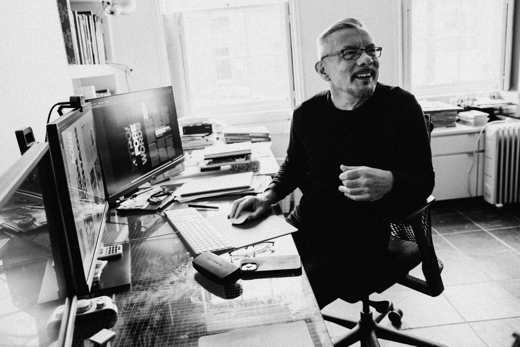
Graphic designer Neville Brody is from England and not really a household name in the American cultural landscape (unless you are a designer as well). However, if you are a fan of print magazines you have definitely seen his work. Having worked on The Face, Fuse, Arena, and many others — he has mastered the editorial layout. Infusing custom typography and column use that still boggles (in a good way) the mind, and delights the eye. In trying to find one image for this post I really struggled because you have to really take in the entirety of his work to fully understand his genius. Luckily for you he has a new book out and it covers just that — the entirety of his work over the past 3o years. I kind of forgot (or took for granted) how amazing his work is. You can learn about his new book here.


