CONCRETE TYPEFACE
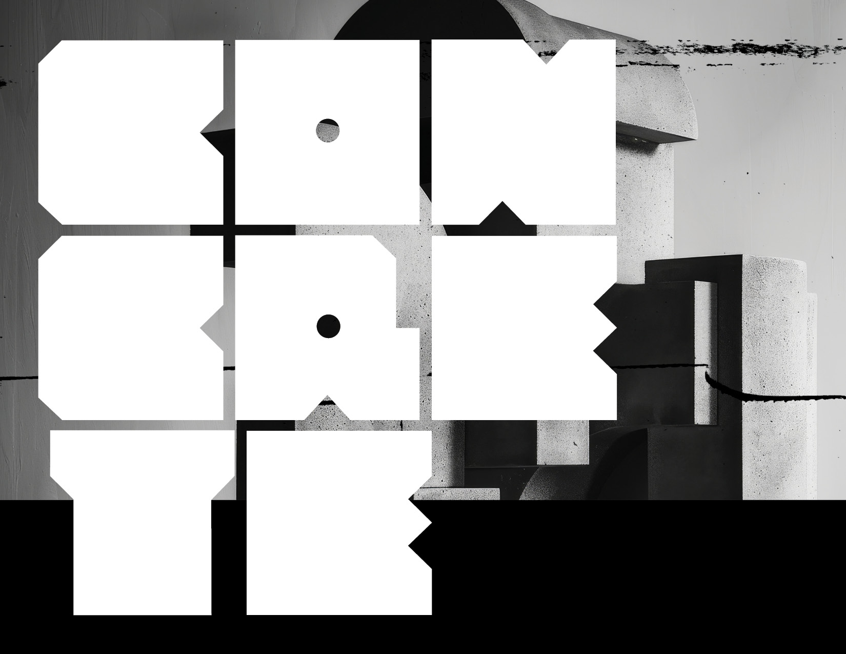
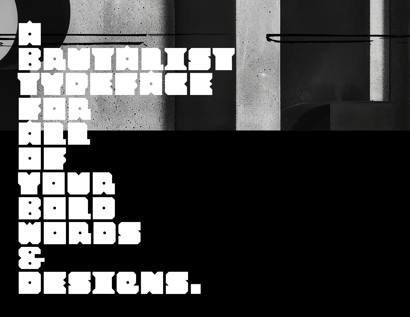
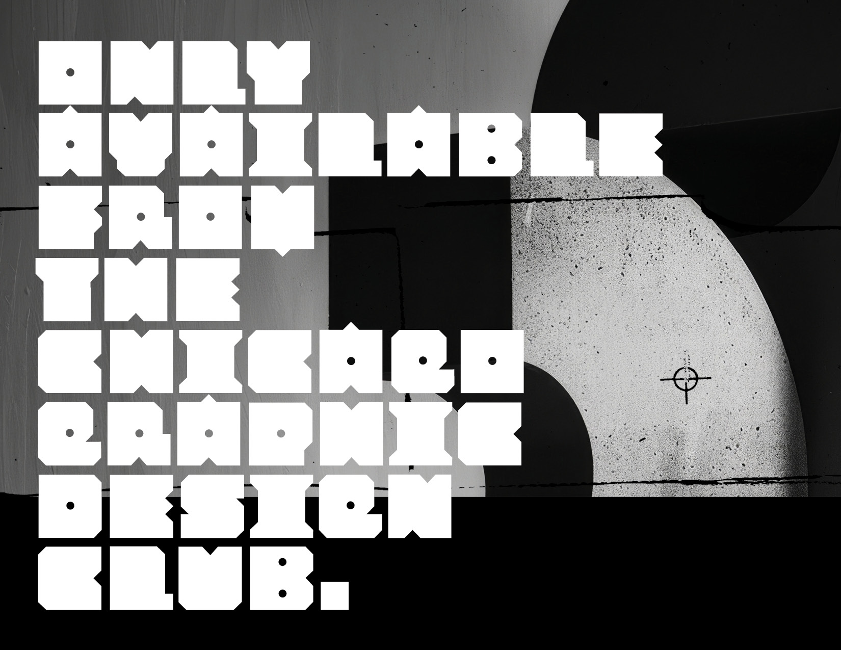
In early 2025, I revisited a typeface design that had been patiently waiting on the back burner, eager for completion. The project, which I resolved to finally "finish," is distinct in its construction— comprised solely of uppercase letters. Despite this limitation, it boasts a comprehensive international character set, making it versatile and suitable for global applications. This typeface was particularly challenging to design due to its unique approach: each letter and numeral adheres to a strict square form, heavily influenced by the raw aesthetics of brutalist architecture and the stark, geometric qualities of concrete structures. The result is a striking visual identity that blends functionality with an artful nod to architectural rigor. I'm excited to share that I plan to offer this typeface for purchase through the Chicago Graphic Design Club shop. If you're intrigued by typography that challenges conventional shapes, and embraces bold minimalism, make sure to secure your copy and get it before your coworker does. Available Summer 2025.


ABCDEFGHIJKLMNOPQRSTUVWXYZ1234567890#$%&!?
Brutalism is an architectural style that uses raw concrete and geometric forms to create bold, monolithic structures.
>Available SUMMER 2025

