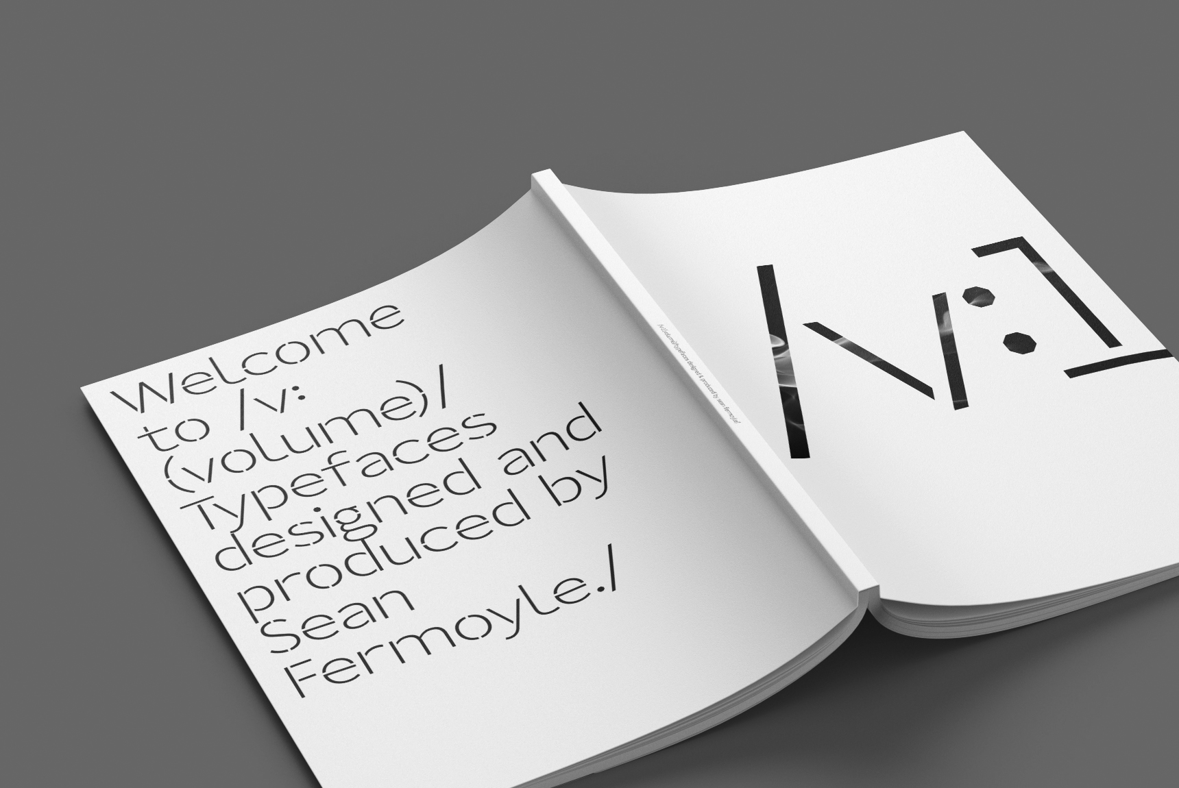
I'm thrilled to share that my self-initiated magazine project, “/v:” Issue 1, is now available for purchase via Blurb. This is the inaugural release in a five-part series that curates and celebrates nearly 30 years of type design—featuring both my own work and collaborations with others. To be released seasonally starting this Summer of 2025. Each issue clocks in at 80 pages, black and white, perfect bound, and sized at a crisp 8.5 x 11". Inside Issue 1, you’ll find five wildly different typefaces, each one getting the royal treatment across seven custom spreads—where I really let loose and pushed the visual storytelling of each alphabet. Expect a genre-bending mix: from gritty grunge to sharp-edged bitmap to other experimental styles that defy easy categorization. The series follows my personal design mantra: “the balance of opposites”—a belief that tension and contrast make the best work sing. If you're into typography, layout experiments, or just want to see someone lovingly sweat over kerning and bezier curves, I think you'll find something to enjoy. It’s zine meets type specimens, with a twist of obsession. Grab /v: Issue 1 here ←.