Personal Work.
Featured below are several select highlights from my personal work archives. These include projects I have initiated, submissions I have sent in response to "Calls for Artists", and/or other experimentally driven exercises that found their way into this world. If you'd like to discuss a collaboration, or submission opportunity that you think my work would be a good fit for; please reach out. Note: you can click on each carousel to pause/advance at your own pace.
Organization
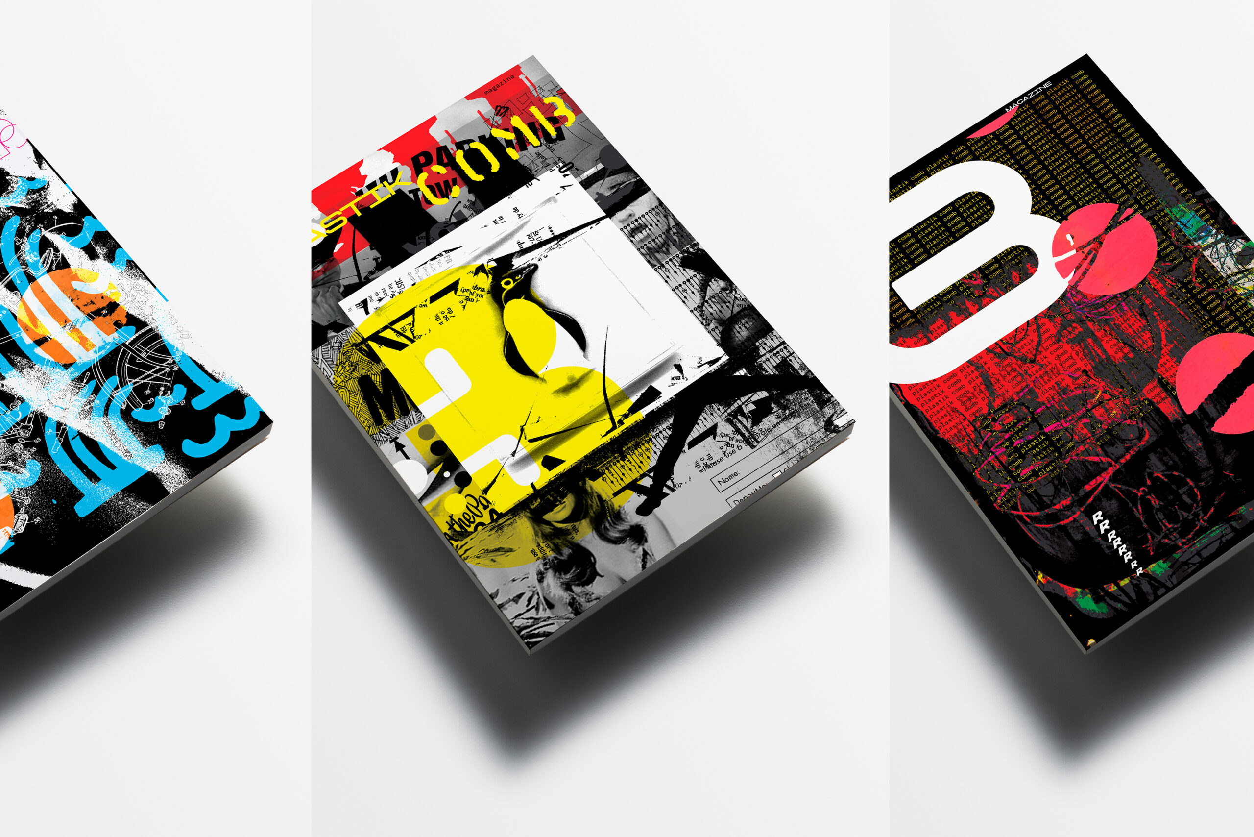
Plastikcomb Magazine
Project Overview
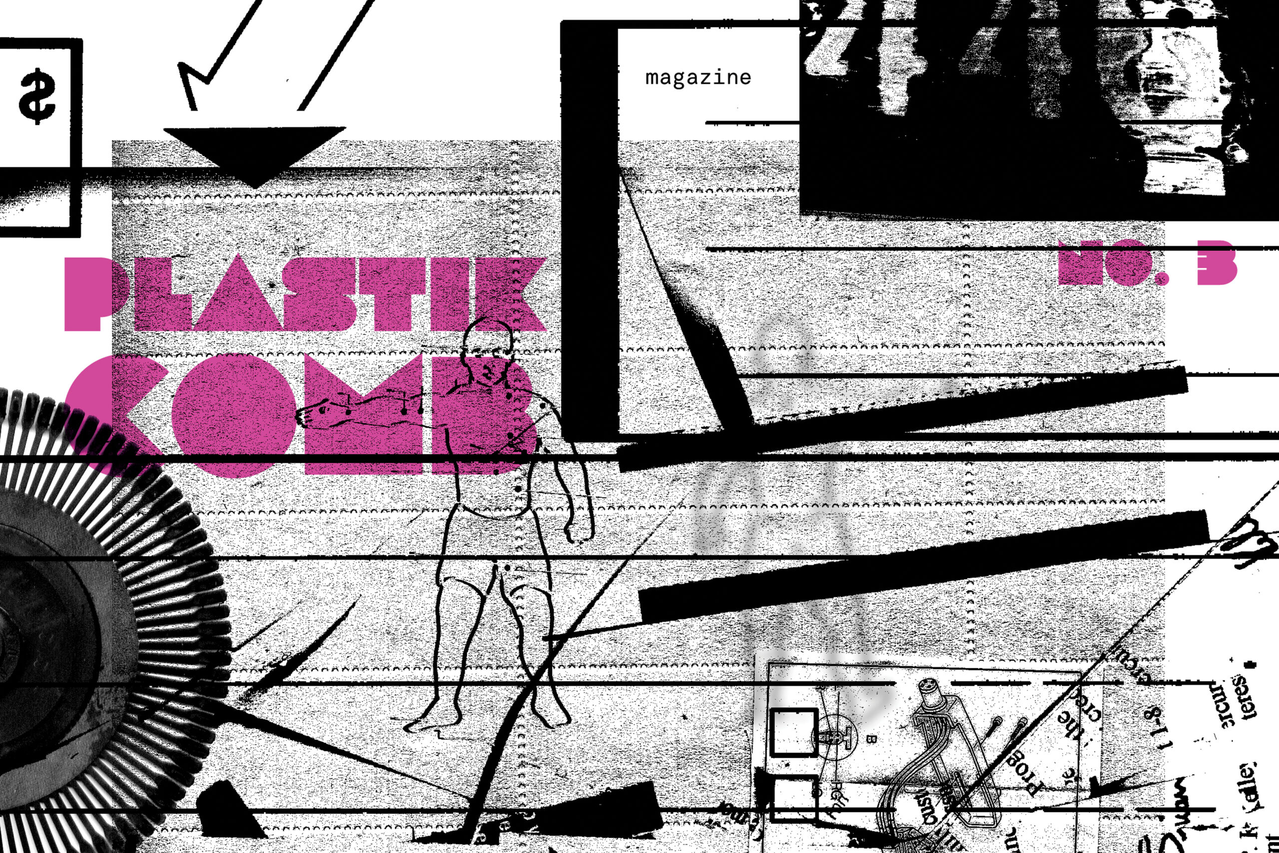
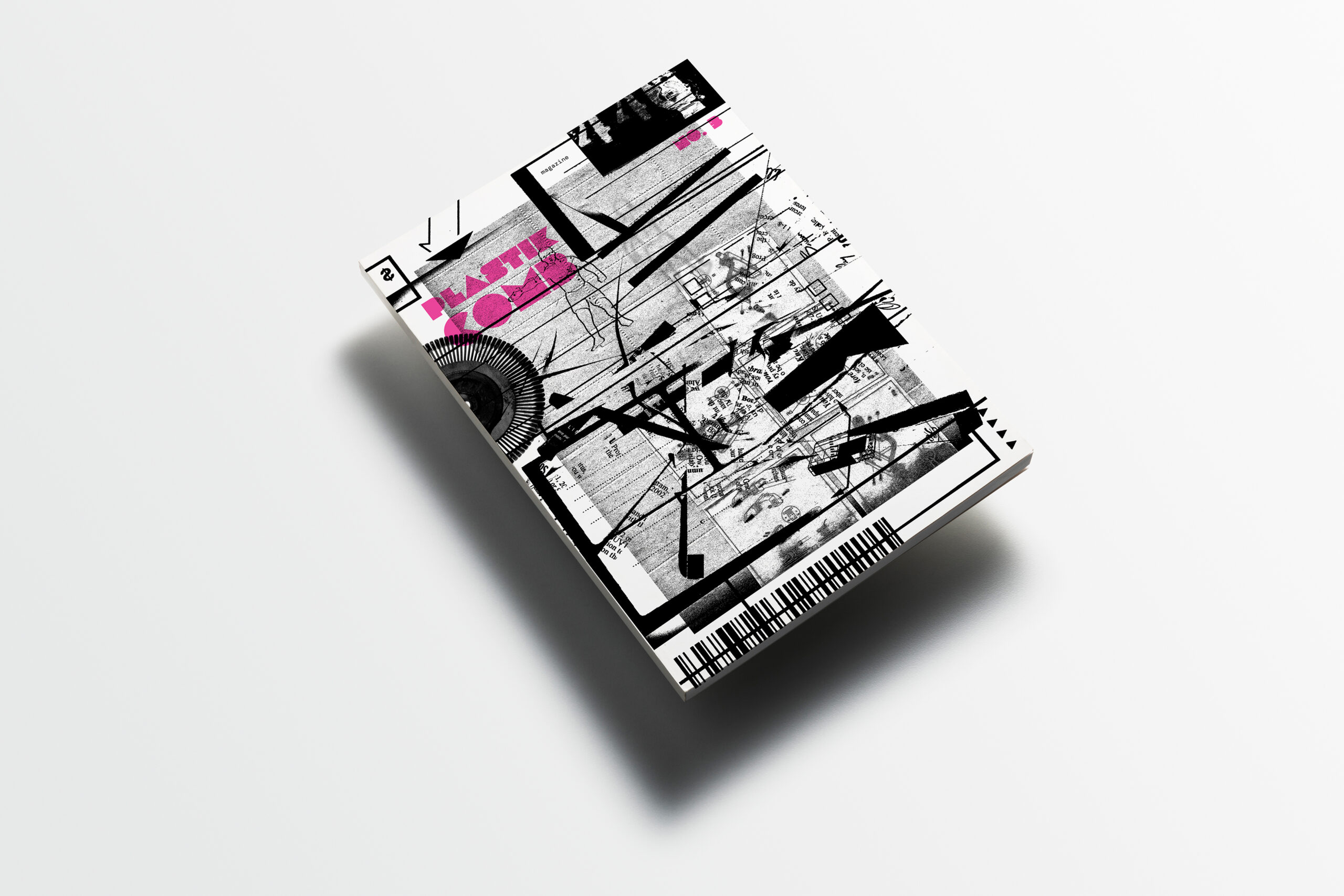
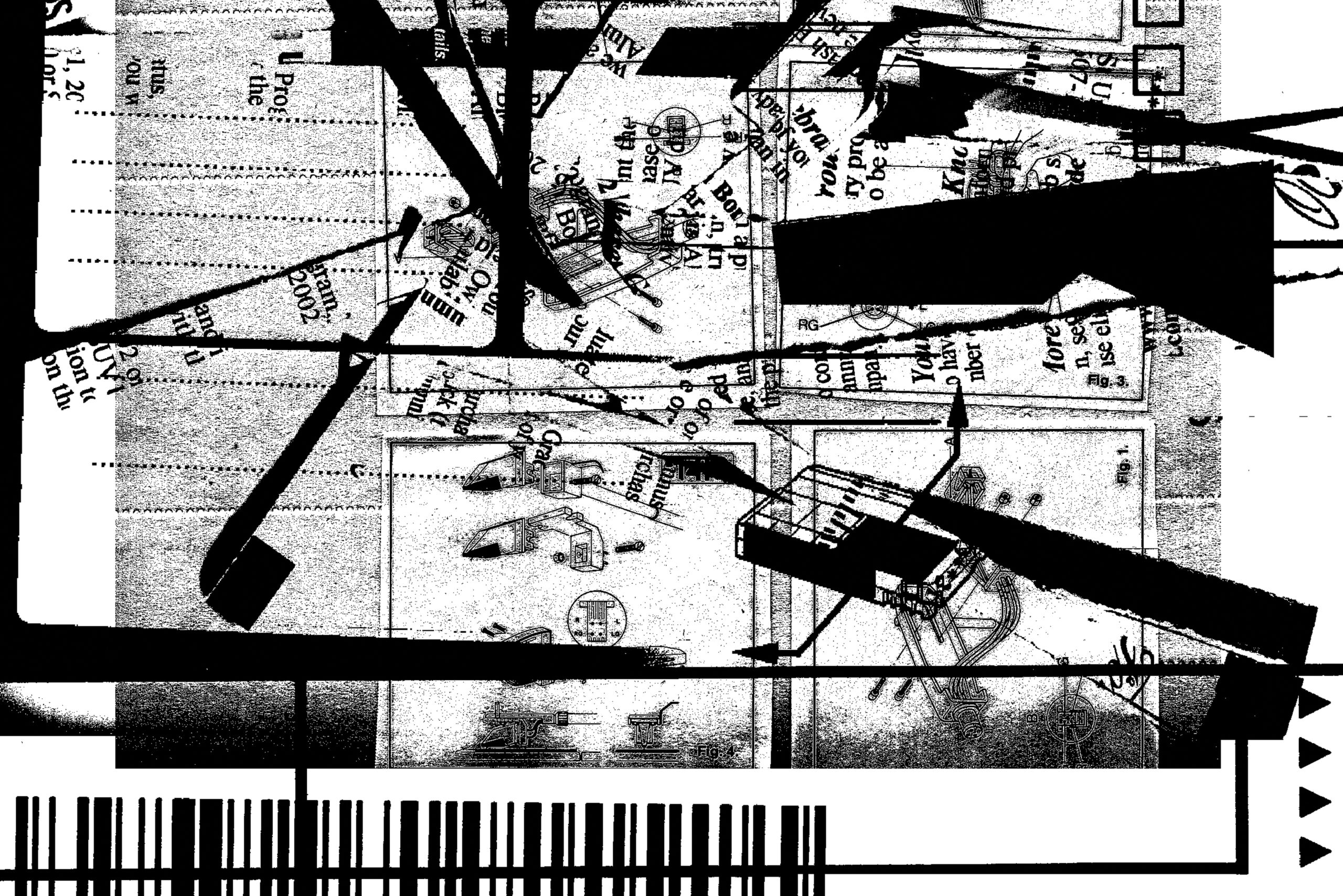
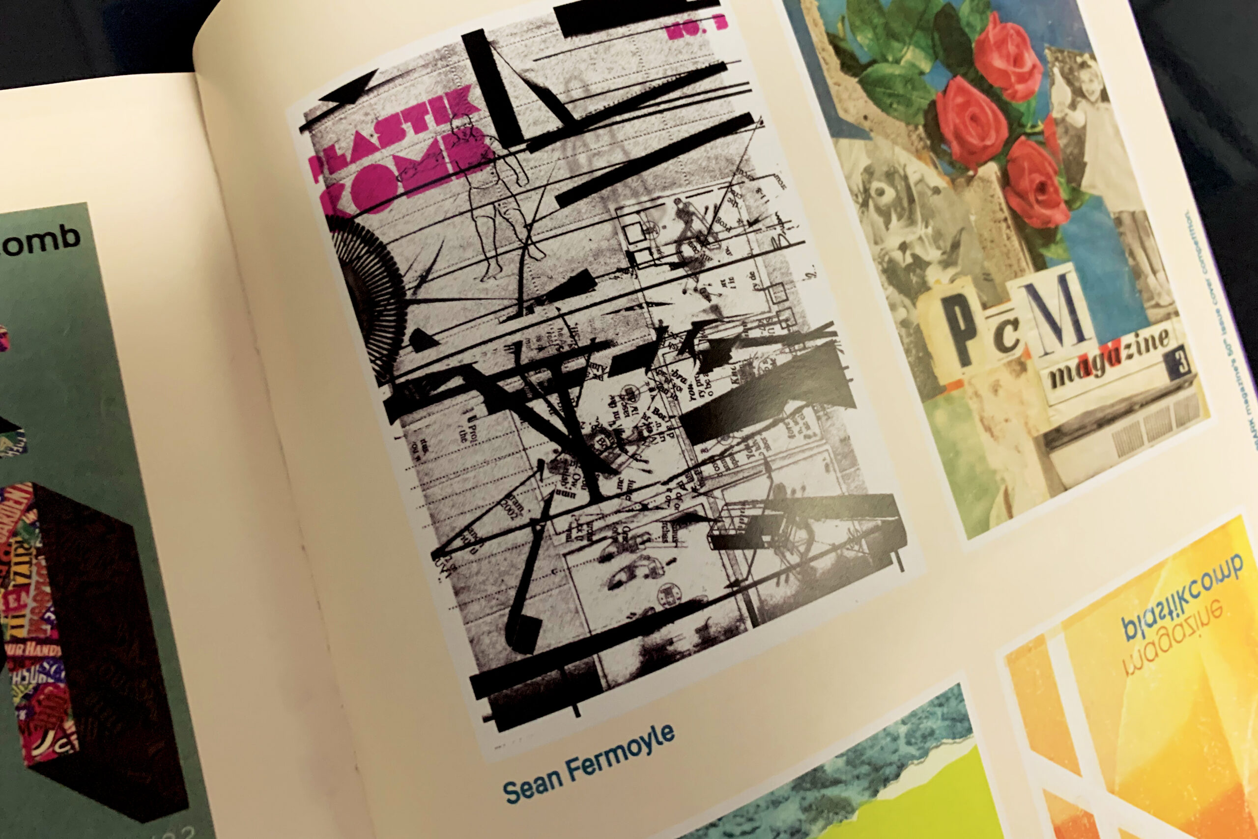
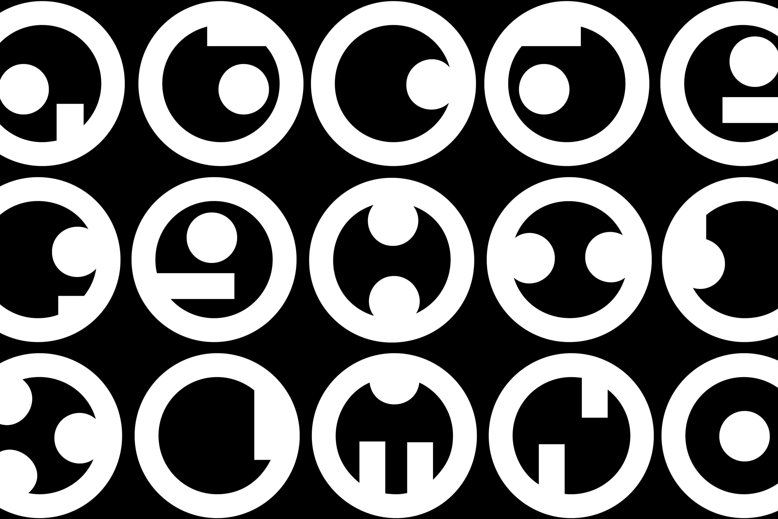
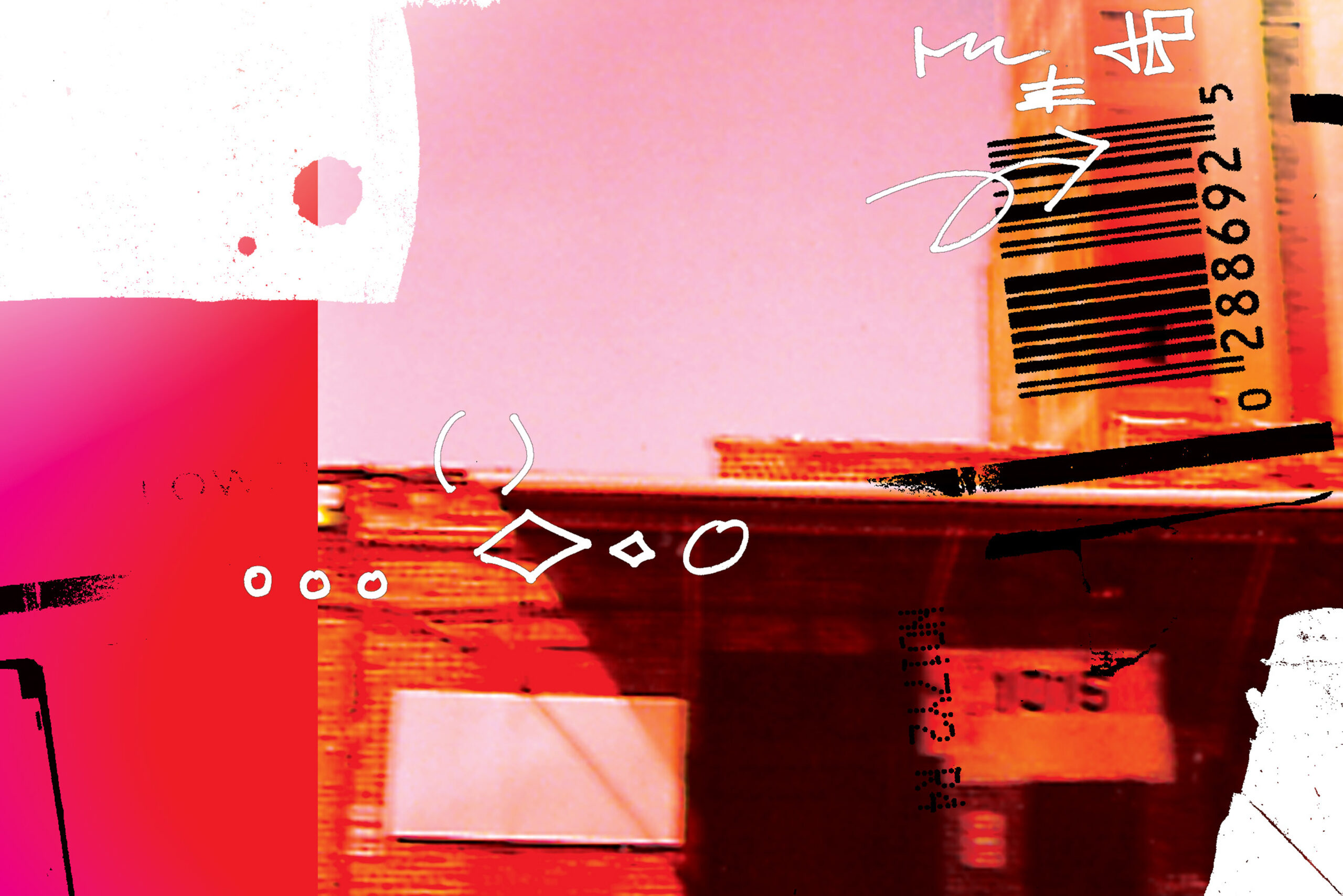
For the Winter 21/22 Issue 3; Plastikcomb magazine invited its graphic design friends (re: Instagram followers) to submit cover designs for their release. Although, my four submisions (shown here) did not make it to the final cut — the "black & white" one made it into the issue as one of several "runner-up designs". It's kind of like a silver trophy — not first place, but I'll take it. In my humble opinion, this publication singled handedly brought the "grunge" design aesthetic back from the '90s, and made it relevant again. Visit plastikcombmag.com for more.
Organization
Chicago Graphic Design Club
Project Overview
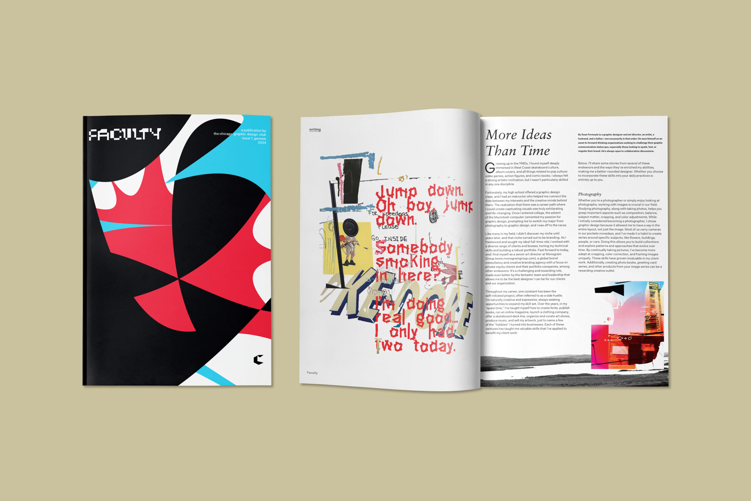
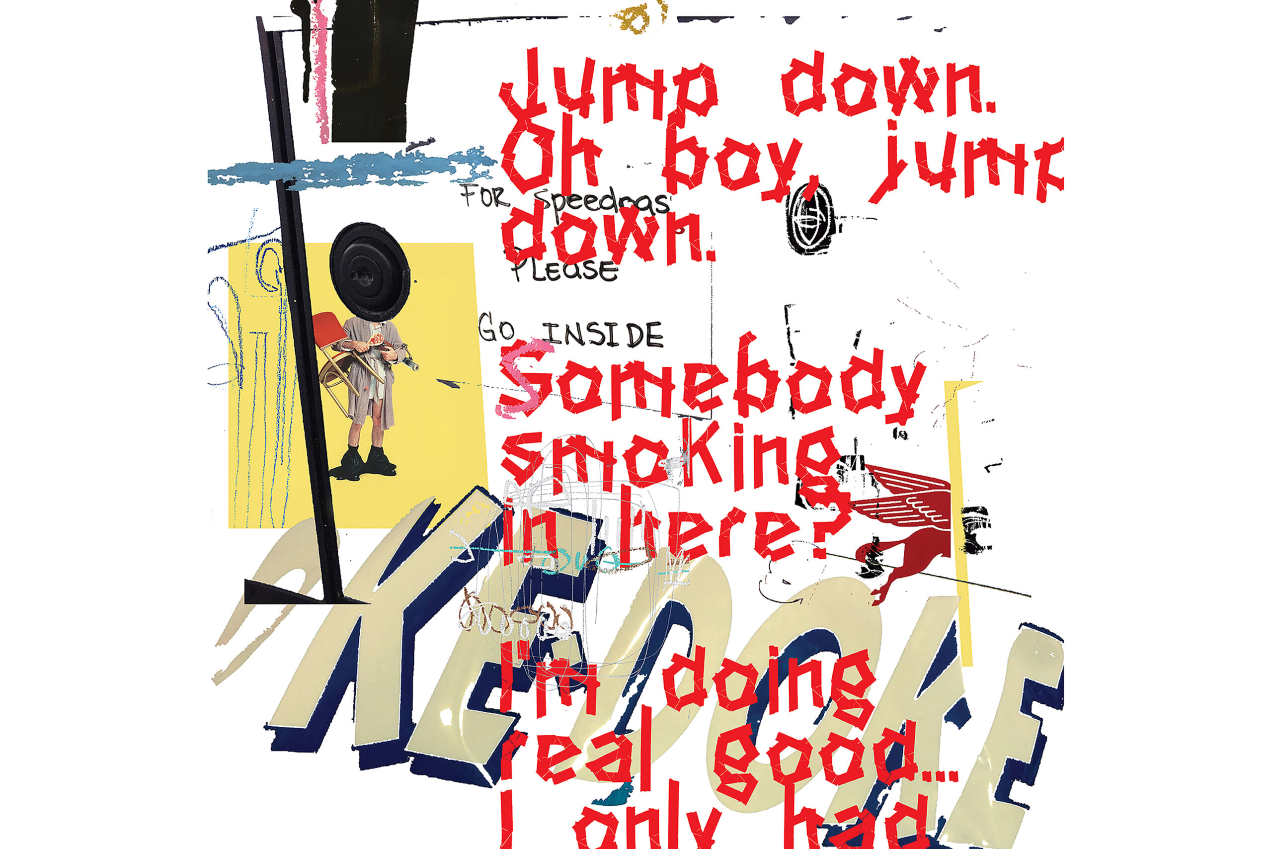
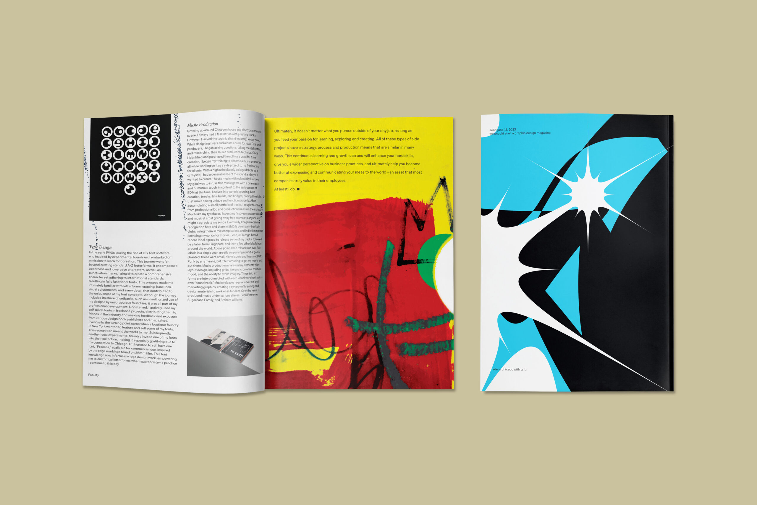
The CGDC started a new publication titled "Faculty" in early 2024, and had an open call for submissions in the Fall of 2023. I sent an article, and some images about how I felt the "side hustles", or the self-initiated projects were just as important to gaining experience as a graphic designer as the more formal fulltime experiences one might go through traditionally. The title of the article was "More Ideas Than Time". They also used my font "Process" for the masthead — so I couldn't be more humbled. Because of the wonderful experience with their team's founder, I am now advising, and contributing to the CGDC brand and business strategies moving forward. Visit chicagographicdesign.club for more info.
Self-Initiated
Craigslist
Project Overview
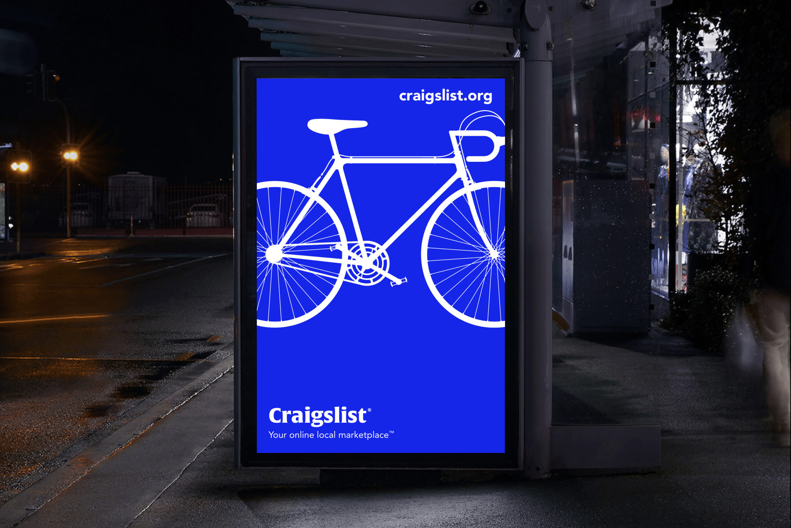
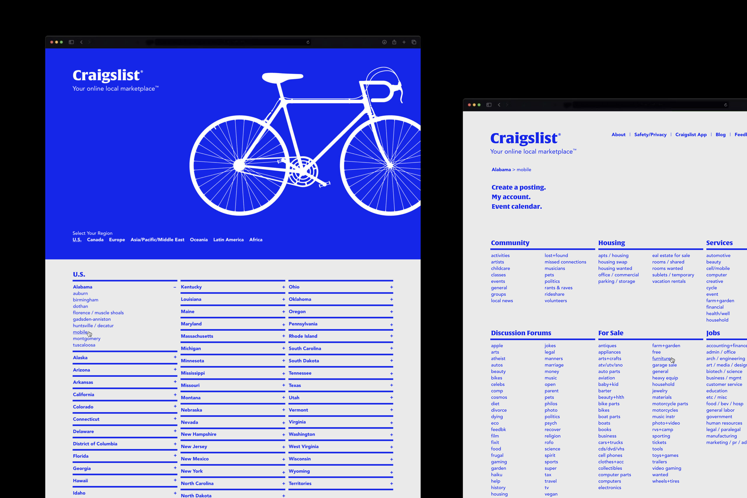
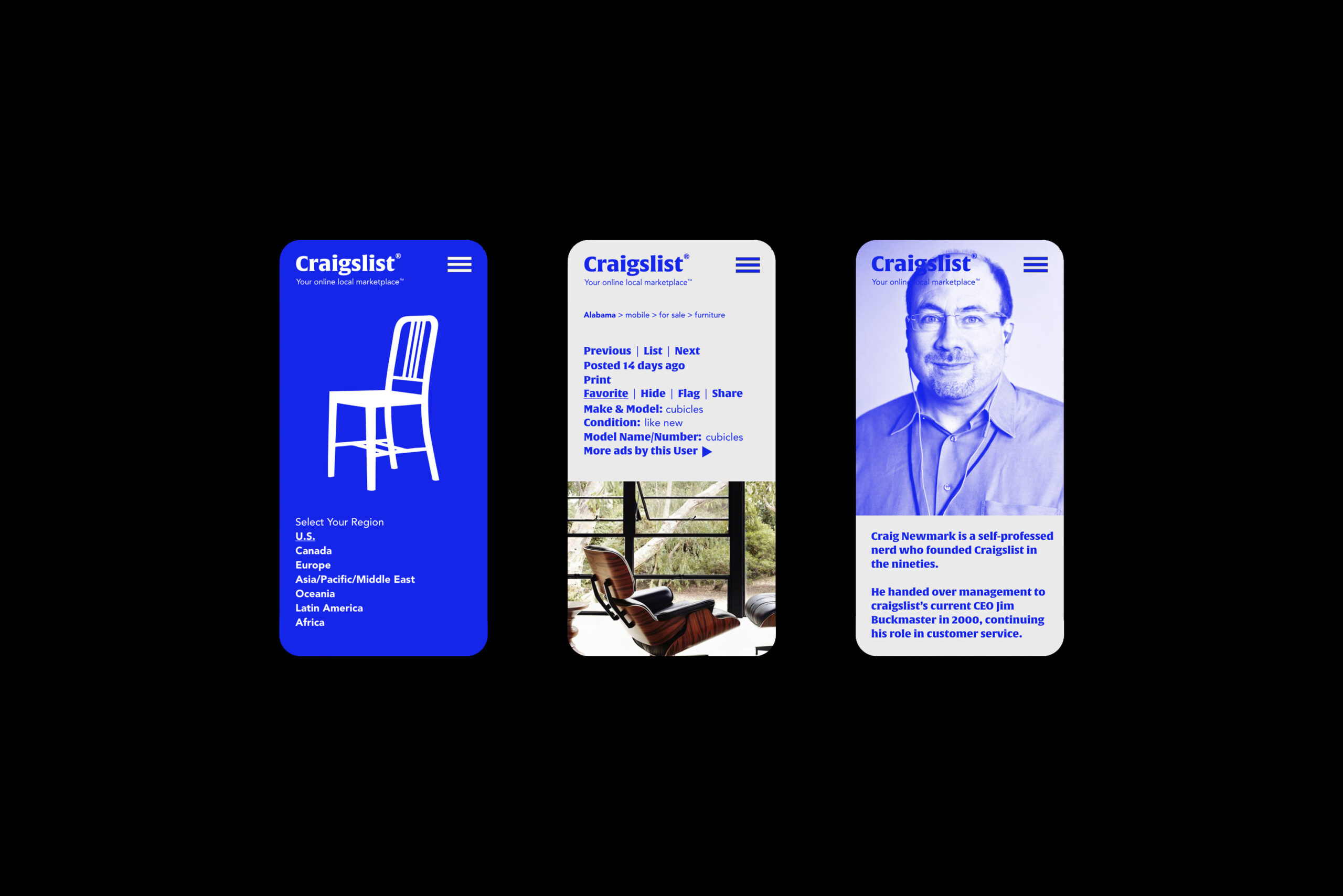
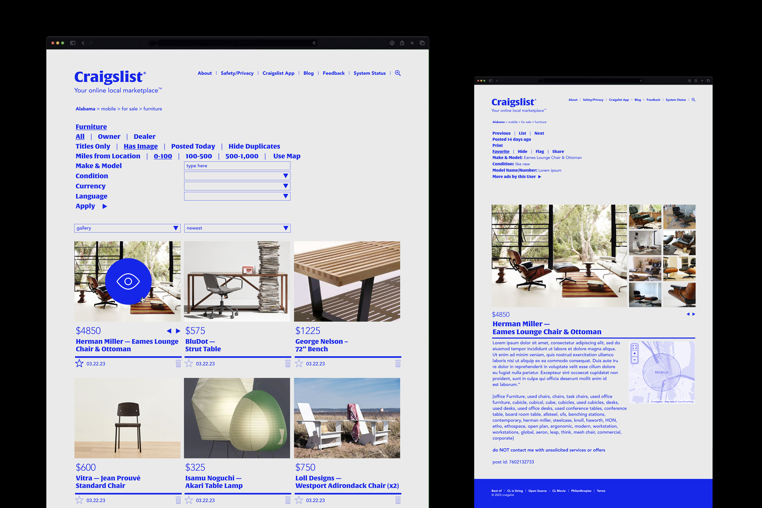
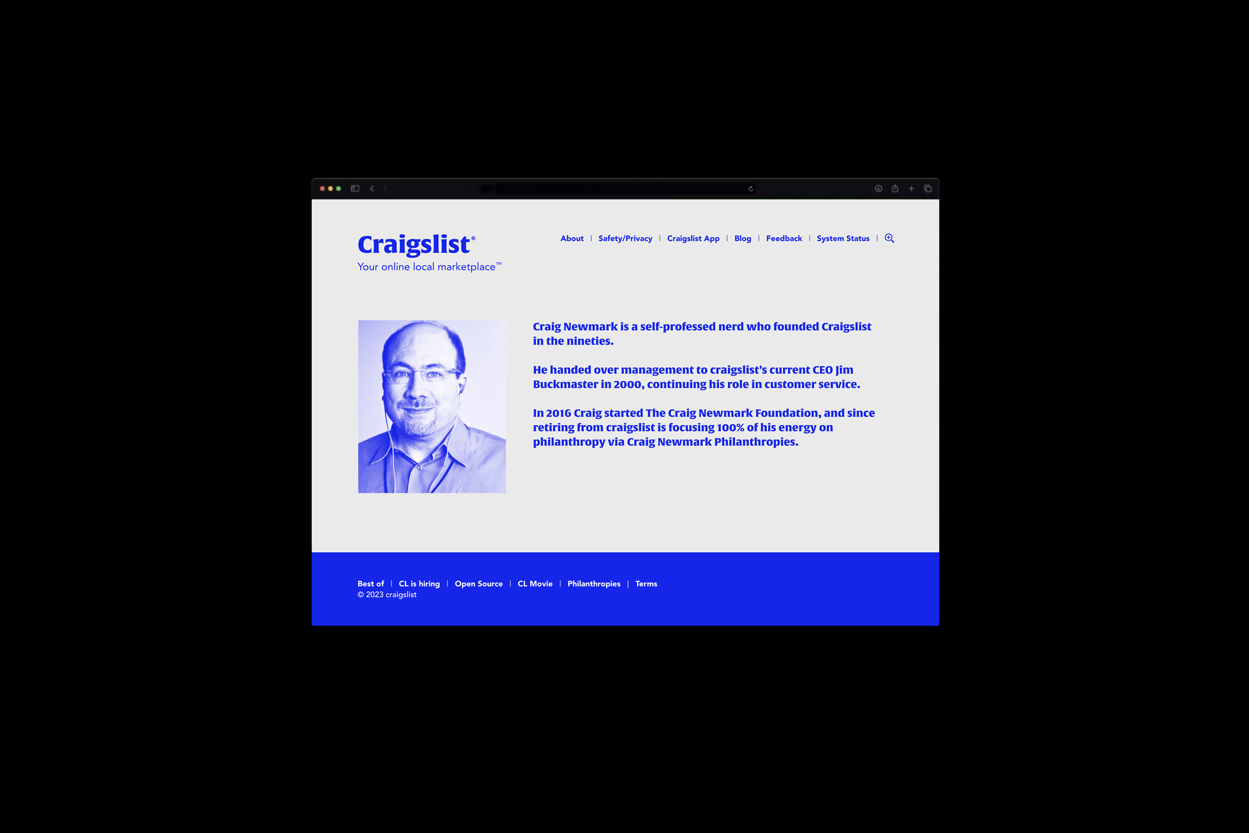
I've always liked Craigslist (still do) and thought for years they could just use a little "nudge" with their brand presence (without reinventing the whole wheel). So for fun I thought I'd show you what I might propose to them (should they ever ask) in order to bring their site more into the present; with minimal overall hierarchical, and function changes. Just a little "volume turned-up" on what they already have. Oh, and an ad series to announce the update might also be fun. I know Craig left, but I'd still love for them to call me sometime. In the meanwhile, they still look like this unfortunately.
Self-Initiated
Boring
Project Overview
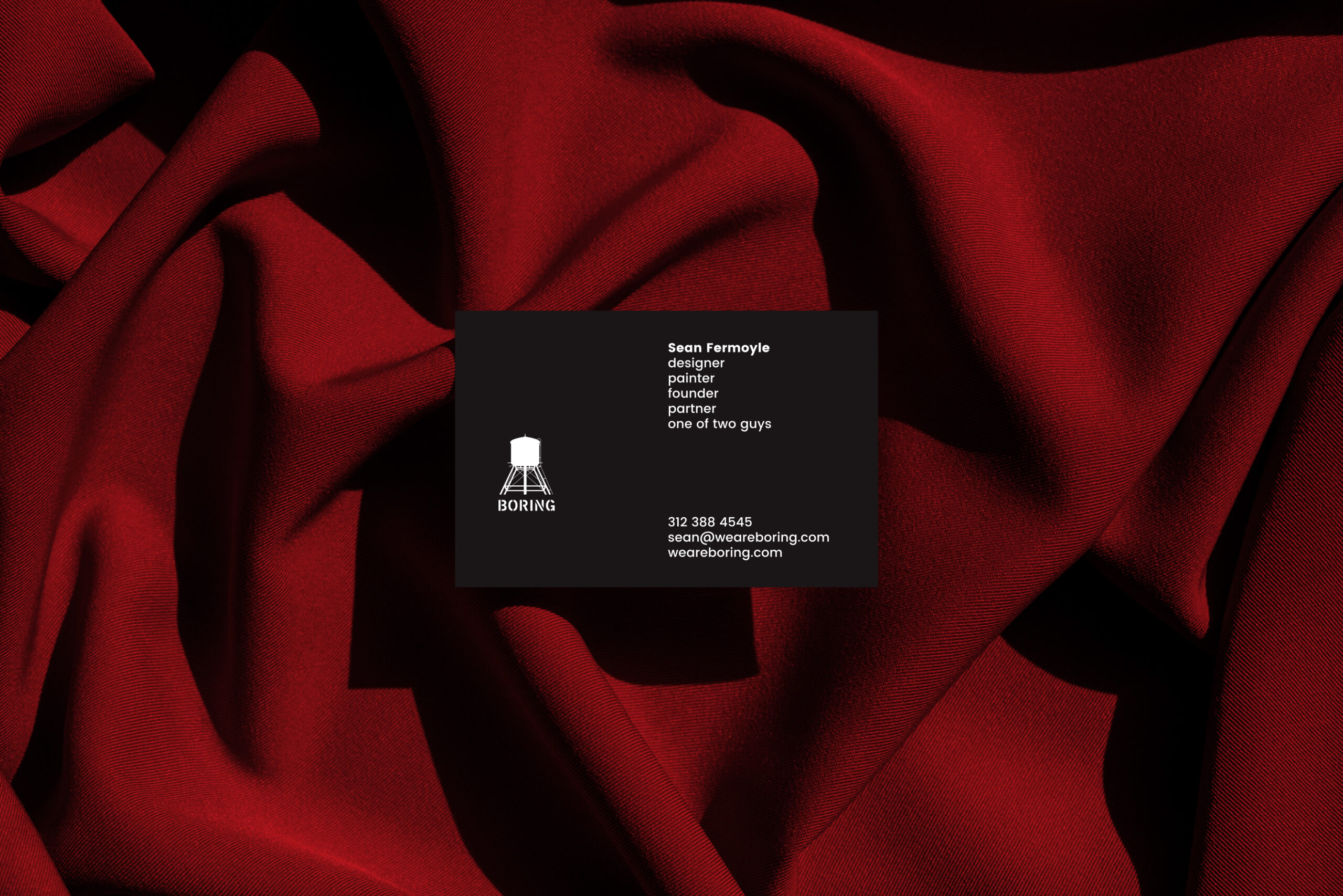
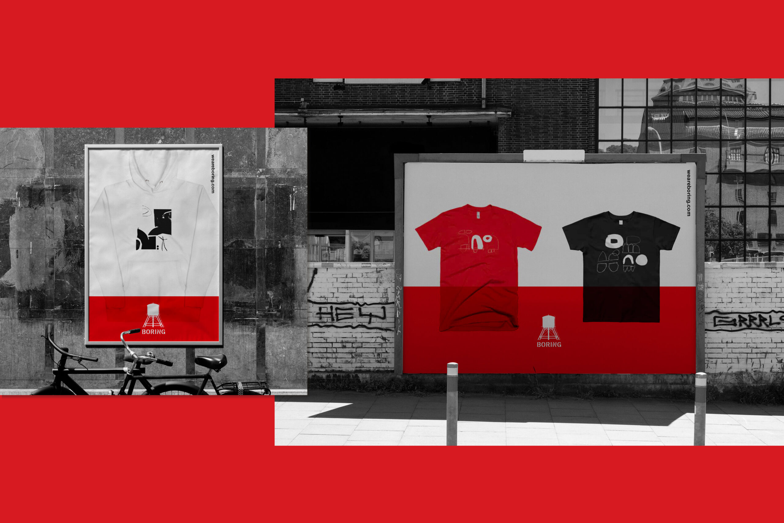
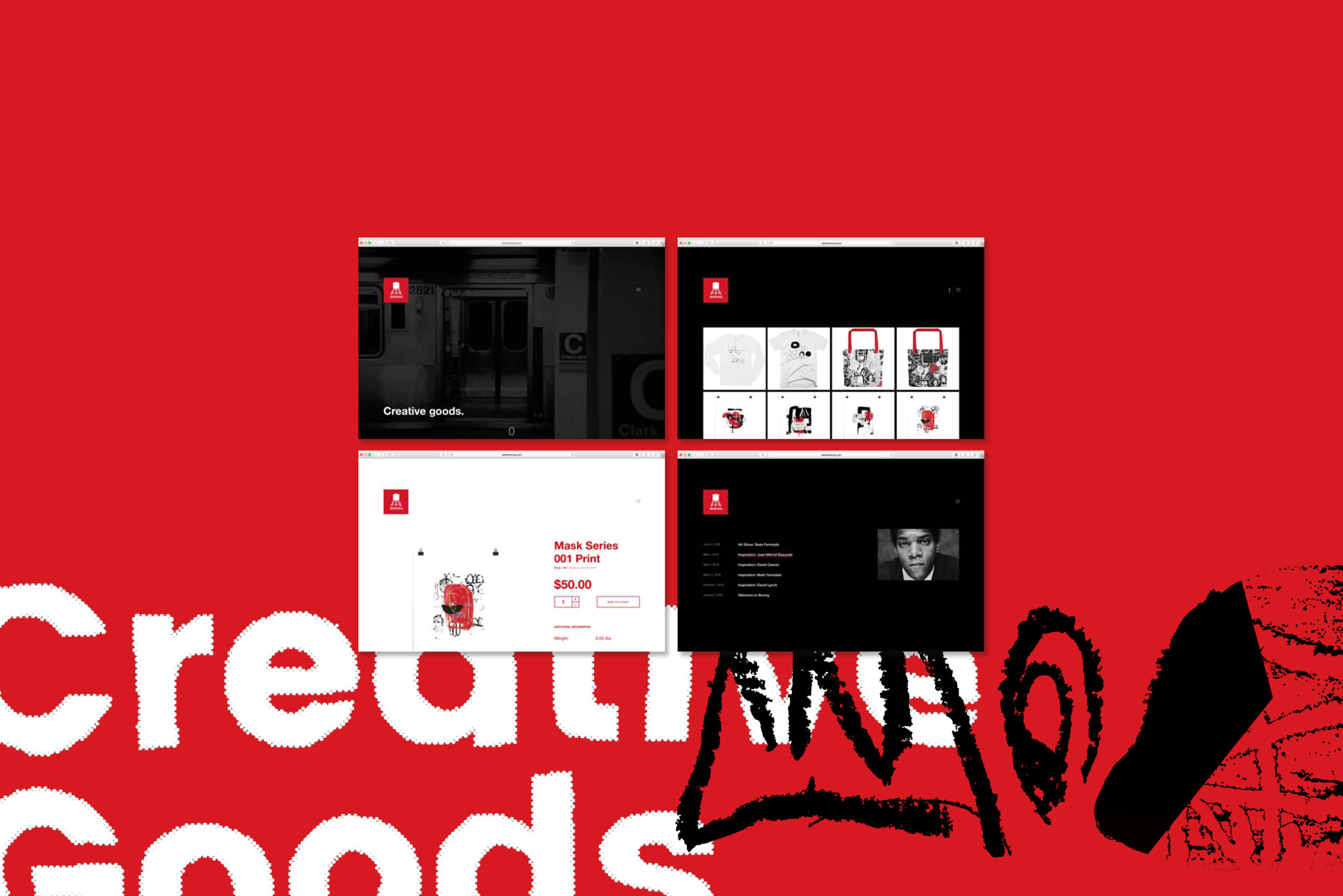
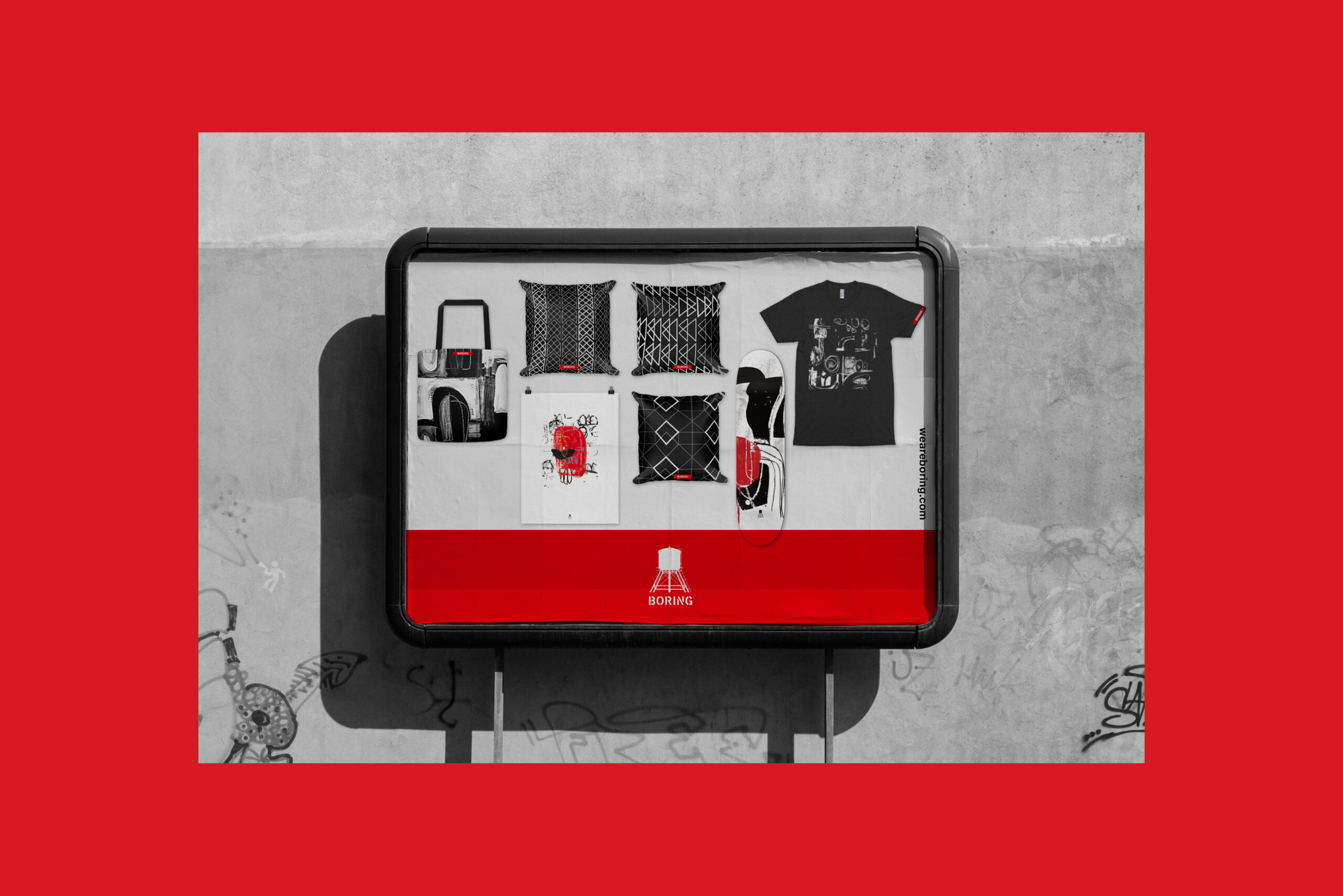
Boring was a creative goods company started by a buddy and me with an emphasis on original works (re: t shirts, art, home decor, skateboards, tote bags, etc). We developed and supported through our offerings; affordable, limited edition, one of a kind products that spoke to a demographic that knew and appreciated this concept. Once a product line of ours was sold out, it was never available again. I concepted the identity, color palette and imagery, built the web site, and set-up the ecommerce integration with a print-on-demand partner. Unfortunately we had to shut it down. However, what I learned about running a "side" business was priceless.
Organization
Typeforce
Project Overview
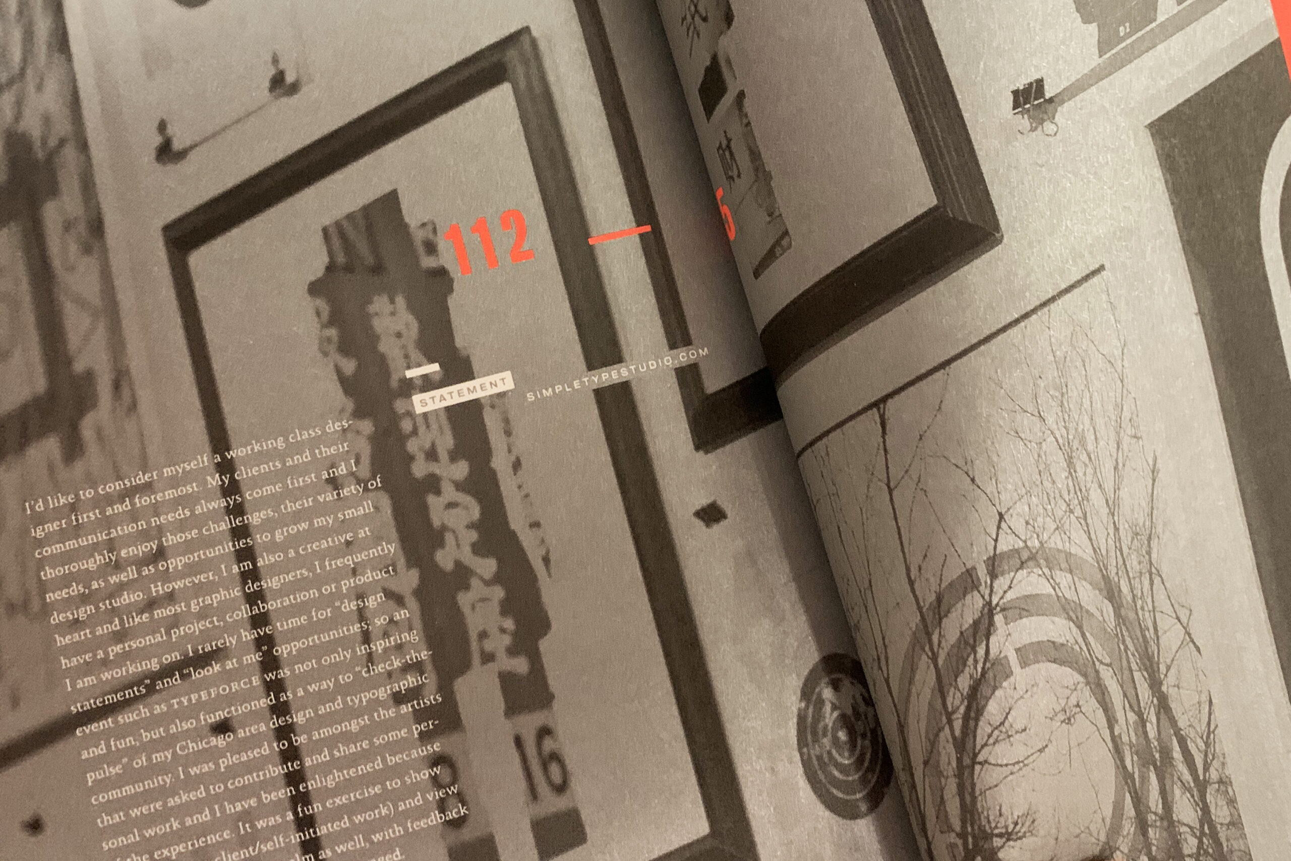
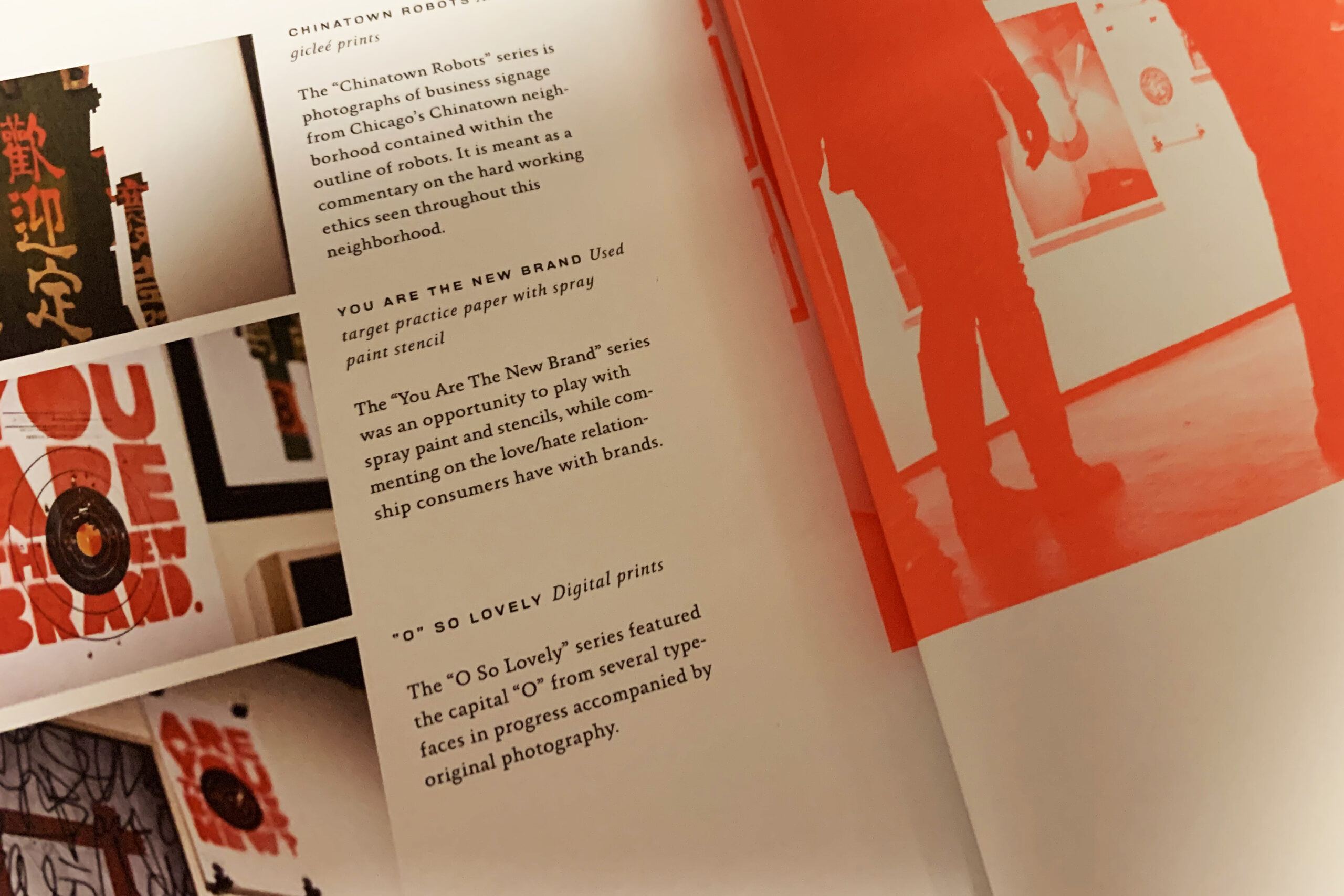
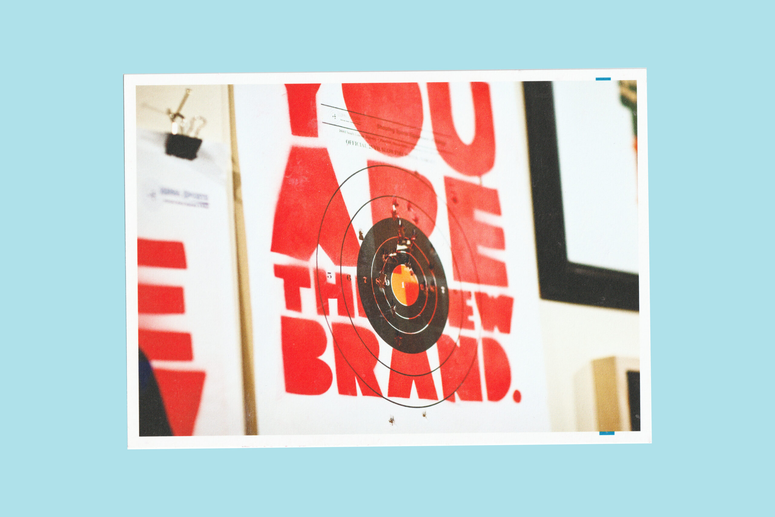
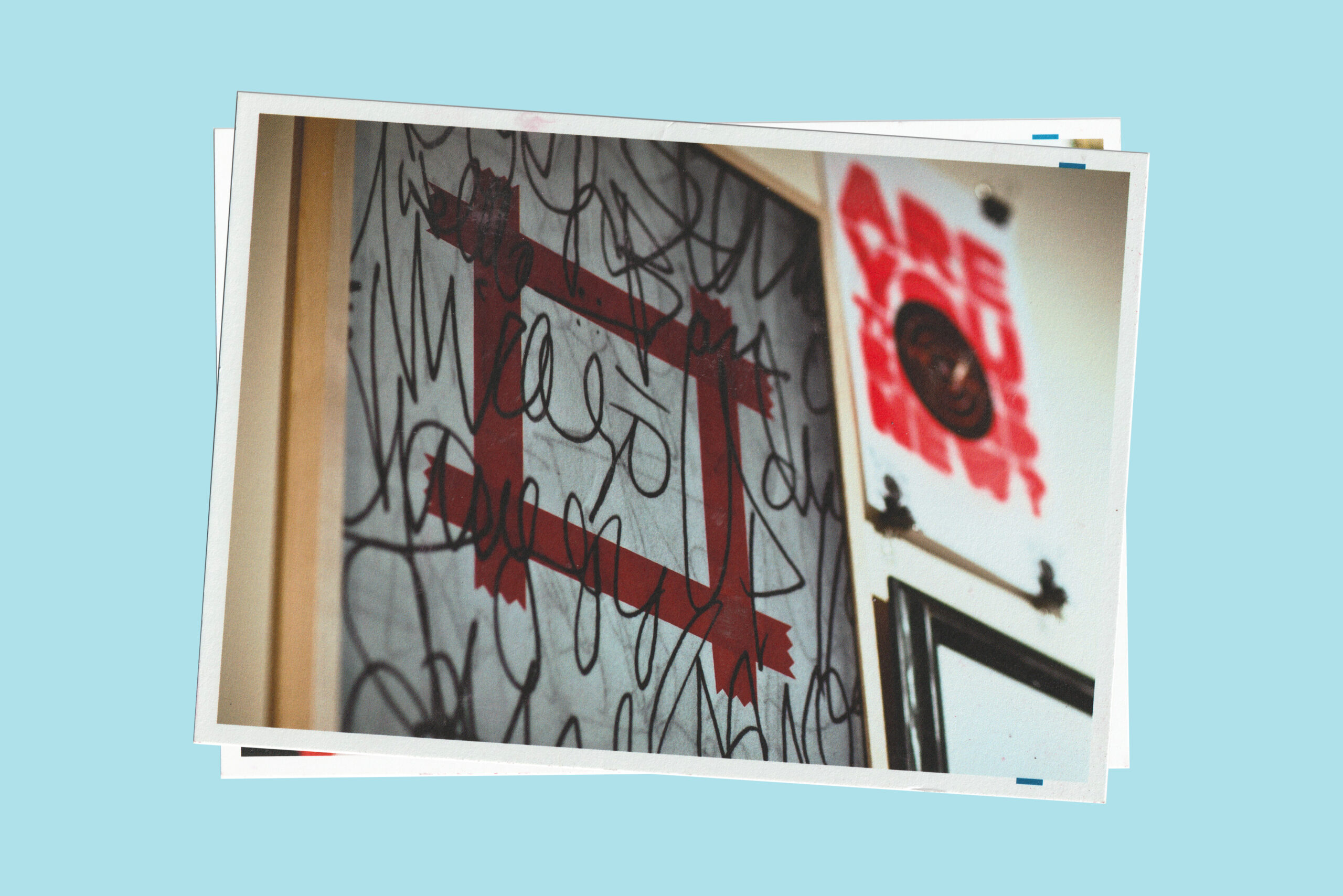
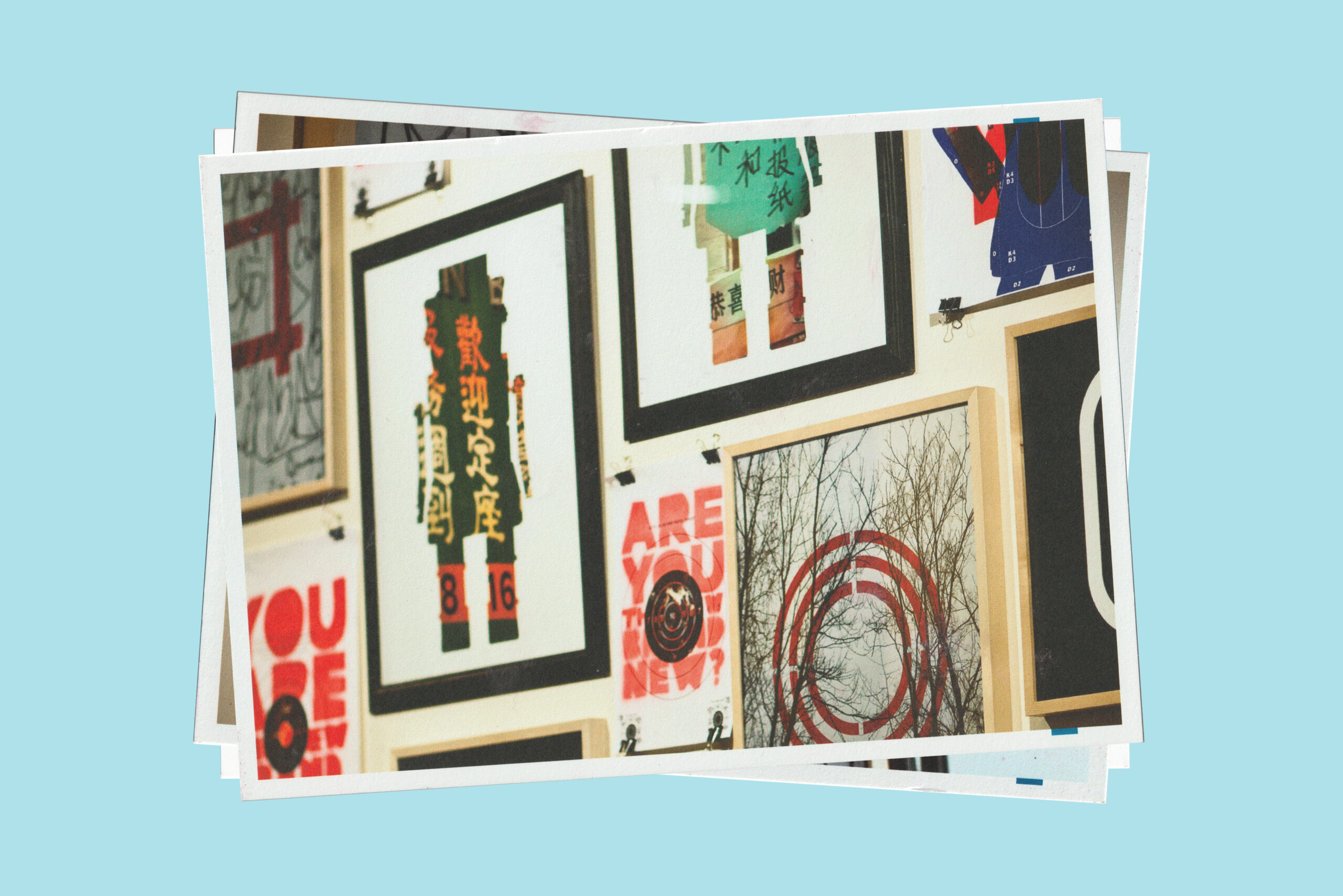
Every year since 2010 — "Typeforce: The Annual Show of Emerging Typographic Allstars" has taken place in the Bridgeport neighborhood of Chicago. I was lucky enough to be a part of their second event, and able to showcase some of my more conceptual, minimal, and experimental typographic artistic endeavors. (Note: I presented this work under my design studio name: Simpletype). Above are a few images of my work from the event via their catalogue and promotional postcards. Note: all brochure and postcard designs are by Firebelly Design. Visit typeforce.com for more info.
Self-Initiated
Artworker
Project Overview
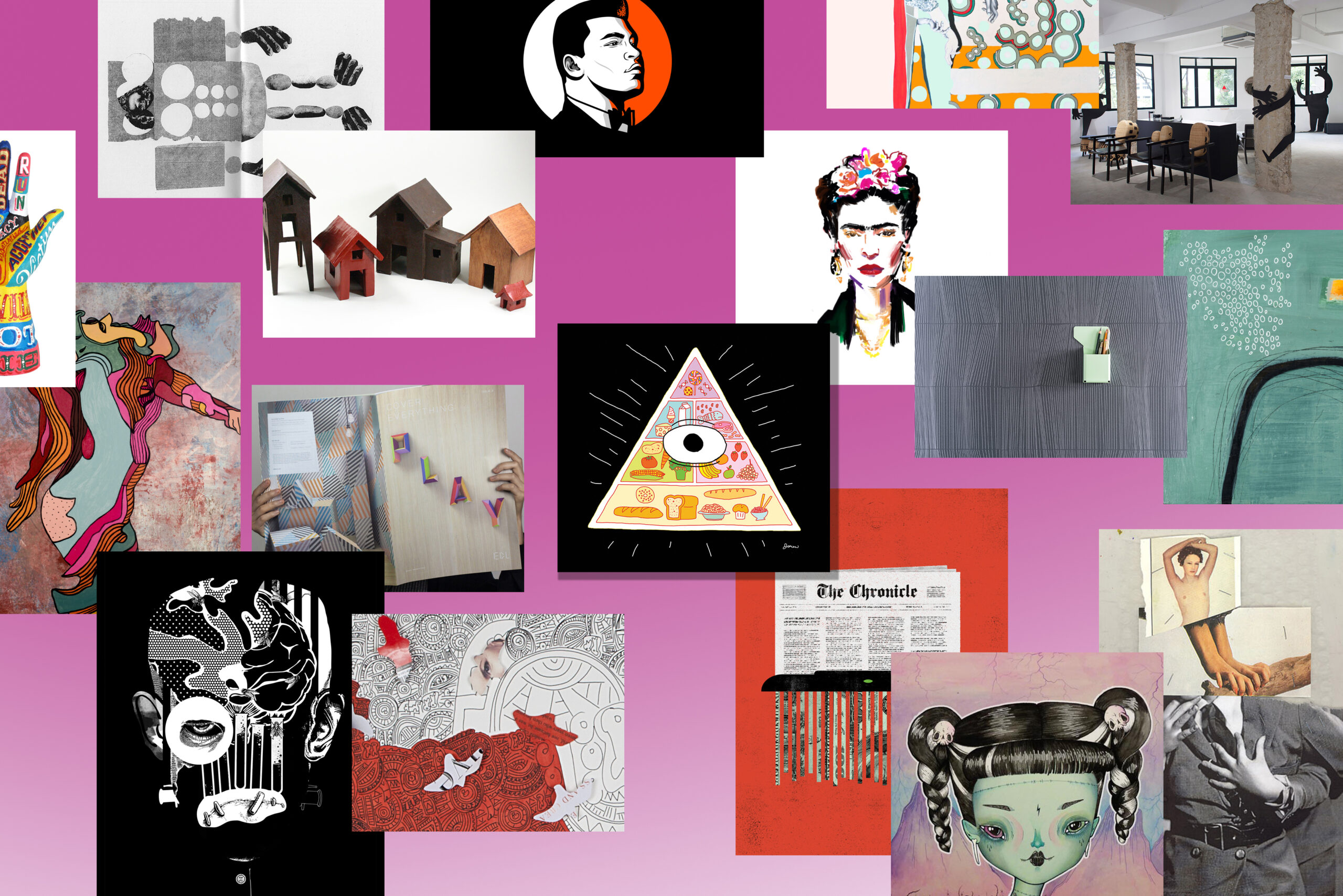
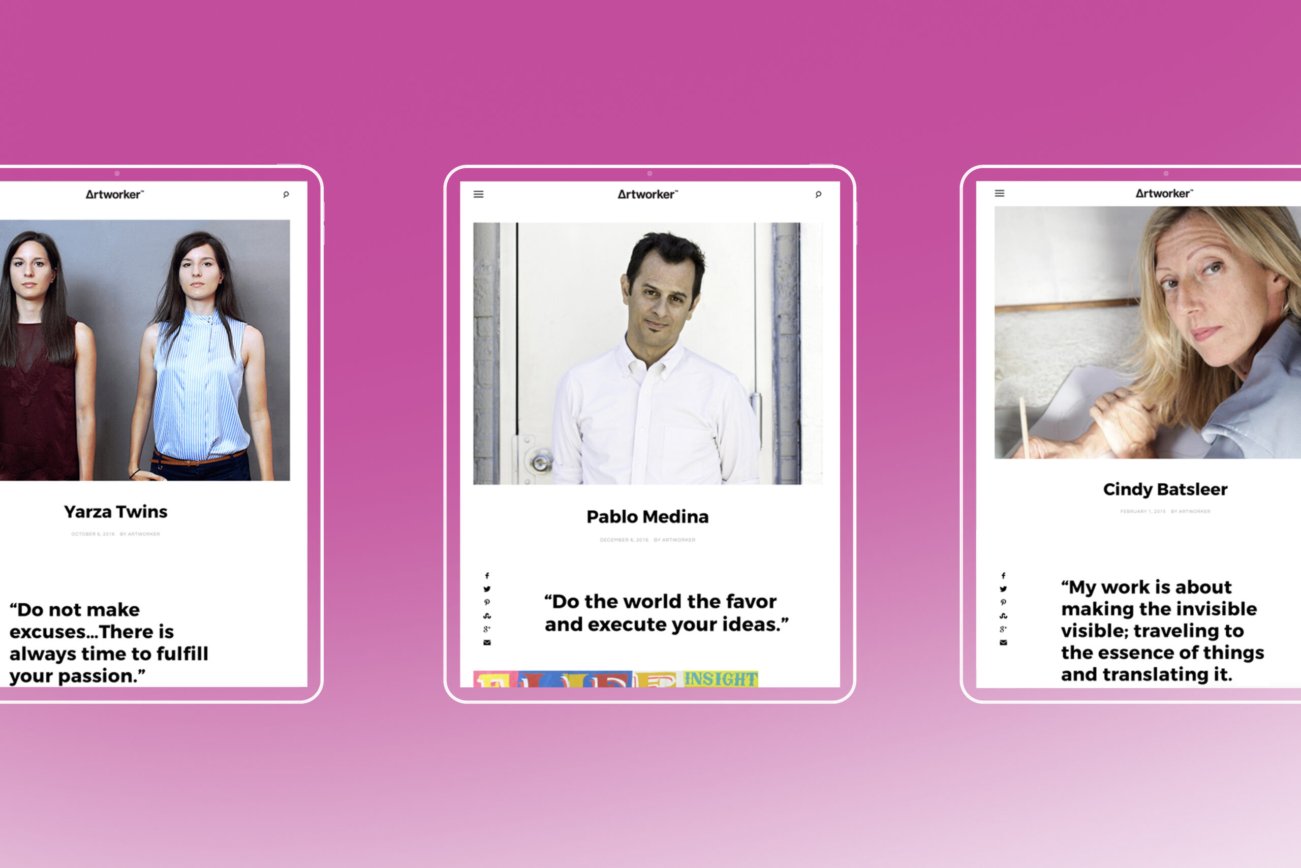
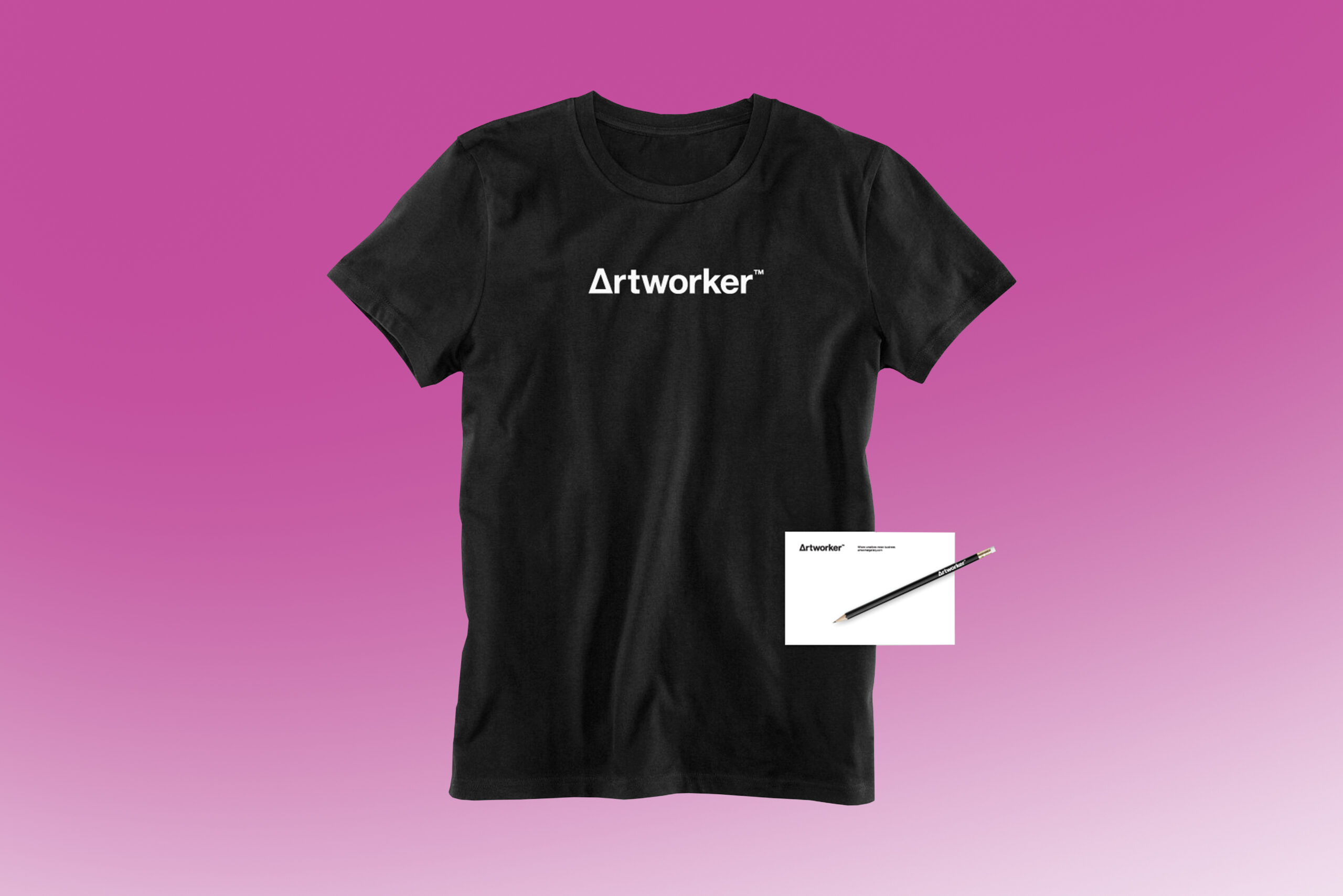
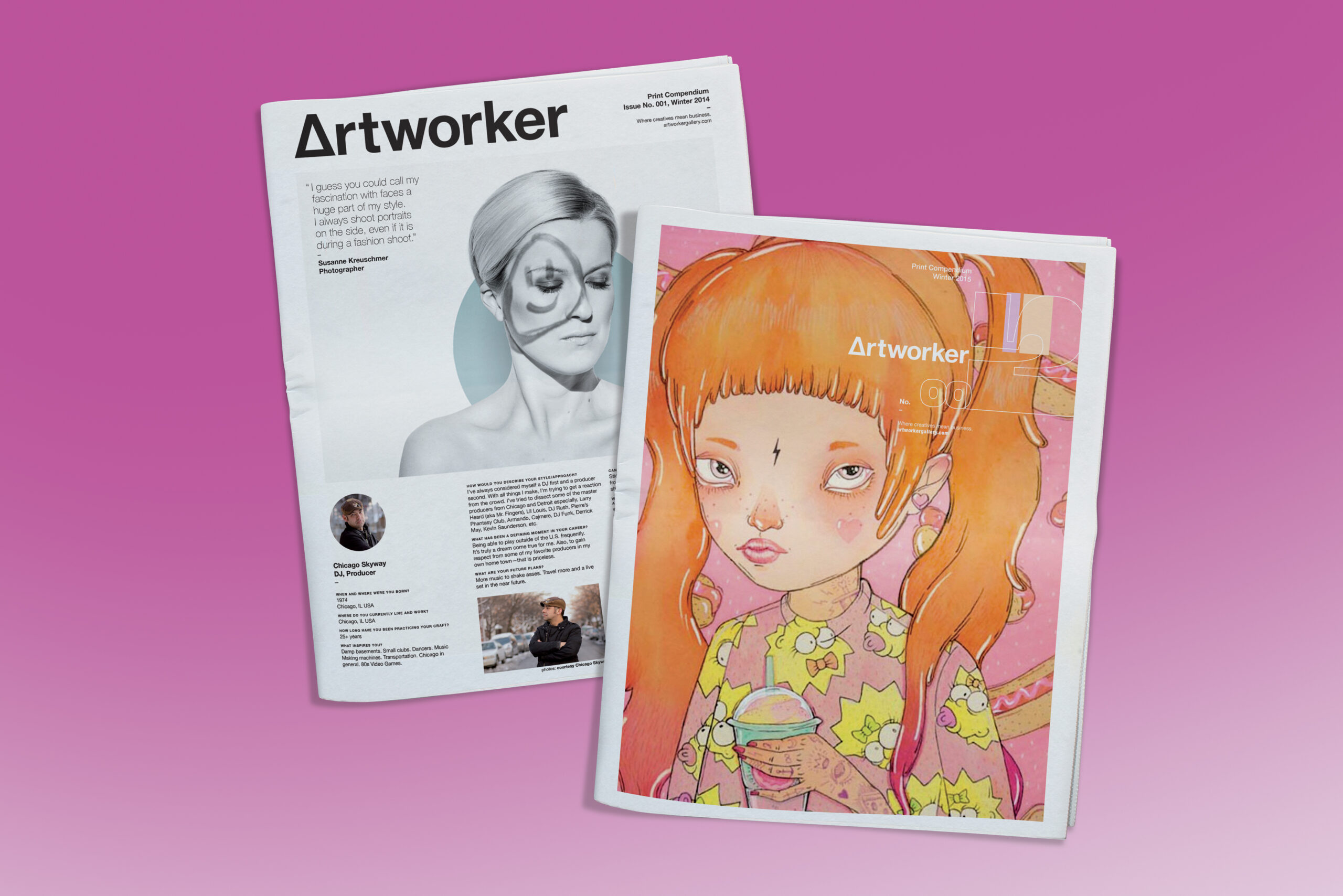
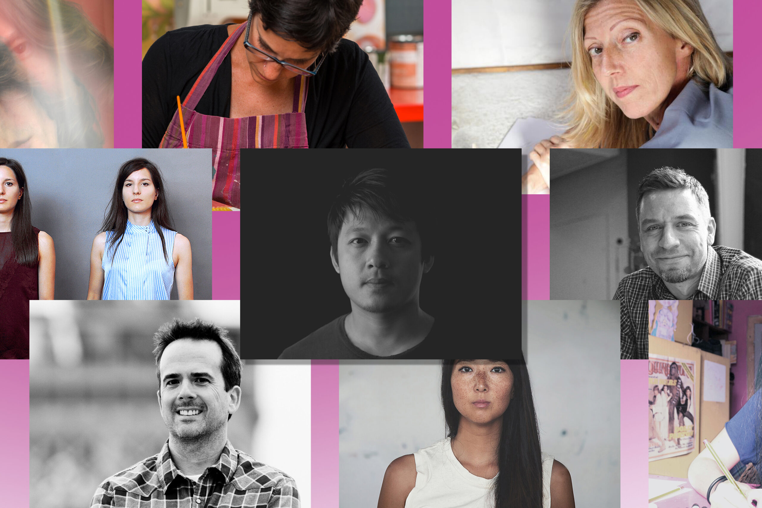
Formerly an online magazine created by me from 2014-2020, it featured a diverse group of talented people who are serious about what they create. It was a resource of passion and inspiration for everyone who creates art and wishes to make it their livelihood. I developed the brand from the ground up which included: naming, identity system, branding, and the online presence. In addition, I also produced promotional items such as pencils, flyers, buttons, and t-shirts. It was inspiring to reach out to, and get to know all of the artists that participated in this project. Shown here is just a small handful of these creatives, and an even smaller sampling of the amazing work they shared with me and our readers.
Self-Initiated
Open House
Project Overview
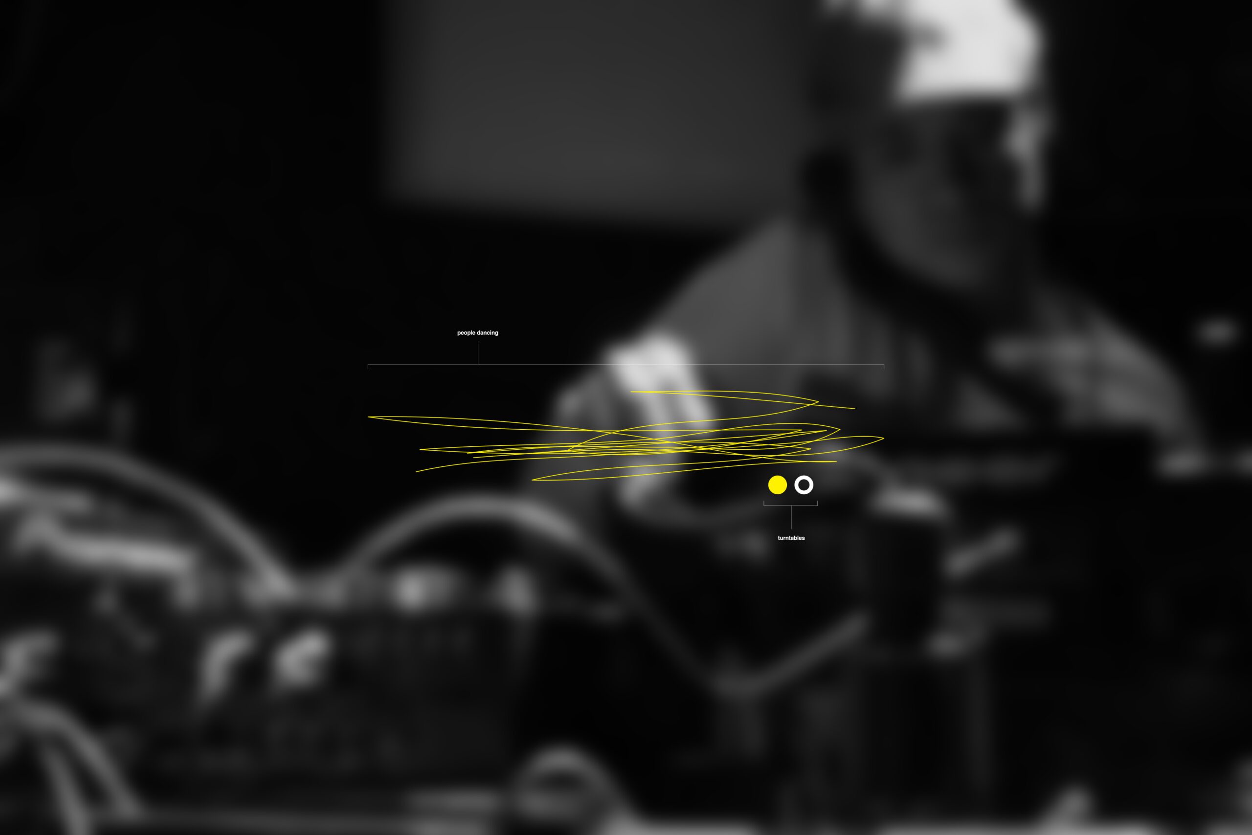
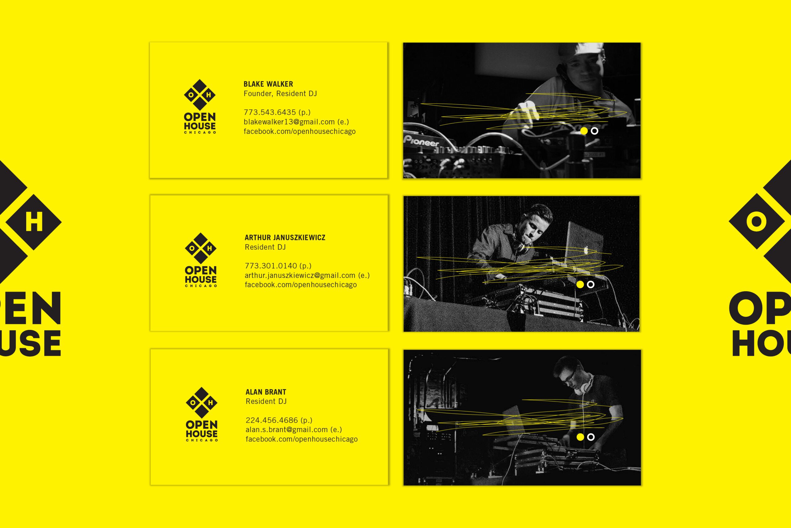
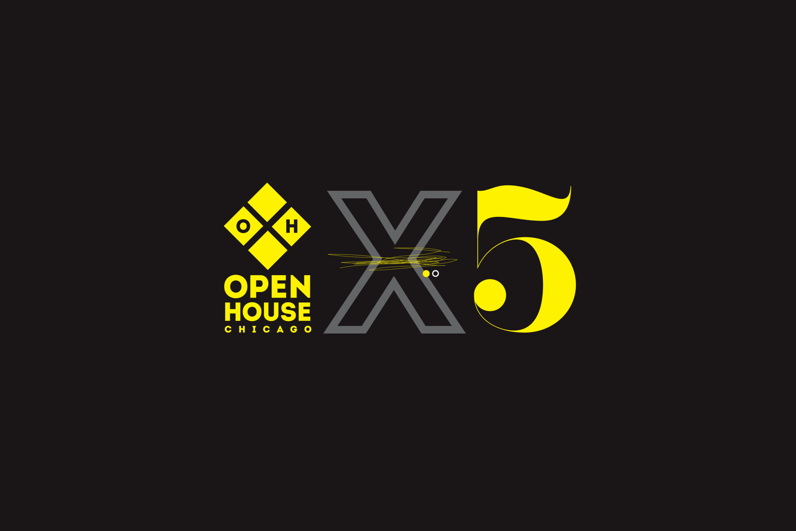
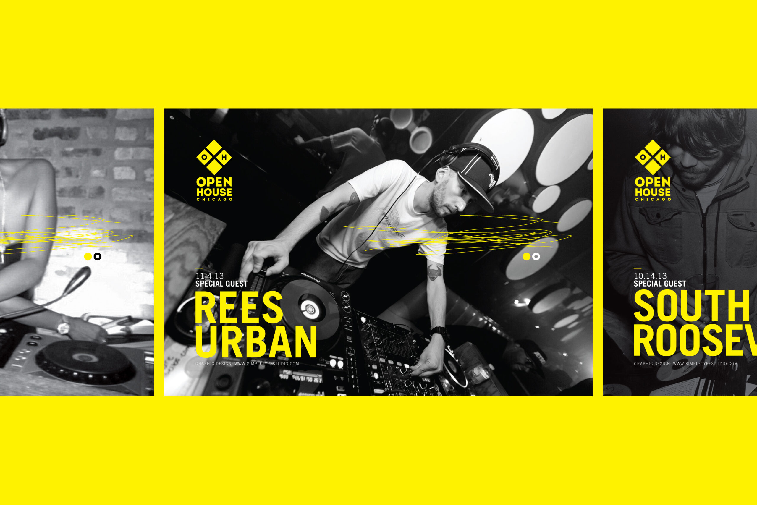
Formerly a weekly house music dj night in Chicago. The founding members of this event (which included myself) wanted to brand OH in order to differentiate ourselves from all the other weekly "club" nights in the city. We felt the identity should be first and foremost: legible, while the look and feel — unique and memorable. This strategy helped inform my branding efforts, and make us stand out. I designed the identity, provided image direction, flyer templates, and other promo items like; buttons, stickers, and video monitor graphics — acting as the Art Director and lead designer for all materials while this event was running. It came to an end shortly after 5 years, but was a blast while it lasted.
Organization
Various (re: logo samples)
Project Overview
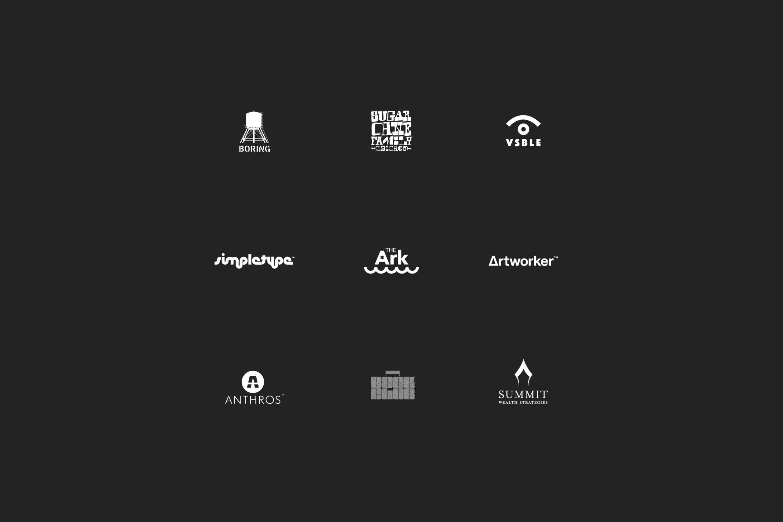
Every organization that I have assisted with their logo design I have learned something new. Whether it be about my client's company/industry, or their services and/or products. Or about how a typeface either works for a company identity or not. Here are a handful of logomarks I have created over the years both for clients and myself. I pride myself on not really having a style, and being able to let the personality of the company/project come through in different ways each time. The goal is always functionality first, style second, but always (and the hope is) — originality.