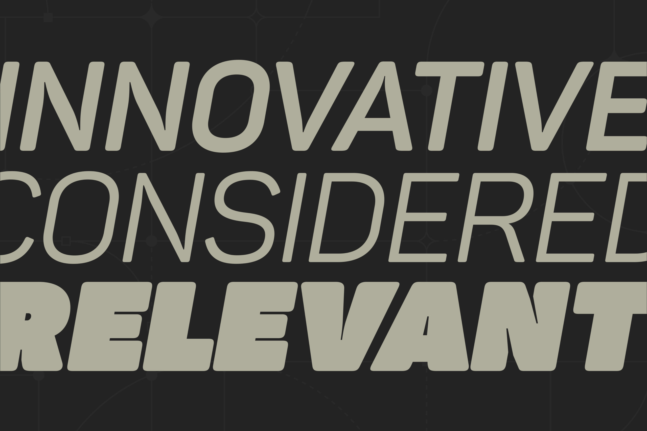
Portfolio.
Featured below are several select projects from my client portfolio. These are just a few examples of work I have done in-house, in freelance capacities on-site, and/or through my own freelance studio. If you'd like to discuss how I might assist you, and/or your organization with your next design project; please reach out. Note: you can click on each carousel to pause/advance at your own pace.
Client
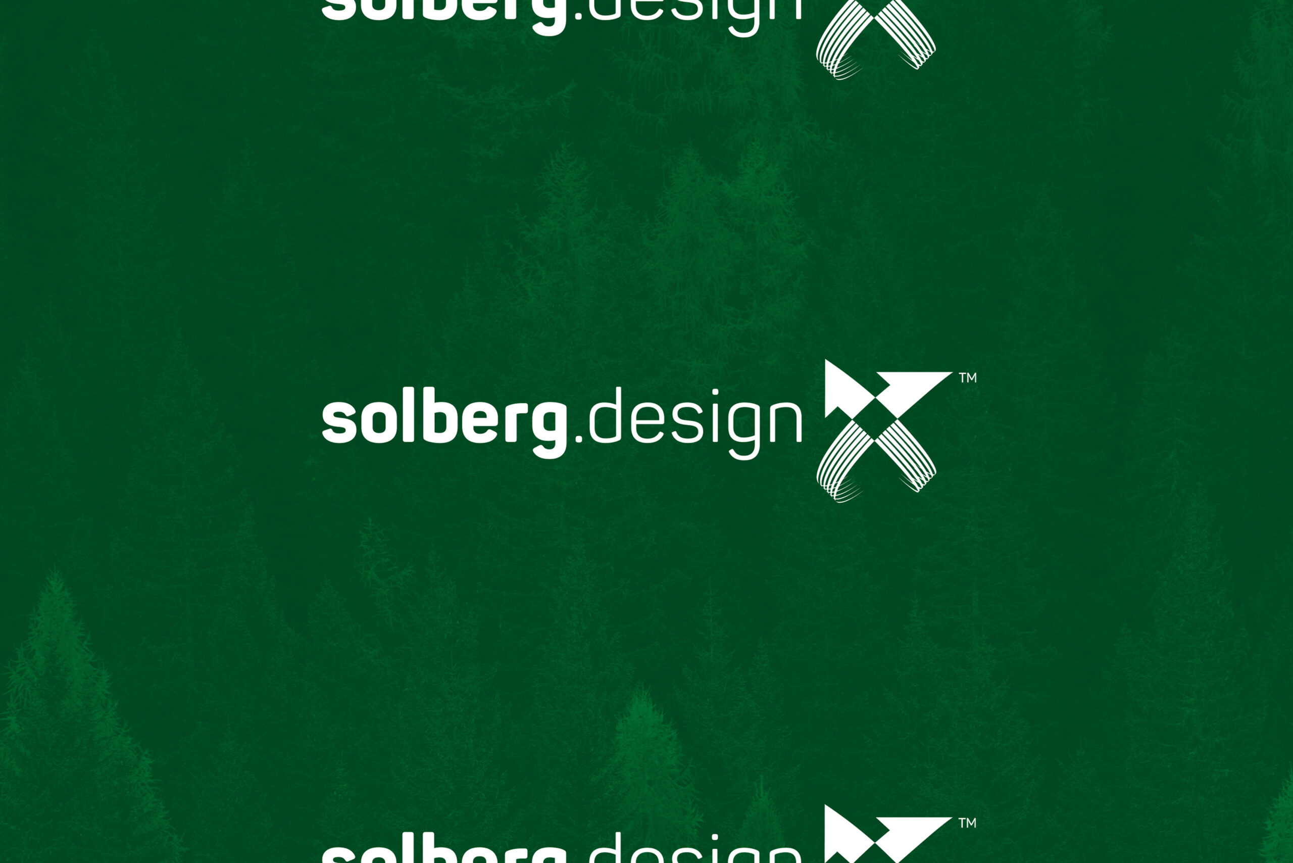
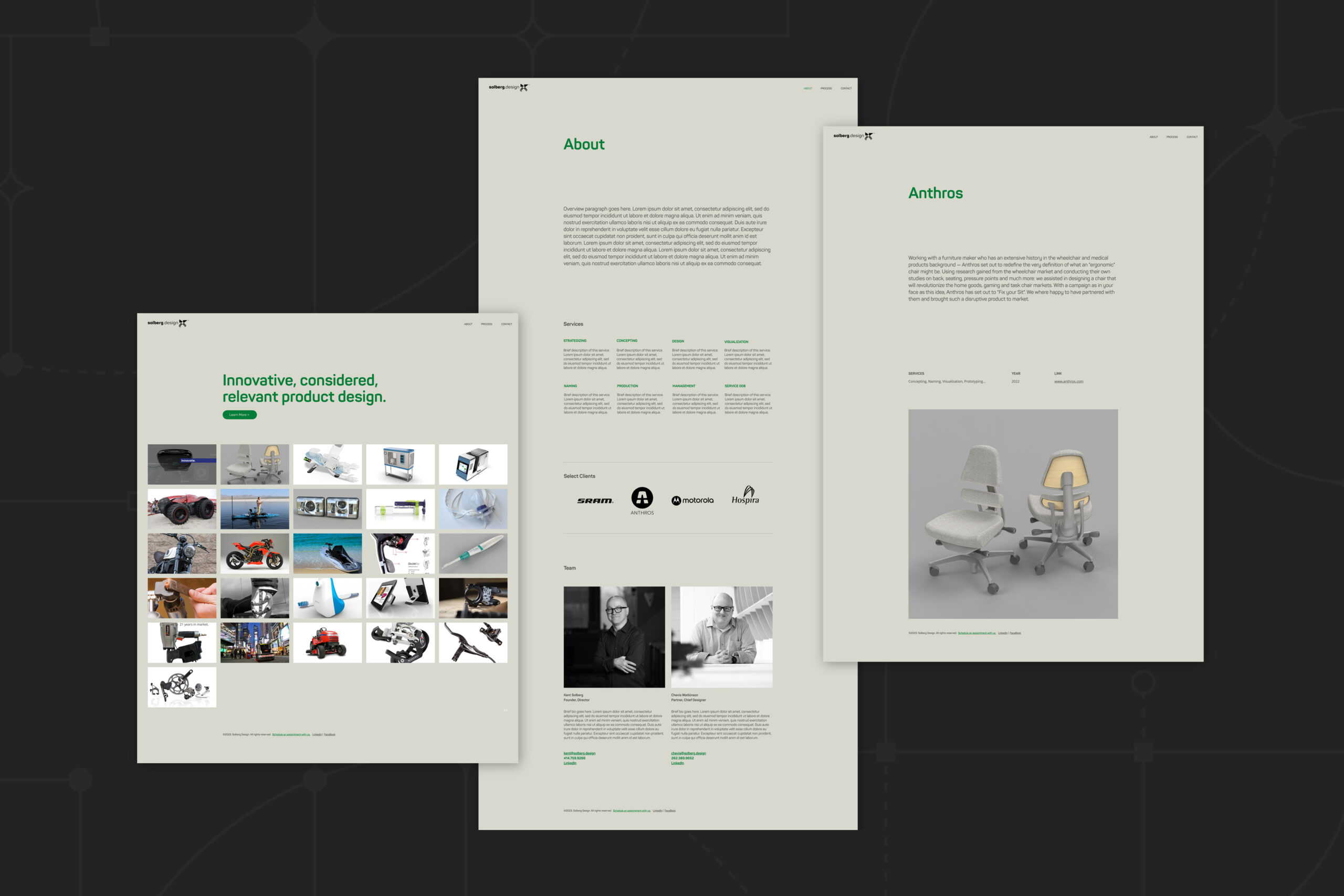
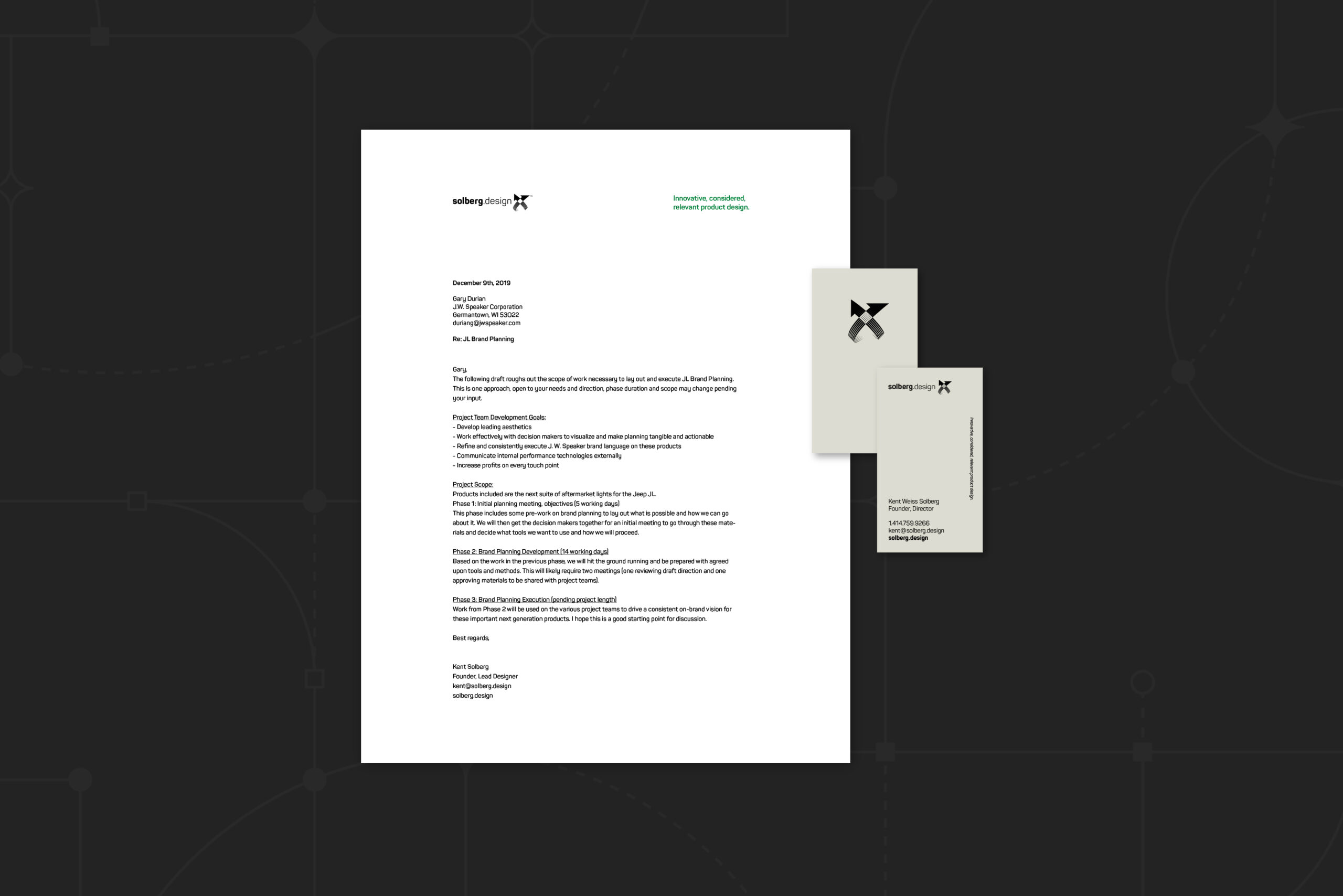
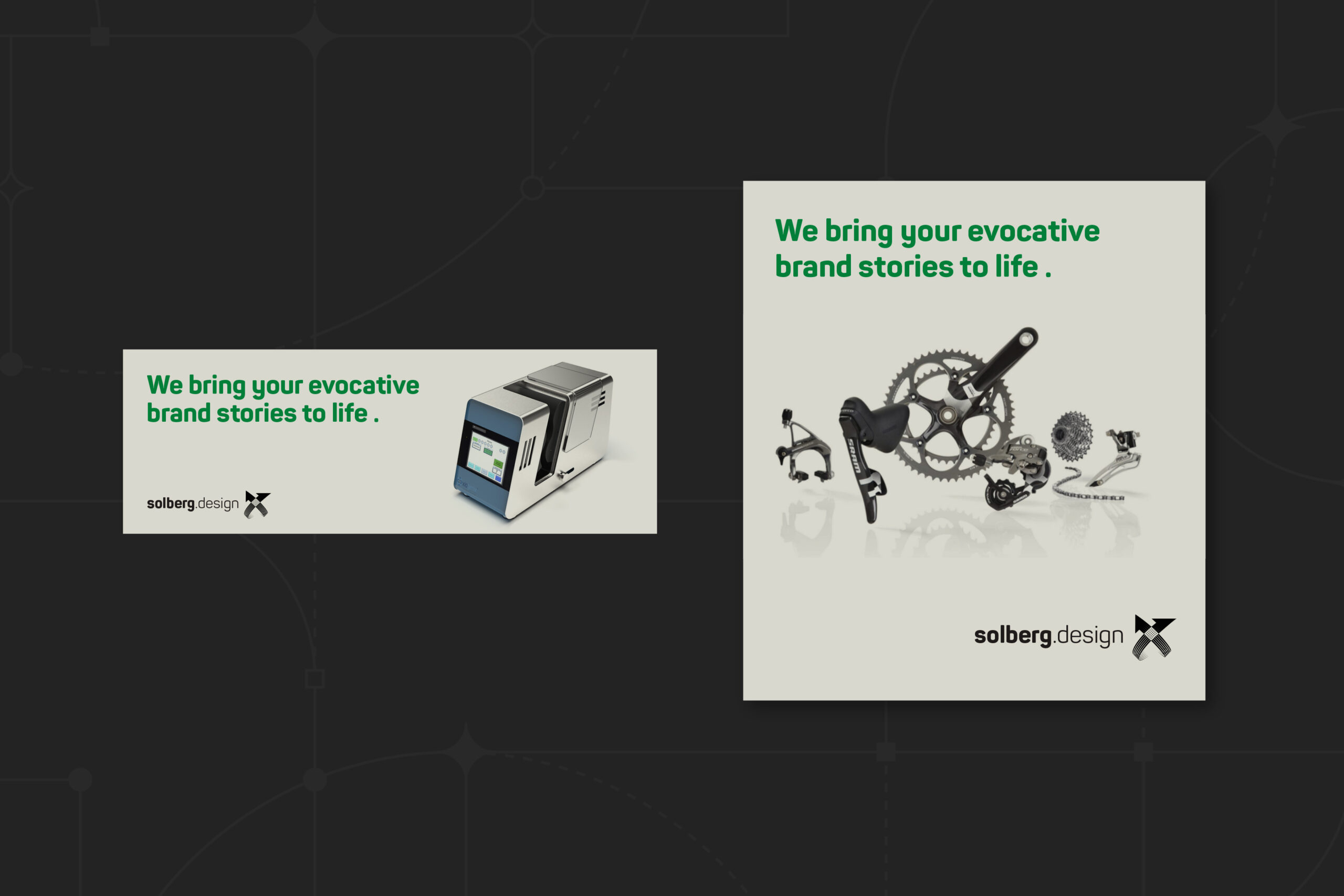
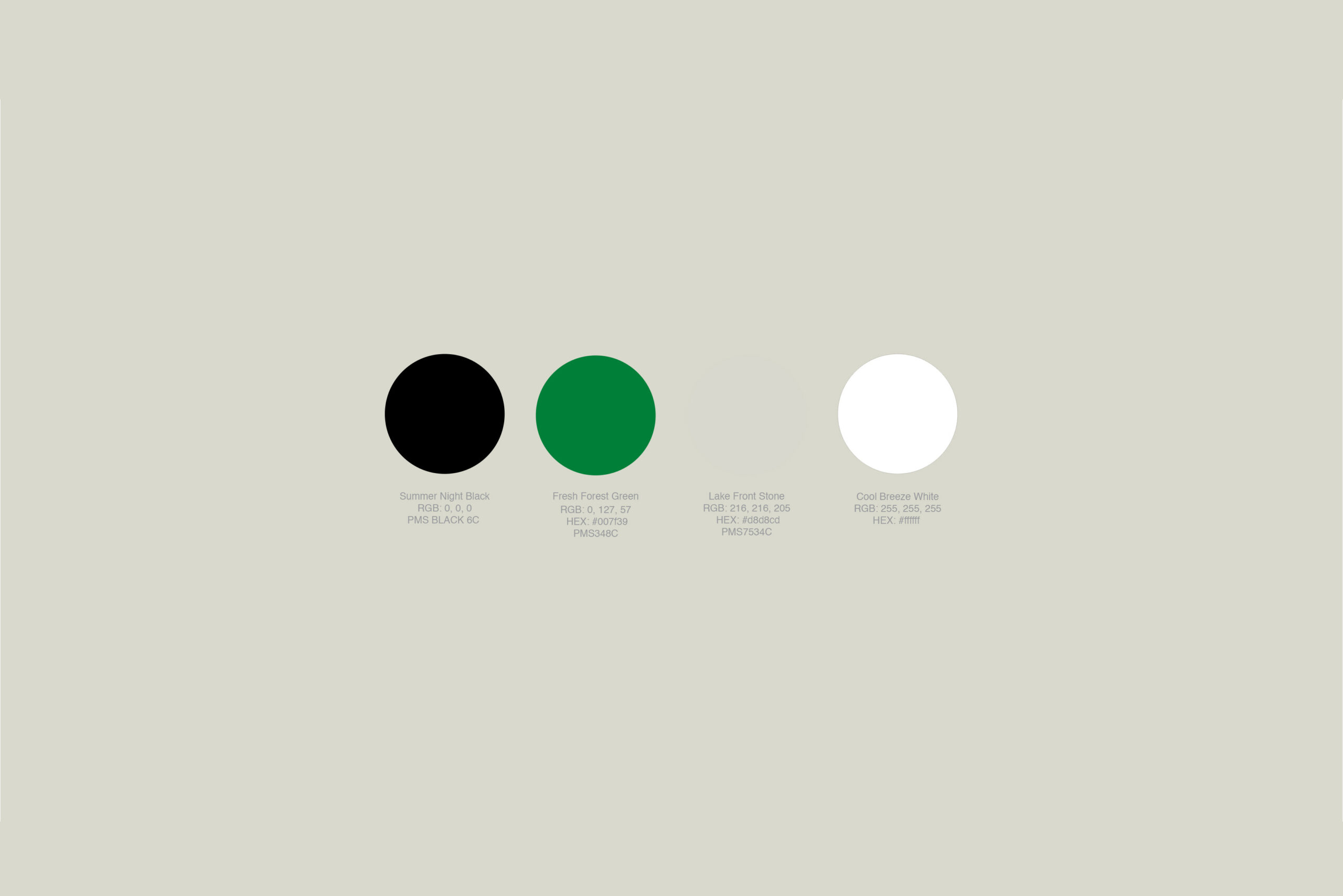
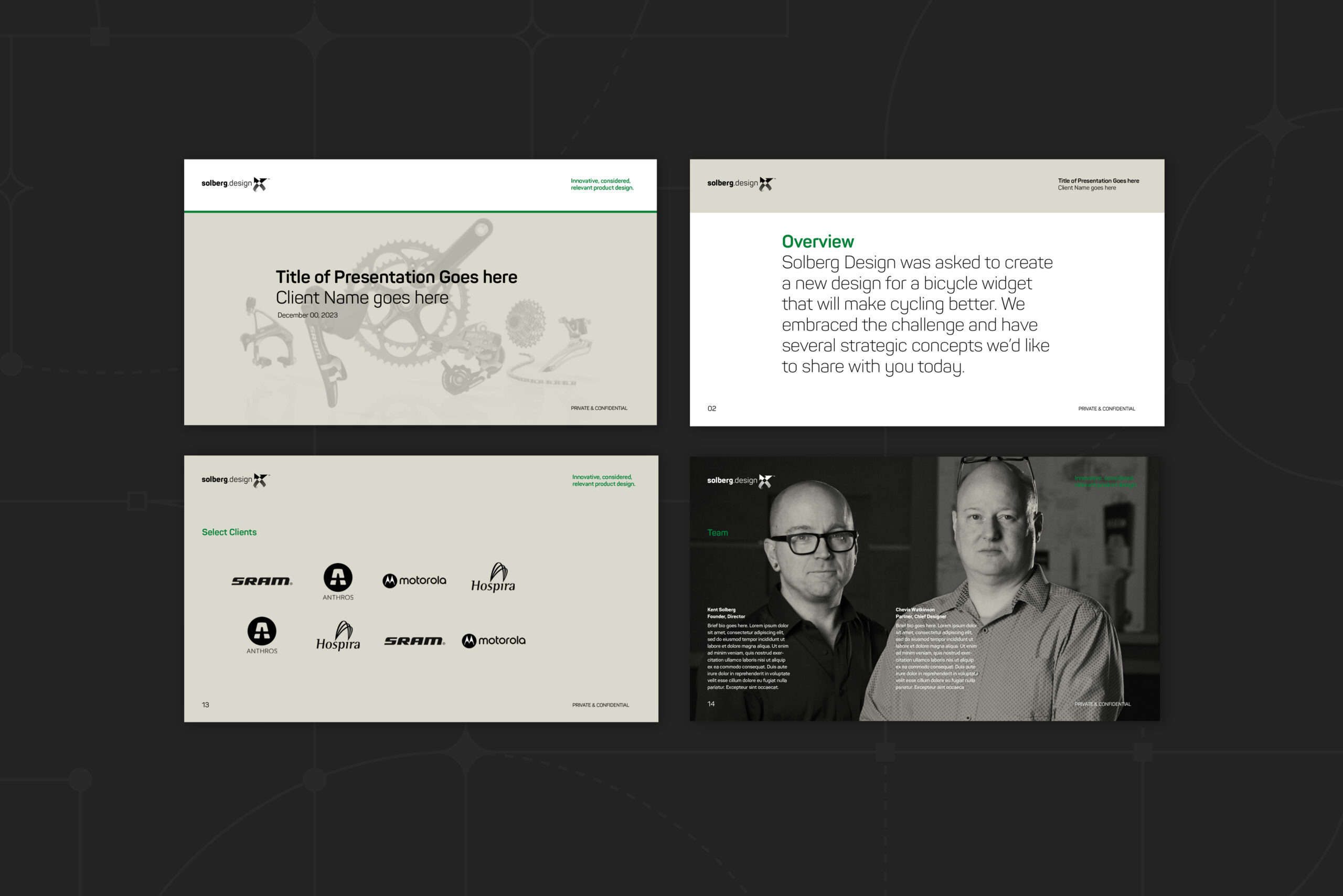
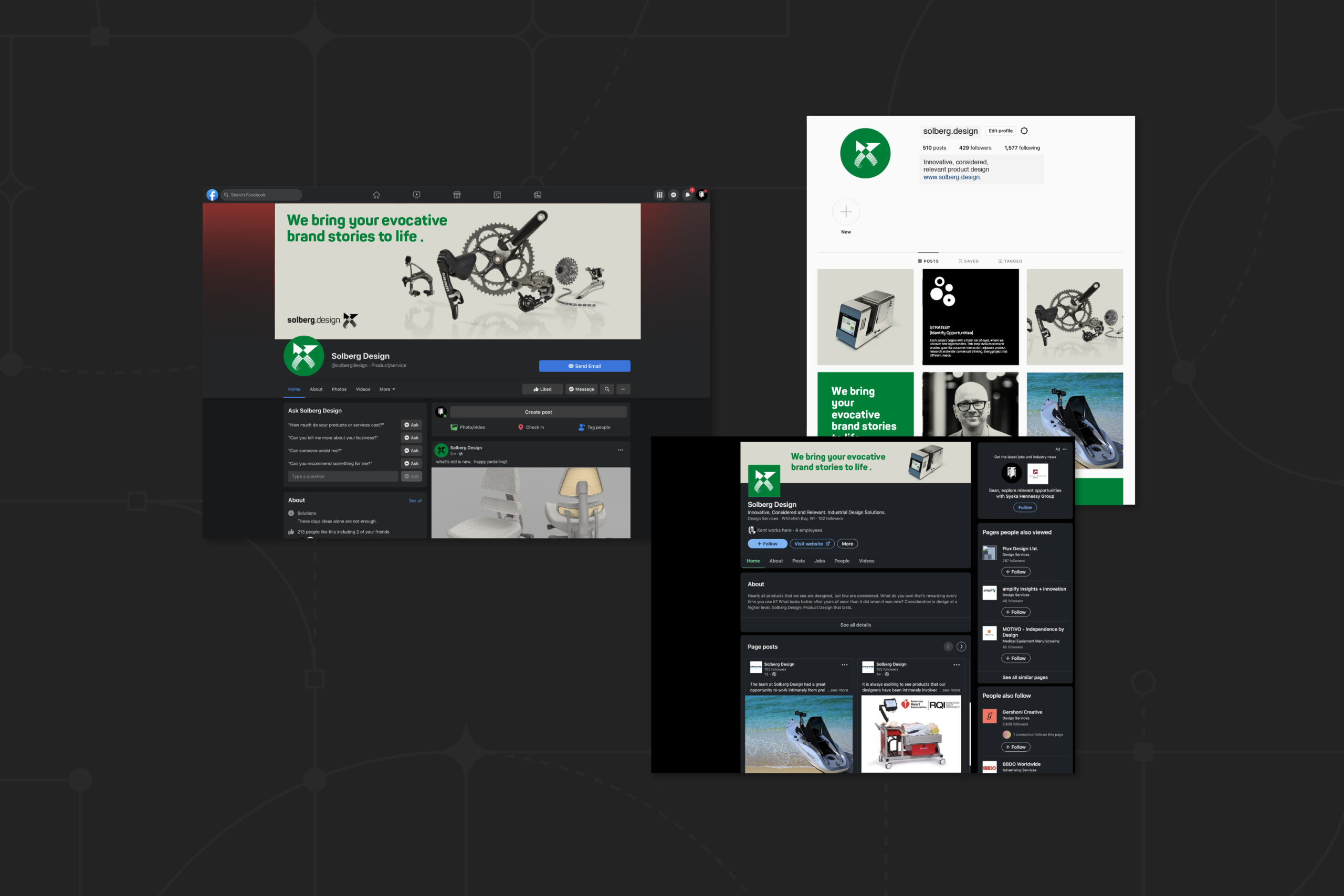
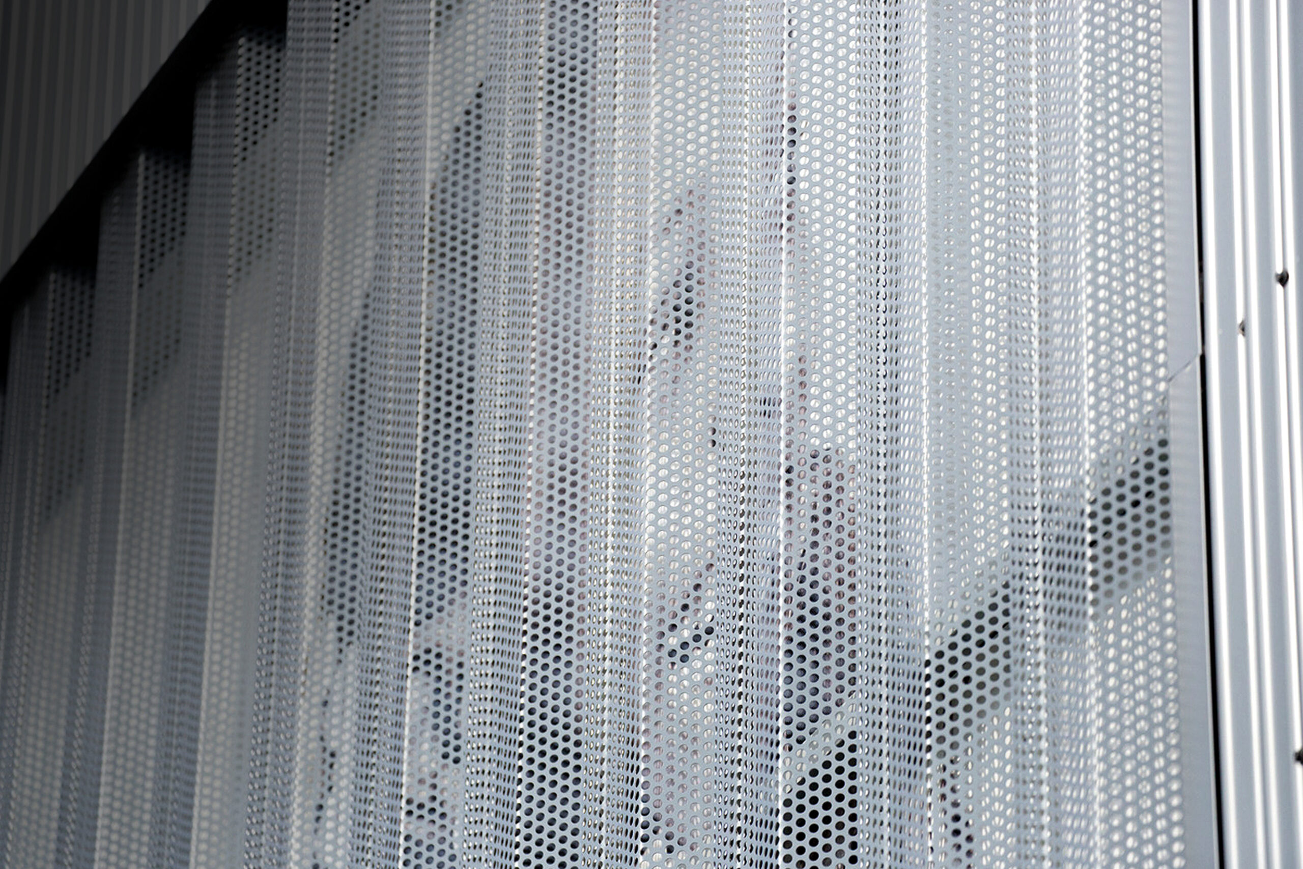
Solberg Design
Project Overview
Founder and Principal Kent Solberg reached out and asked if I could assist him with refreshing his visual identity — while adding to the overall palette of modular assets in his communications arsenal. This involved redrawing the existing logo and icon, fine tuning the core identity standards and colors, as well as designing templates for elemental business collateral pieces such as presentation templates, proposal and invoice forms, business cards, as well as giving a WIX™ website a little refreshed "skin". He and his team were happy, and so was I. Learn more here.
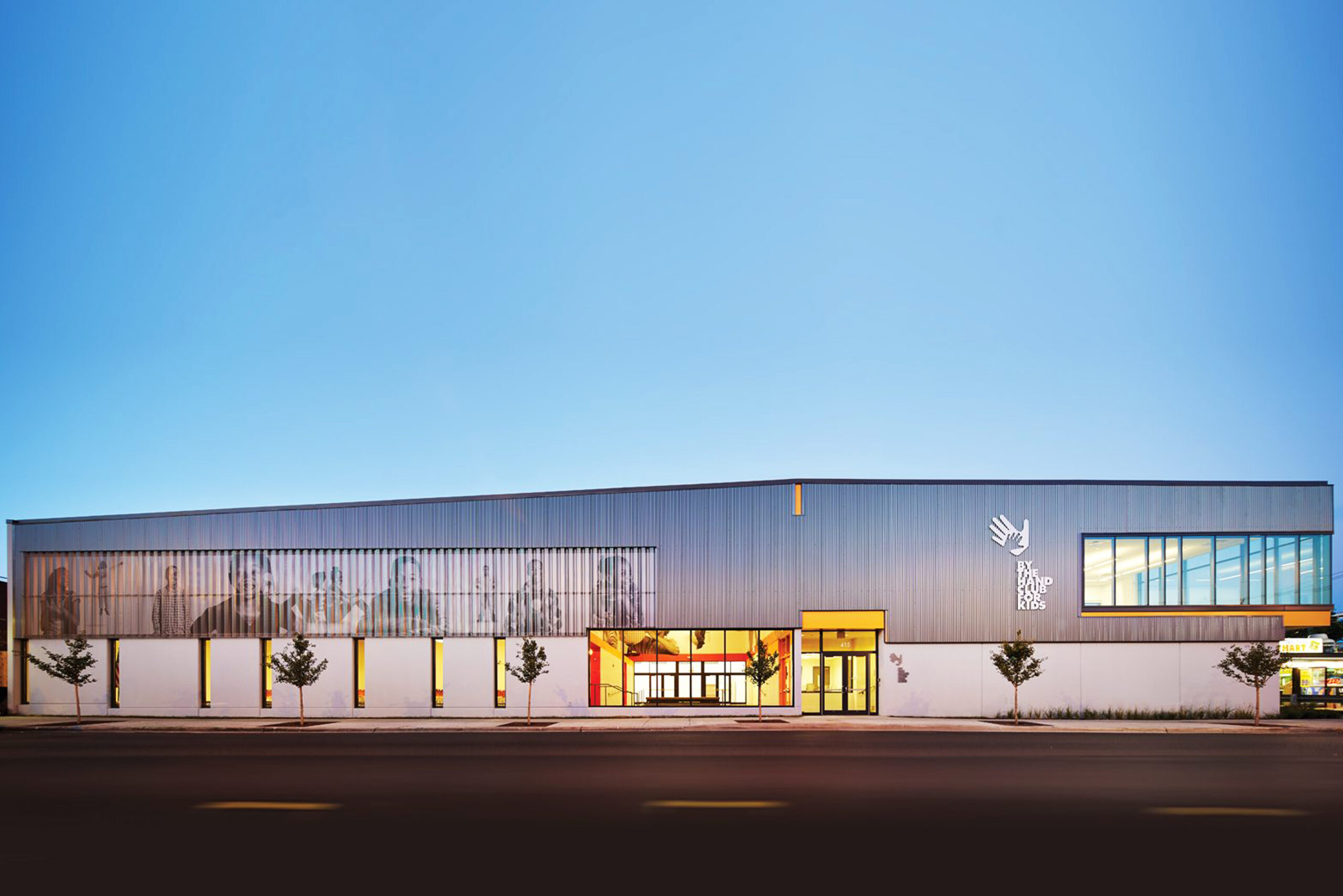
Client
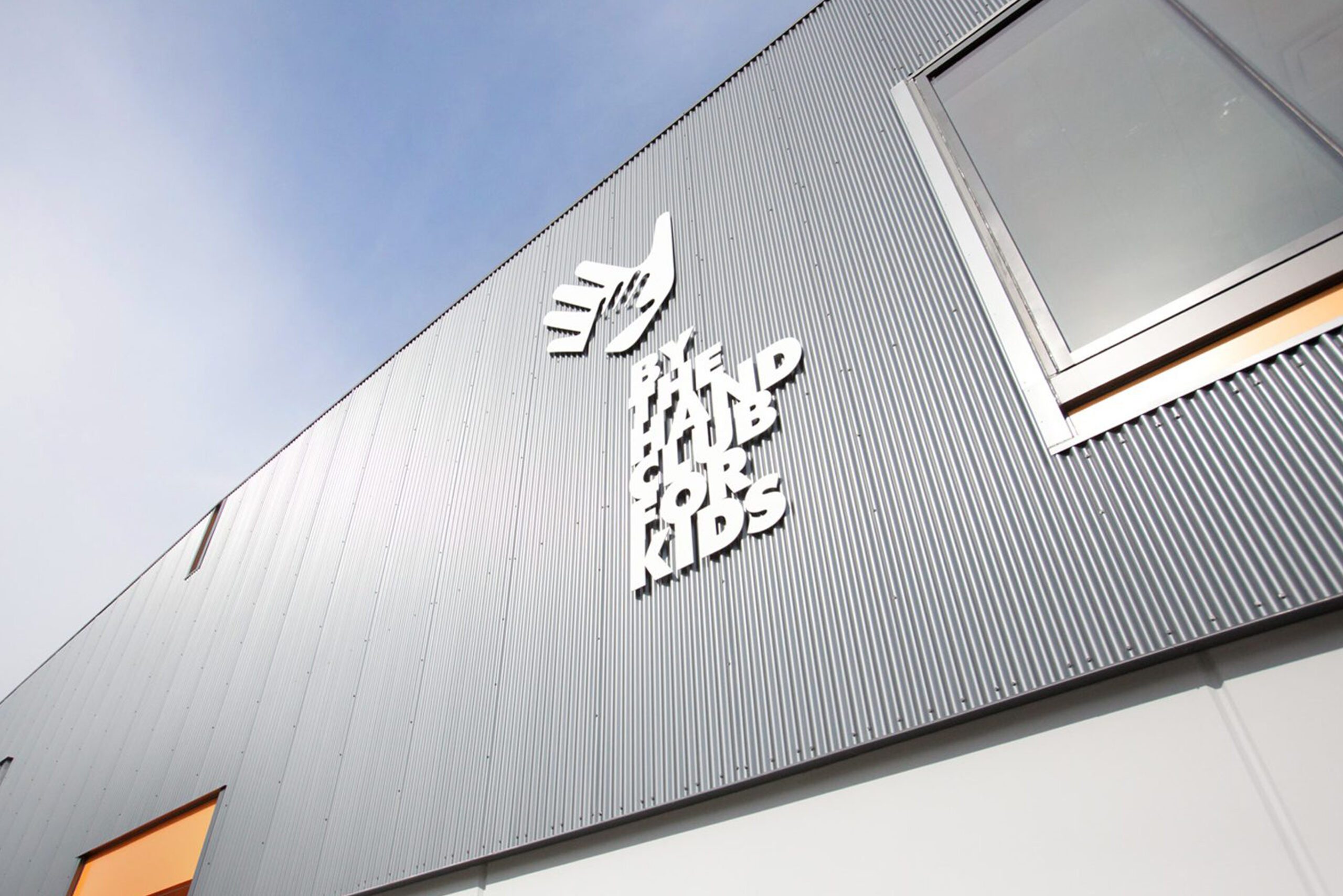
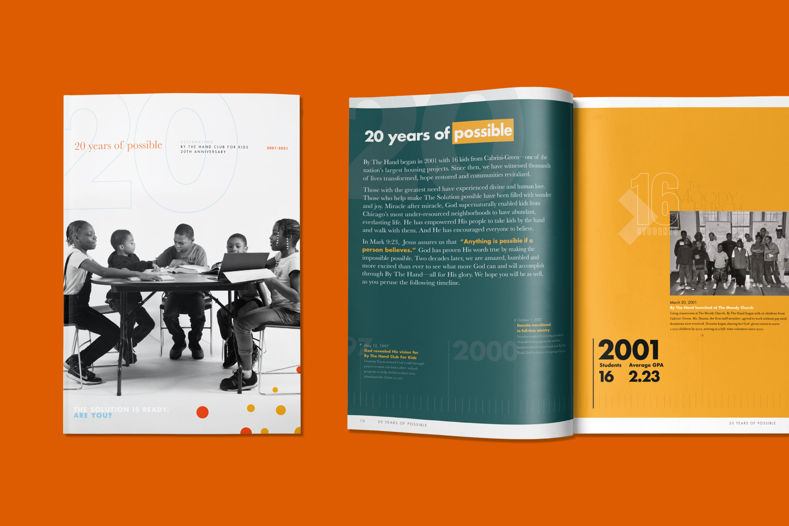
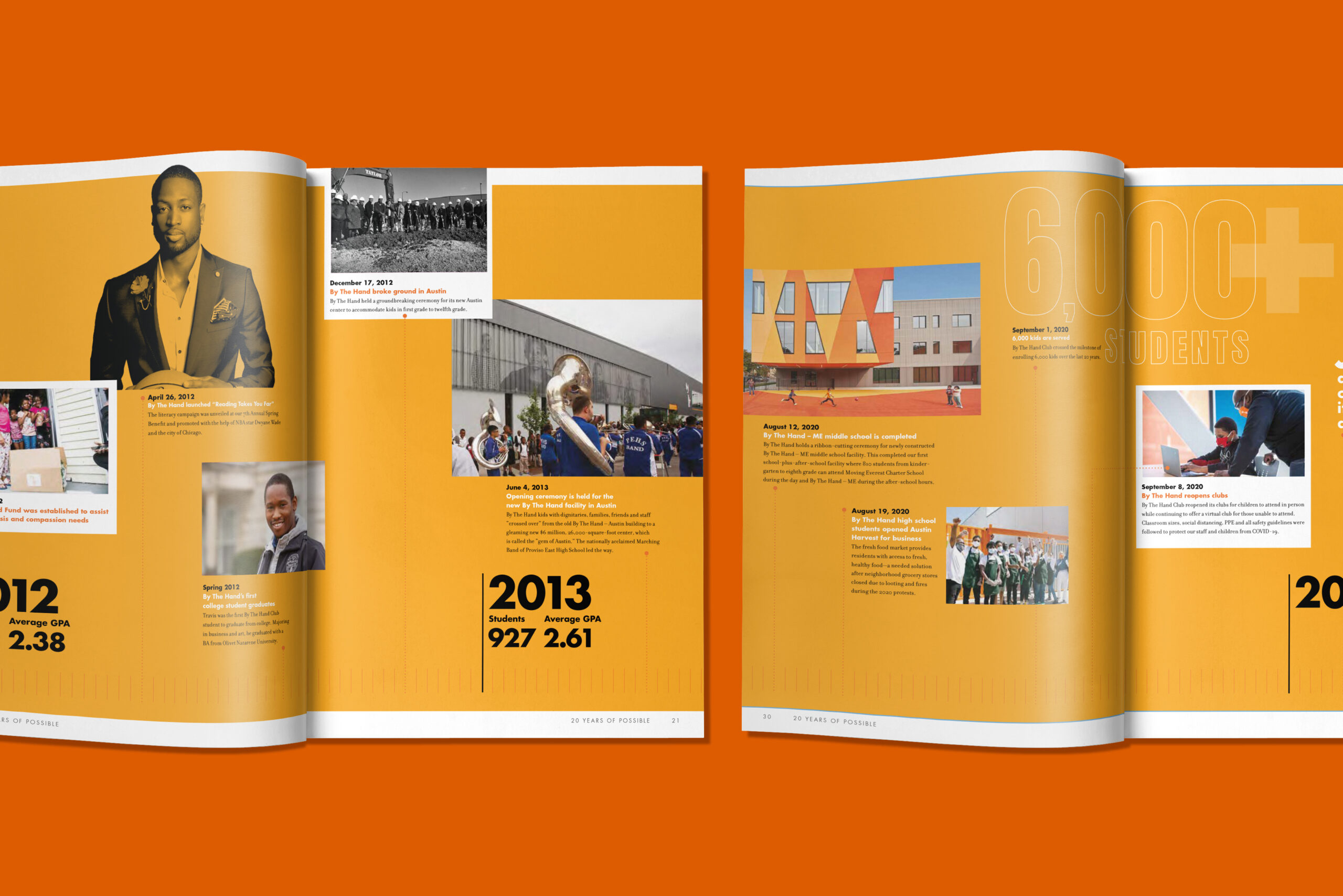
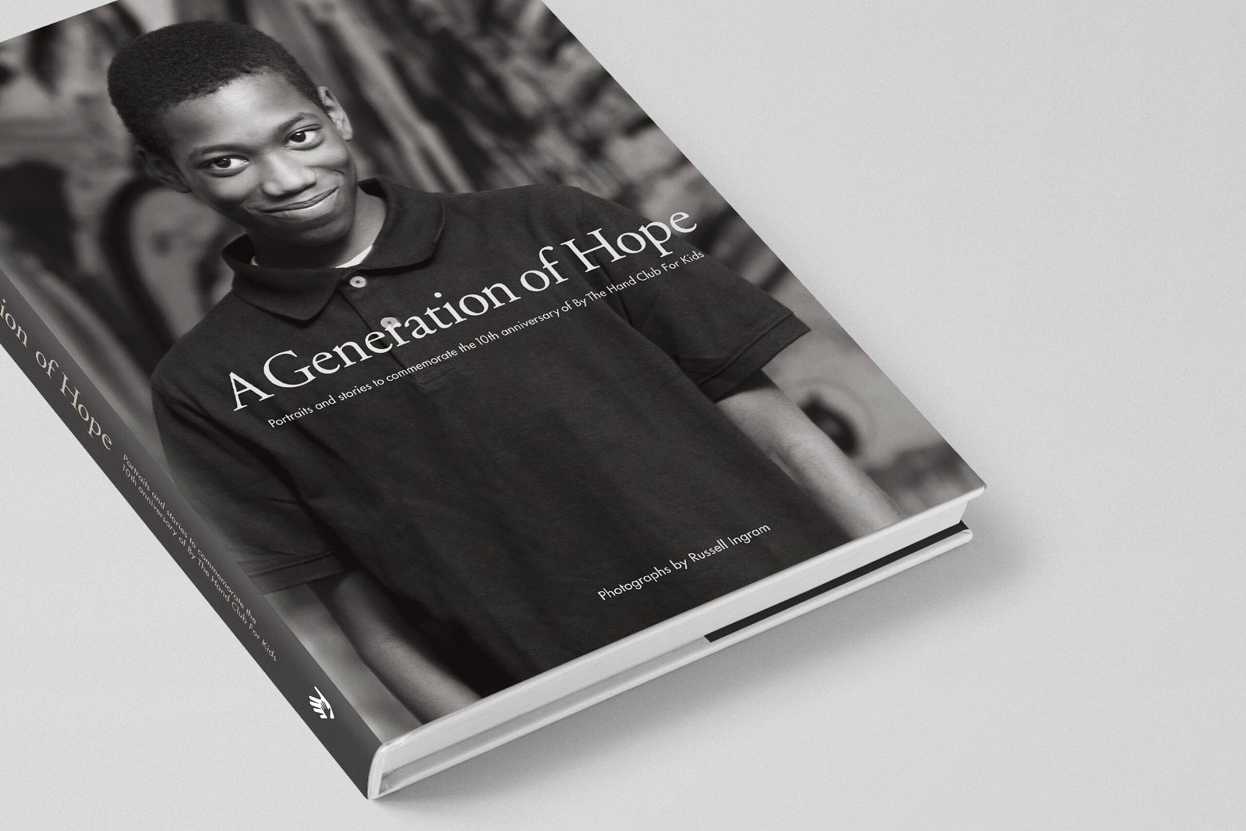
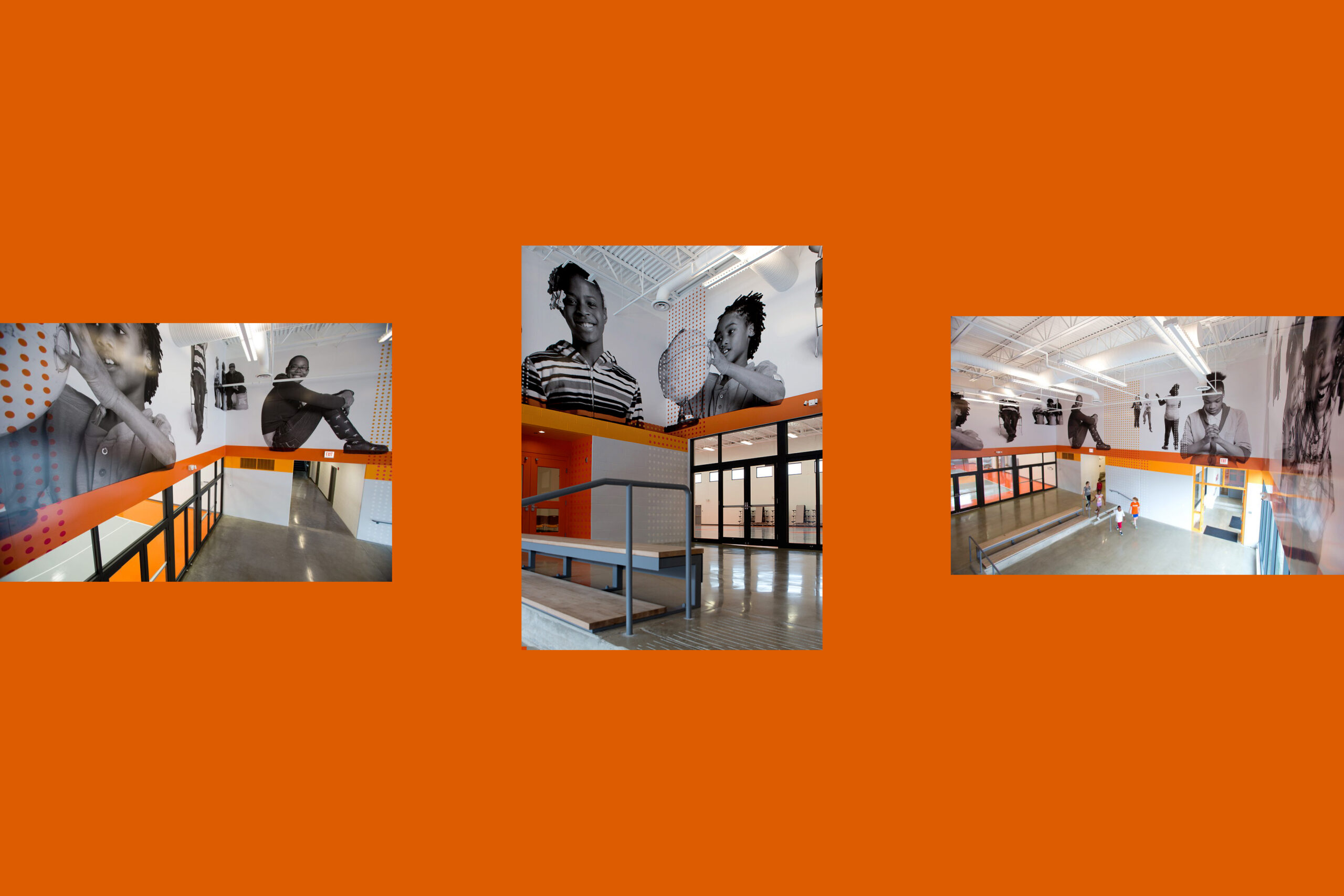
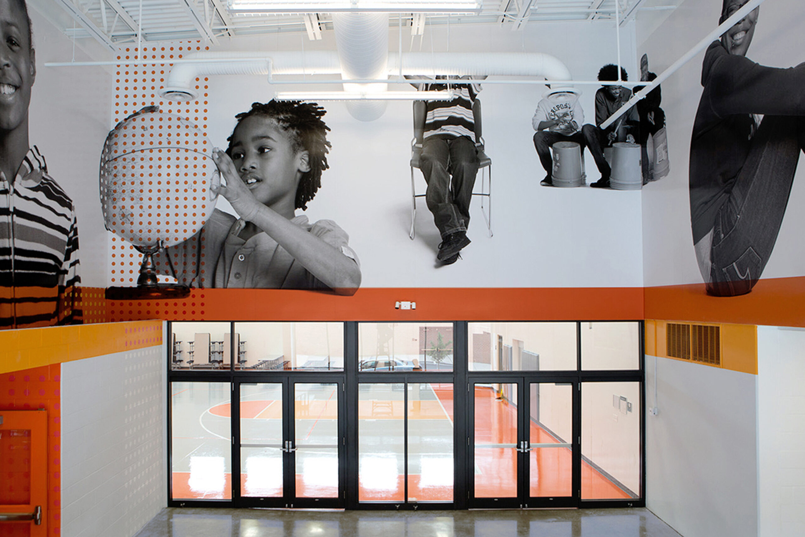
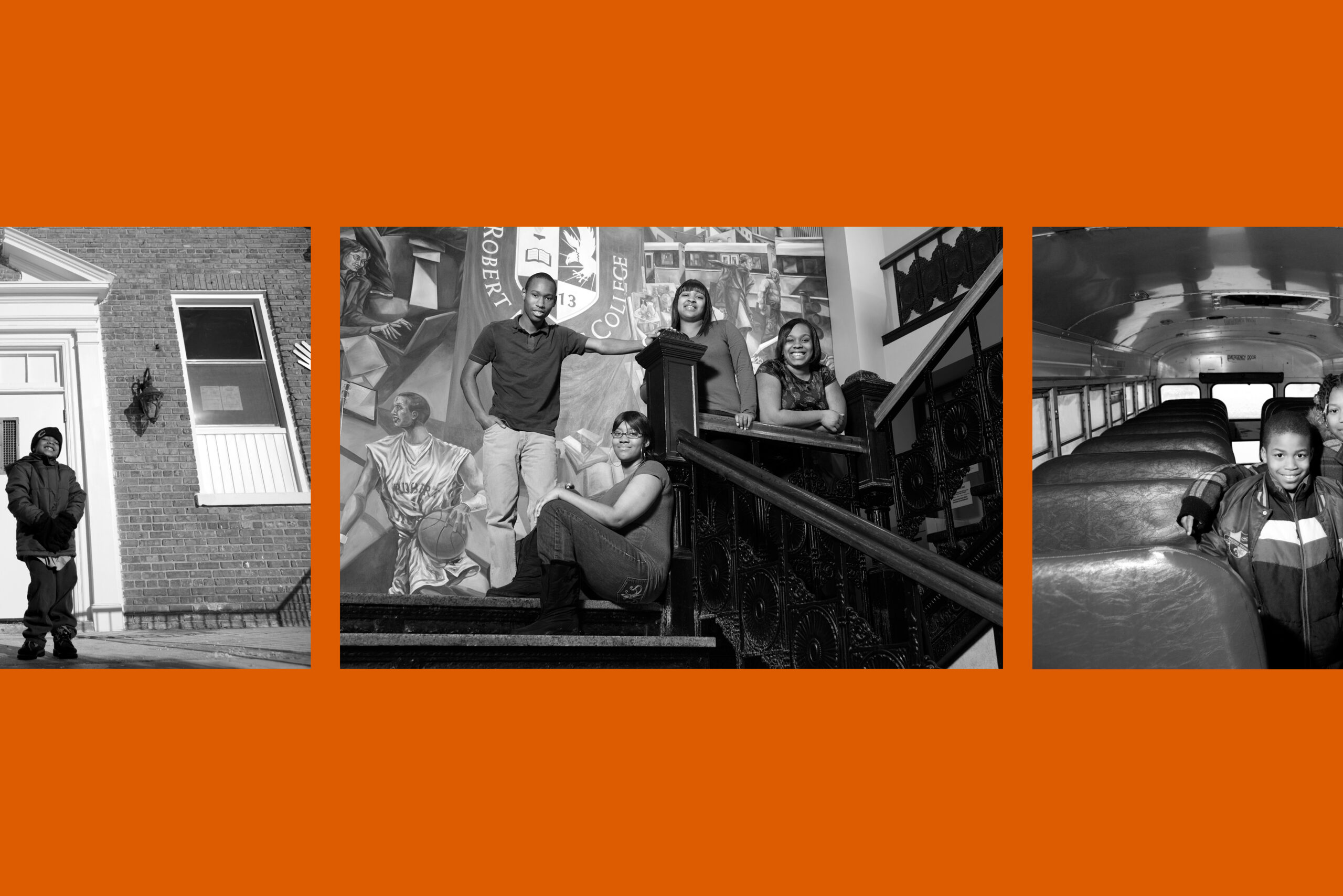
By The Hand Club For Kids
Project Overview
Helping children who live in high-risk, inner-city neighborhoods have abundant life. Since 2001 with 16 children from the Cabrini-Green area in Chicago, they have witnessed transformation within the lives of their kids—and as an organization. Currently they are serving over 1,600 kids from Cabrini-Green, Altgeld-Murray, Austin and Englewood. While working with Design 360, I assisted in the creation of the BTH identity system, environmental signage, and their first book — amongst many other marketing materials. Learn more about BTH here. Work done through Design 360. Photography by Russell Ingram.
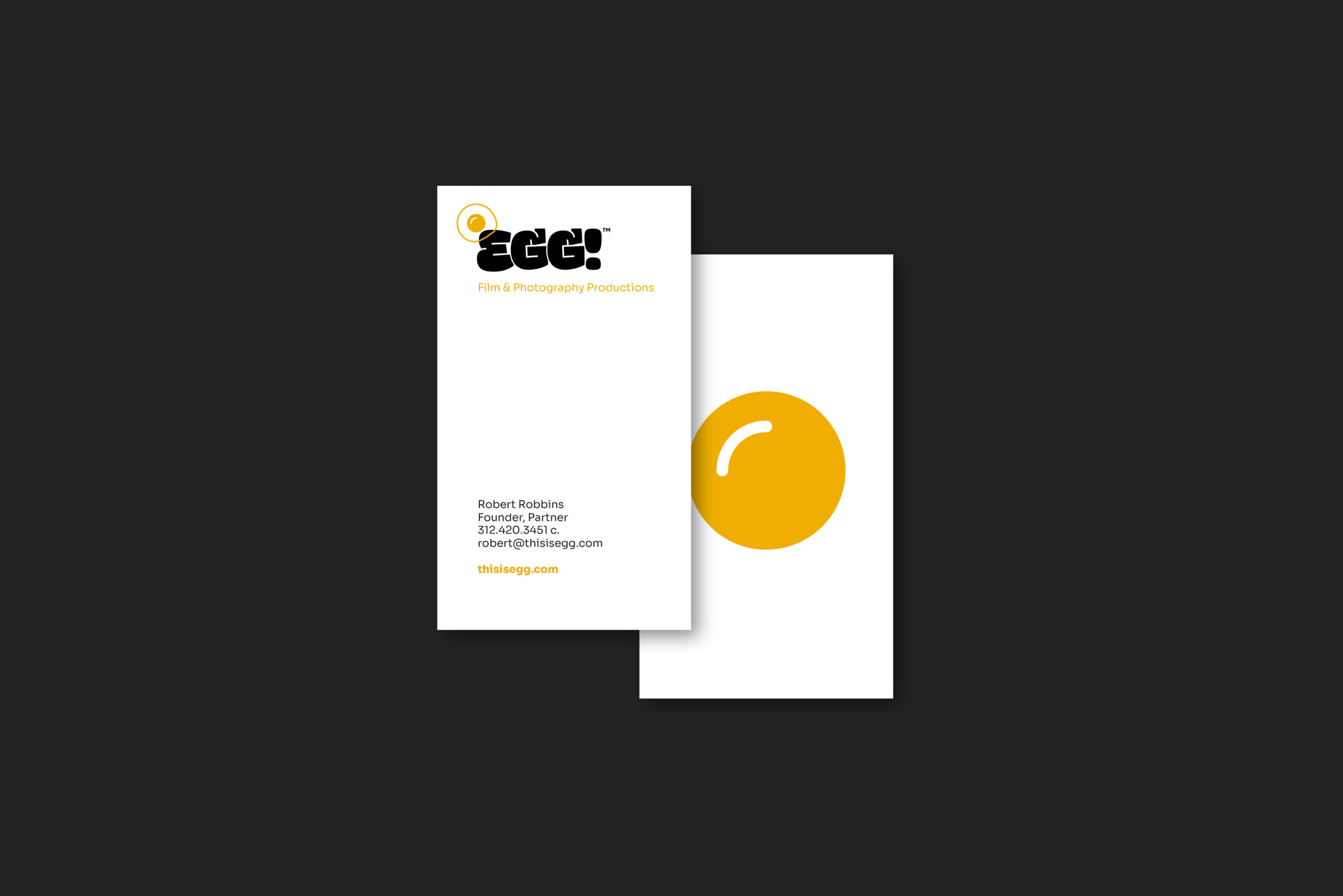
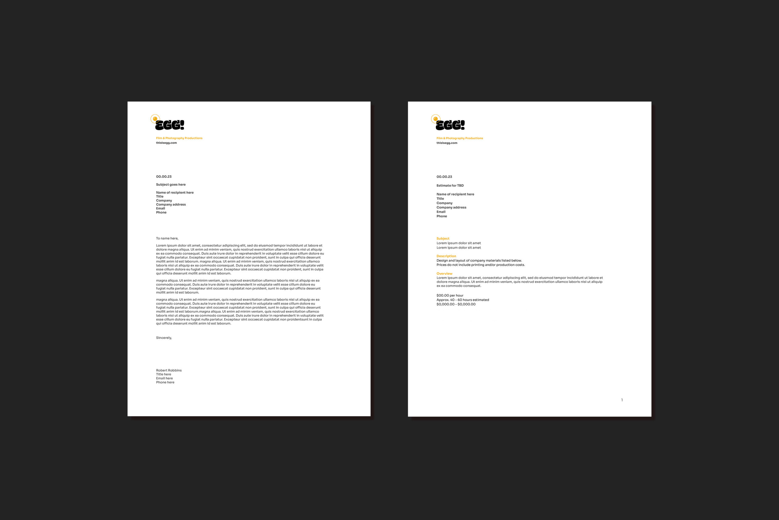
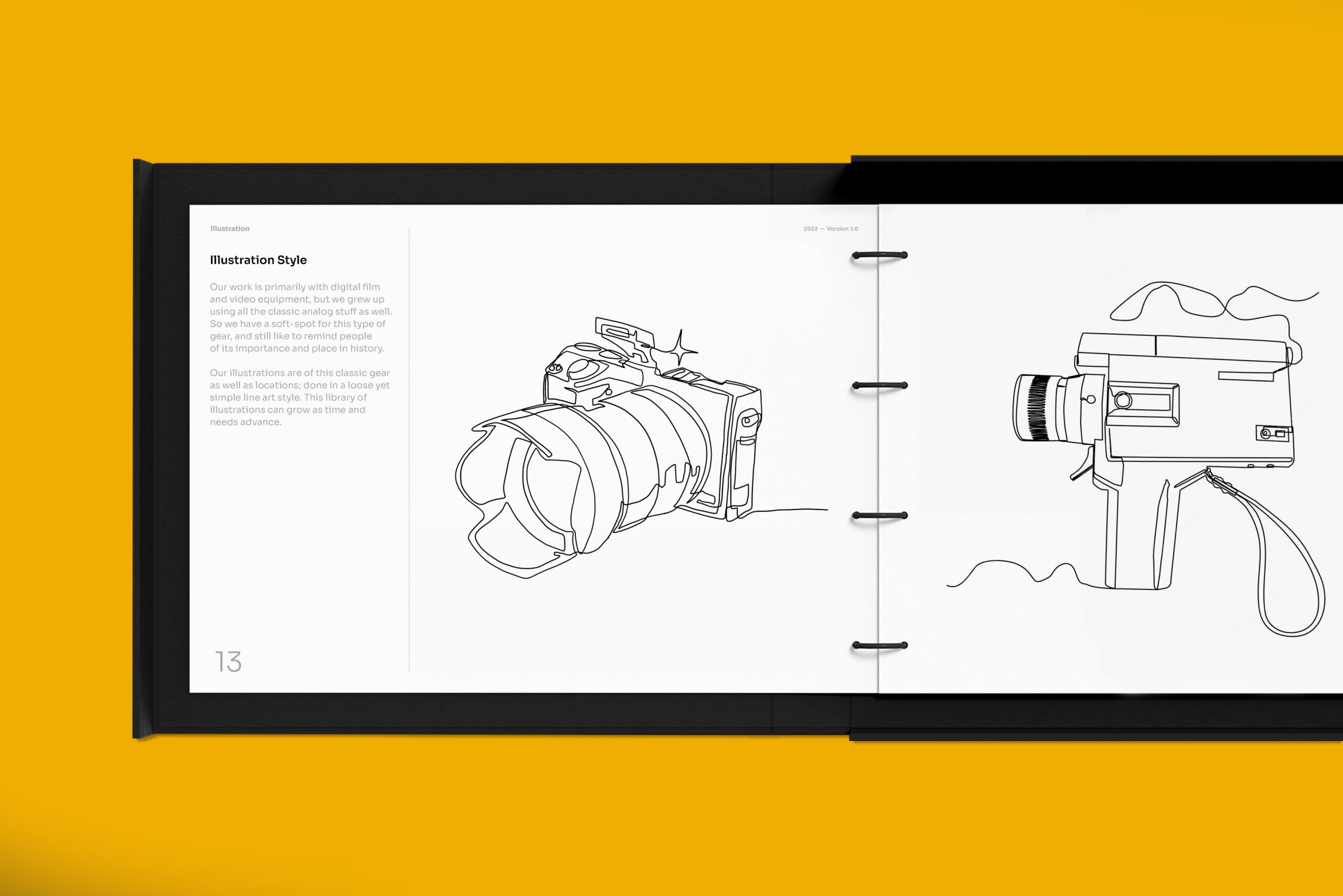

Client
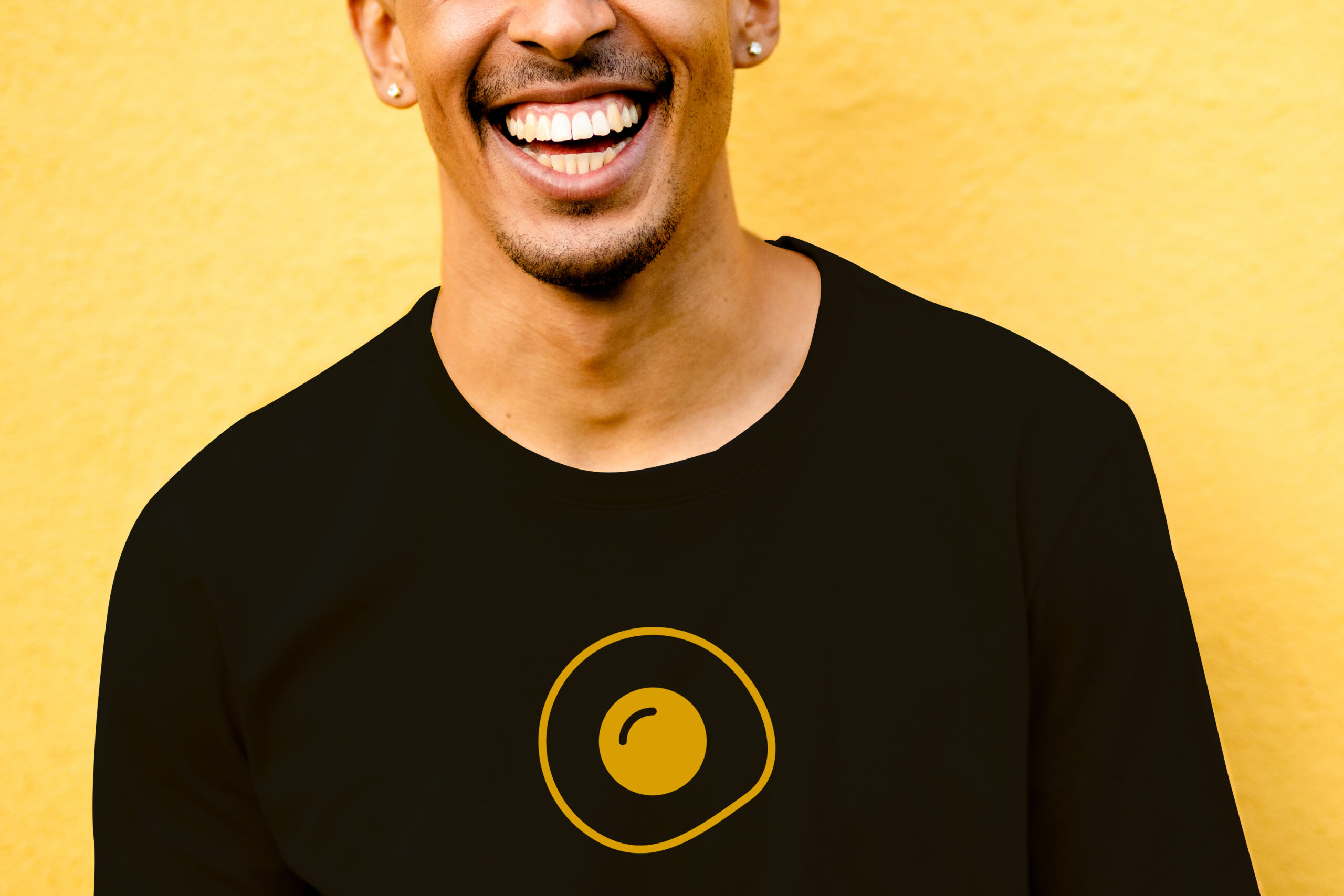
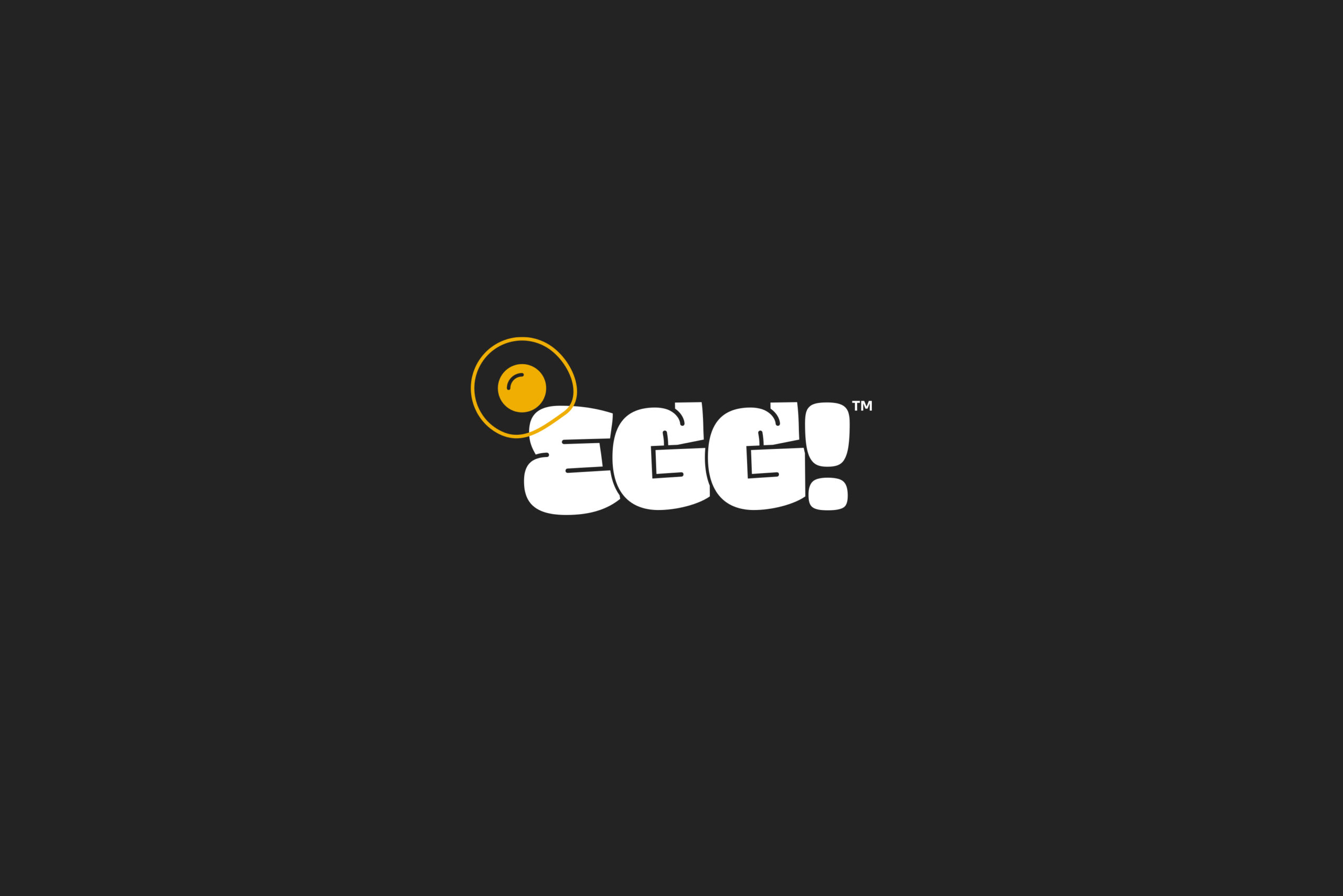
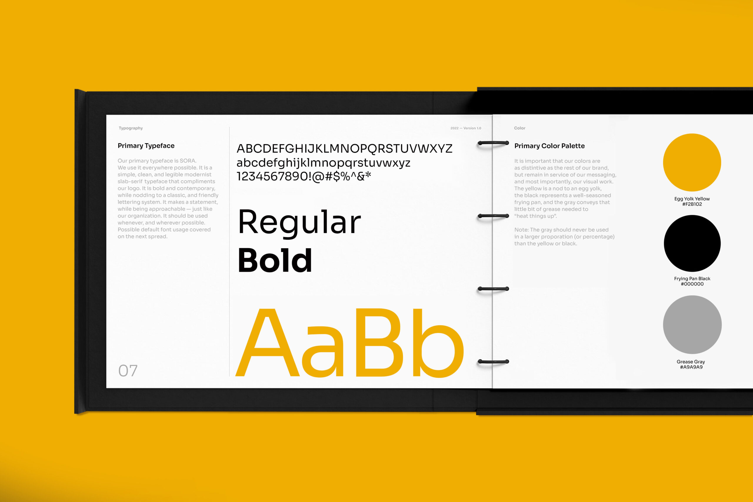
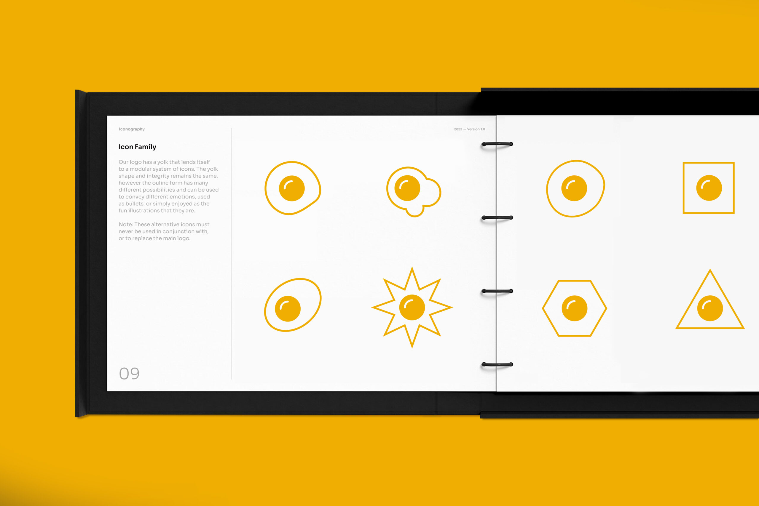
EGG! (in progress)
Project Overview
Two veteran photographers/filmographers joined forces and started a studio named EGG!. With offices in both Chicago and Vancouver, WA; these visual storytellers have shot campaigns for both big and small alike. I helped them narrow down a name (based on the old "What came first, the chicken or the egg?" philisophical dilemma), and designed their identity and brand from the ground up. Including a modular icon family for different, expressive marketing needs, a business collateral system, and a website. All of which feature their perspective, attitude, and humor. And according to them — the "egg" didn't necessarily come first, but by declaring a point of view and opinion, it opens the door to further dialogue and conversation. And isn't that what good storytelling is all about?


Client
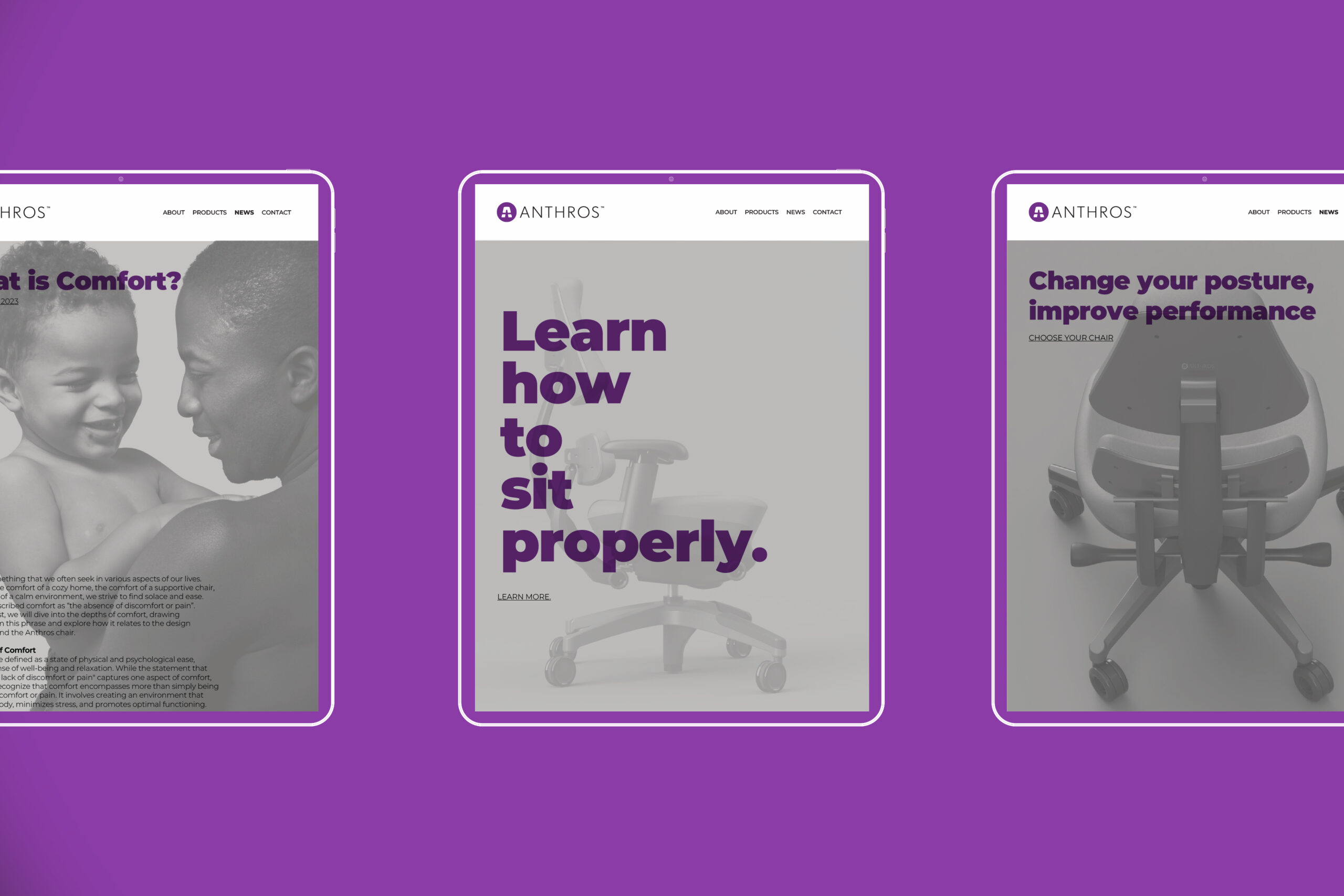
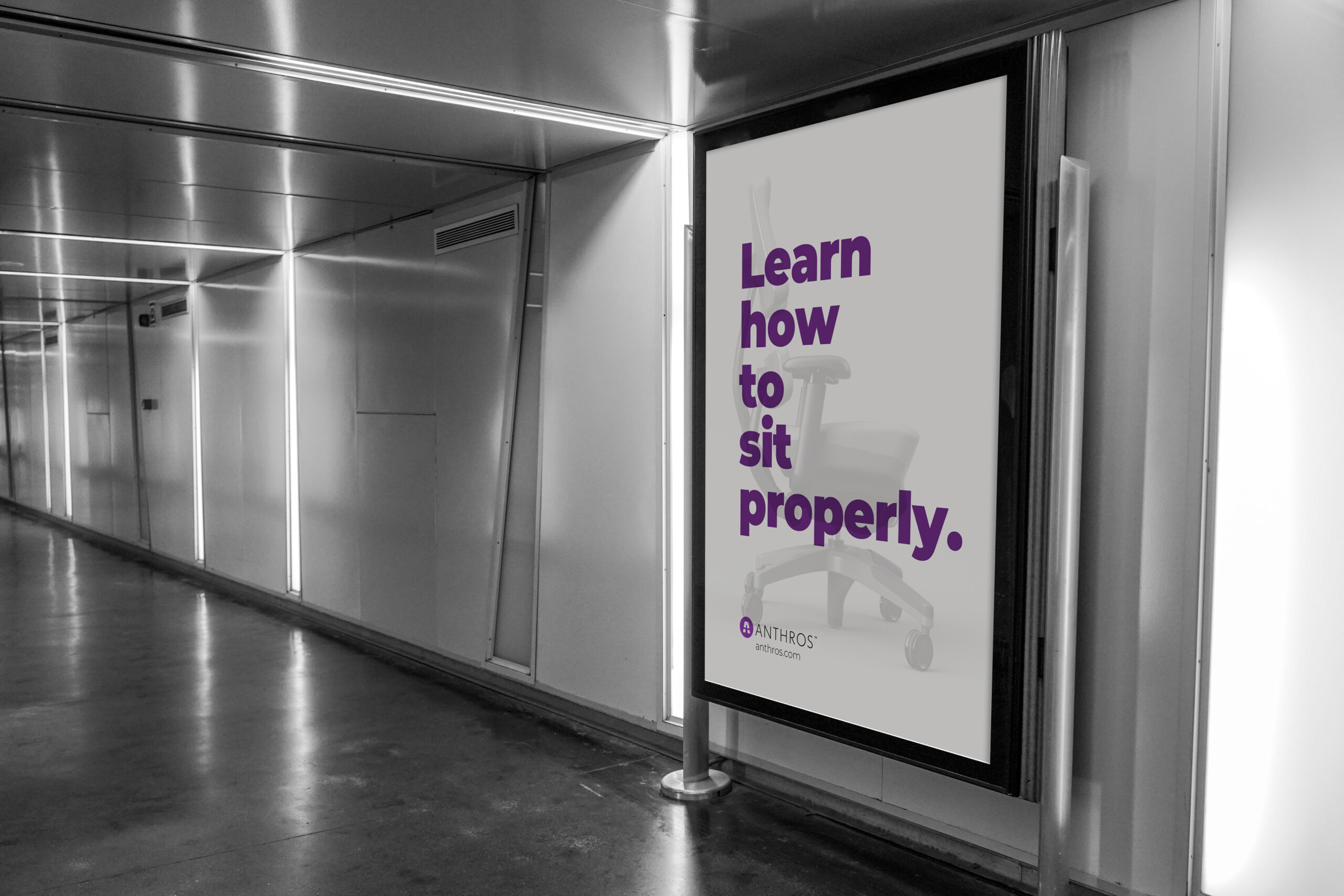
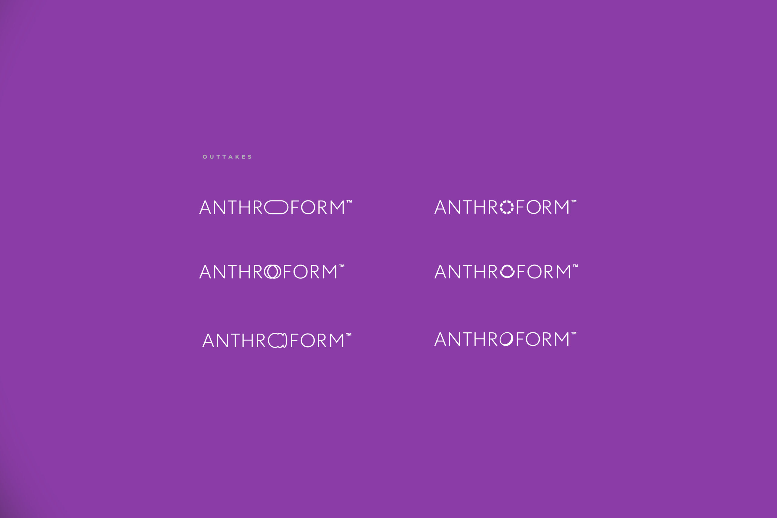
Anthros
Project Overview
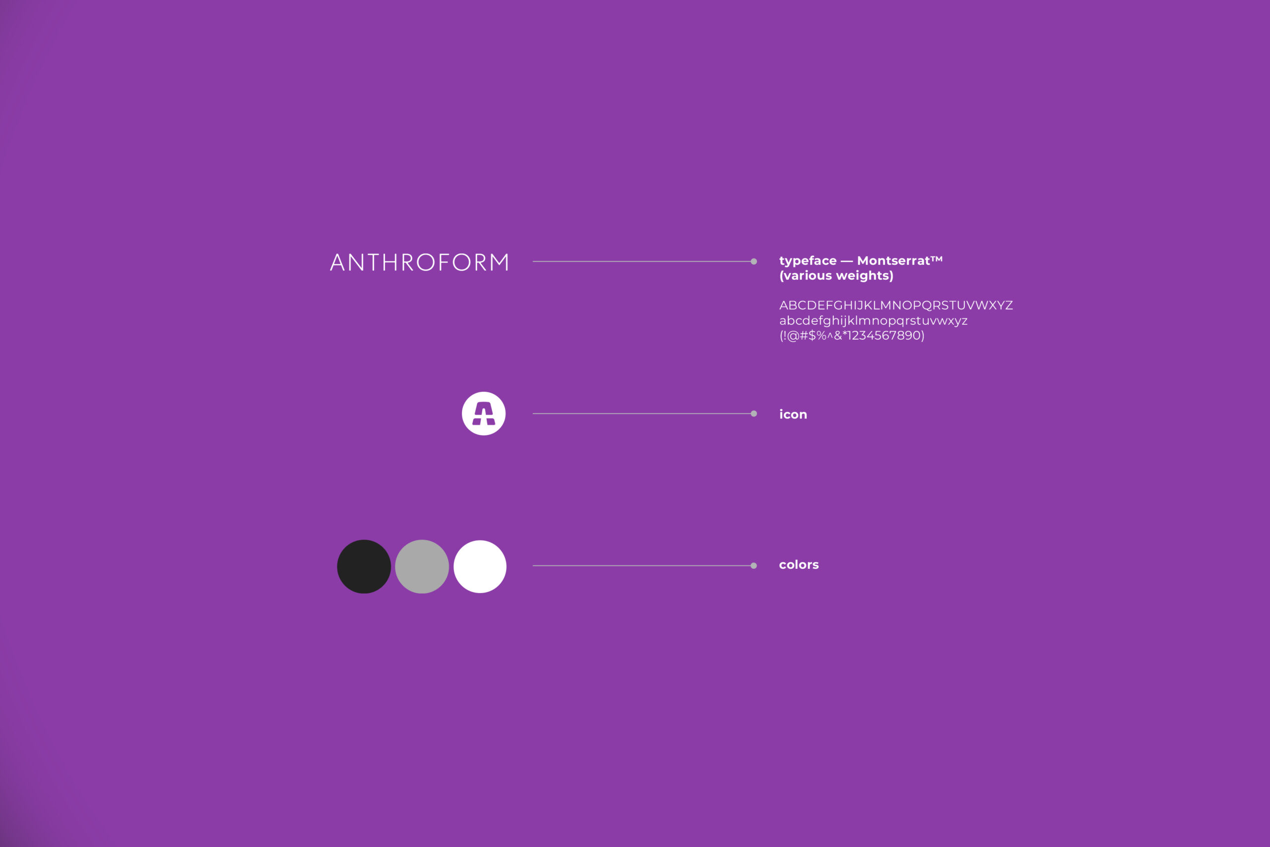
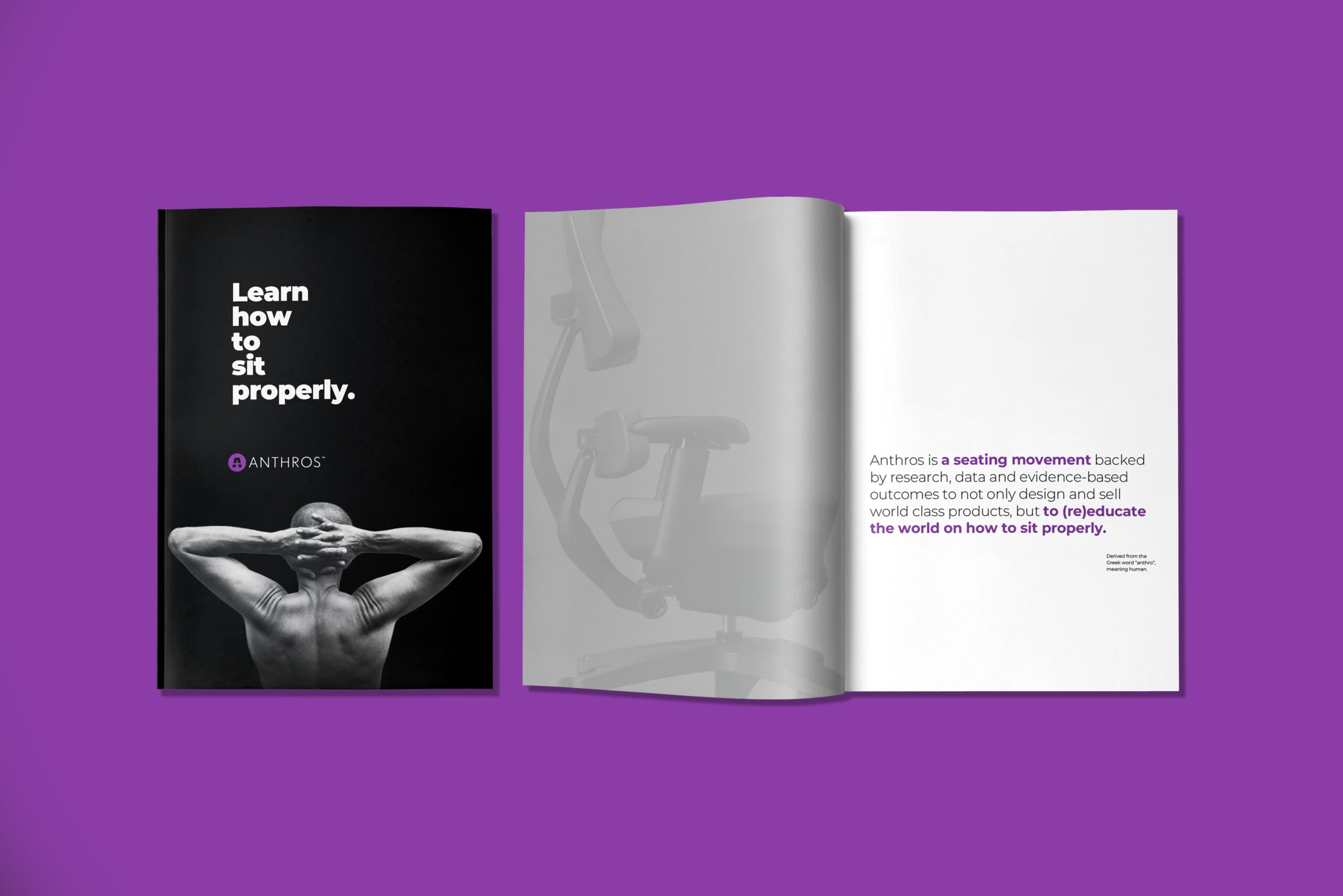
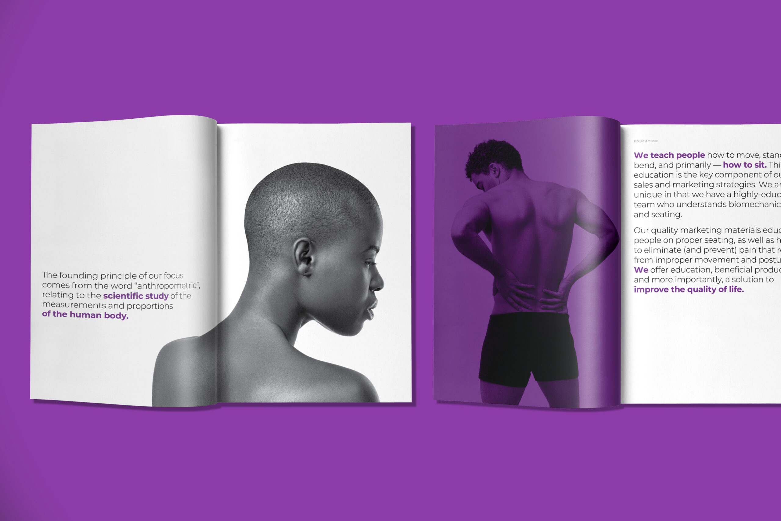
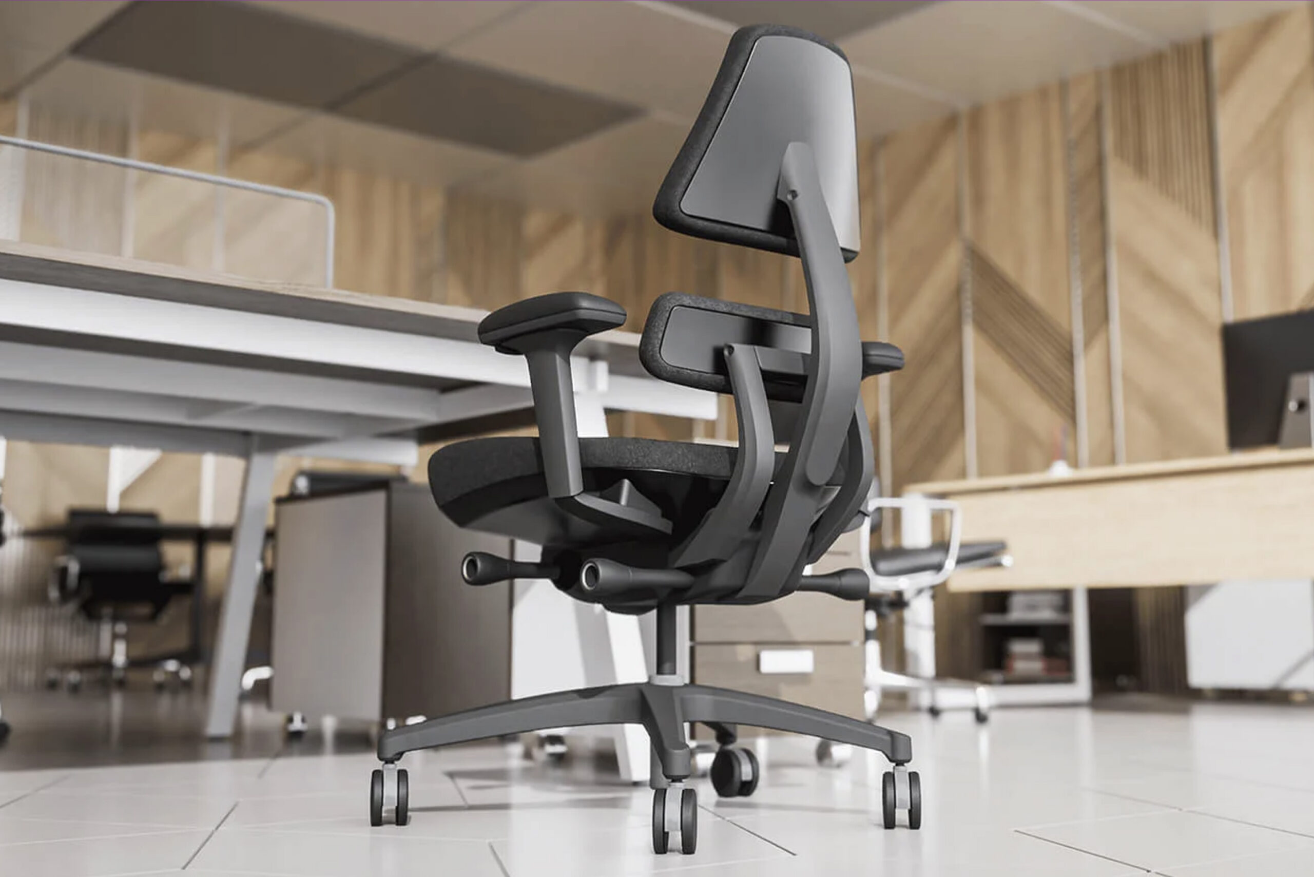
Anthros (a division of Anthroform) is a brand new furniture company hoping to redefine what it means to be a "human focused" organization. They are challenging the notion of what proper ergonomics means within the task chair market. They asked me to assist their design team in exploring, refining, and finalizing their new logomark and icon for this chair line, while also looking at their parent company identity, and how it might tie-in. I then used the above images, colors, and comps to showcase the new logo mark in action. Learn more about Anthros here. Work done through Solberg Design.
Client
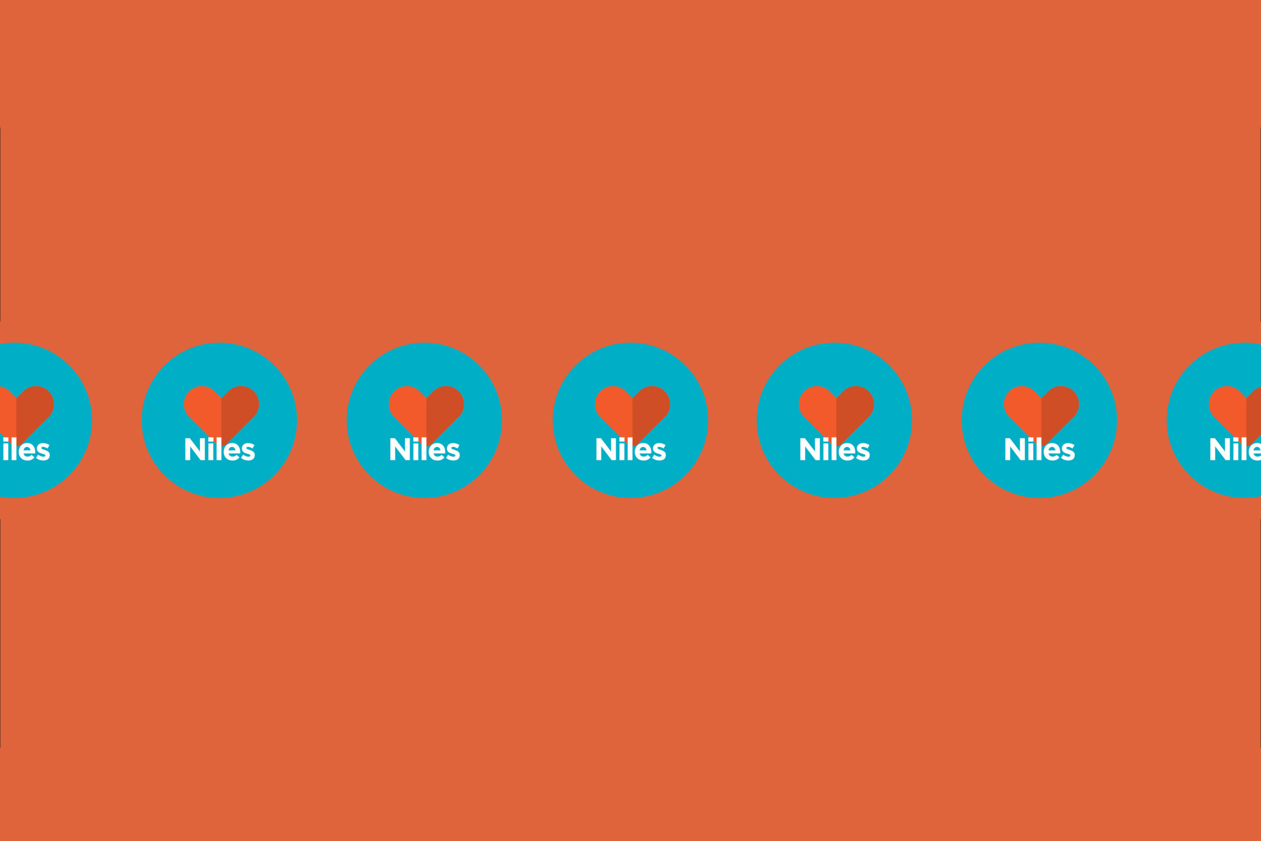
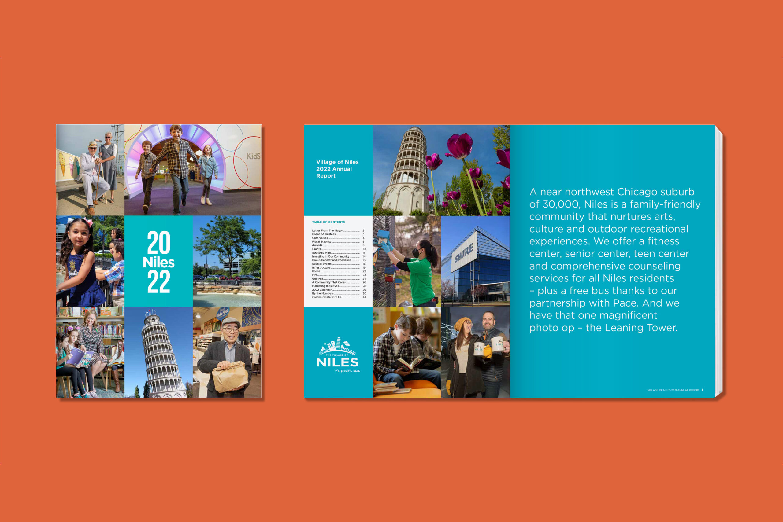
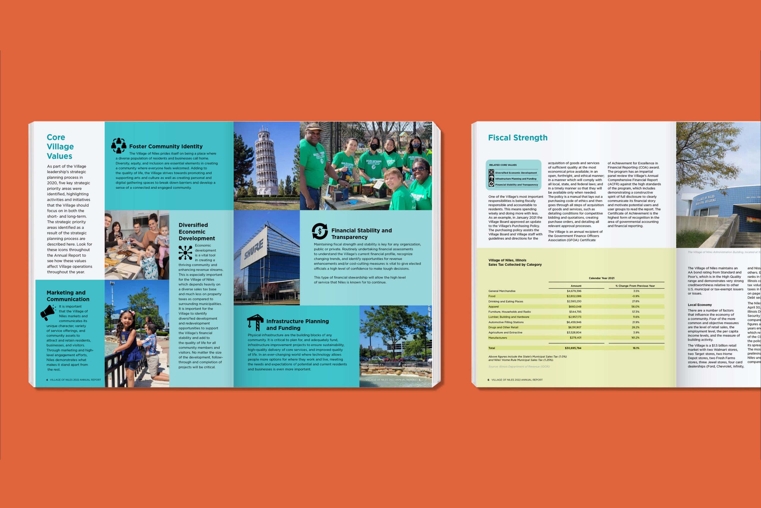
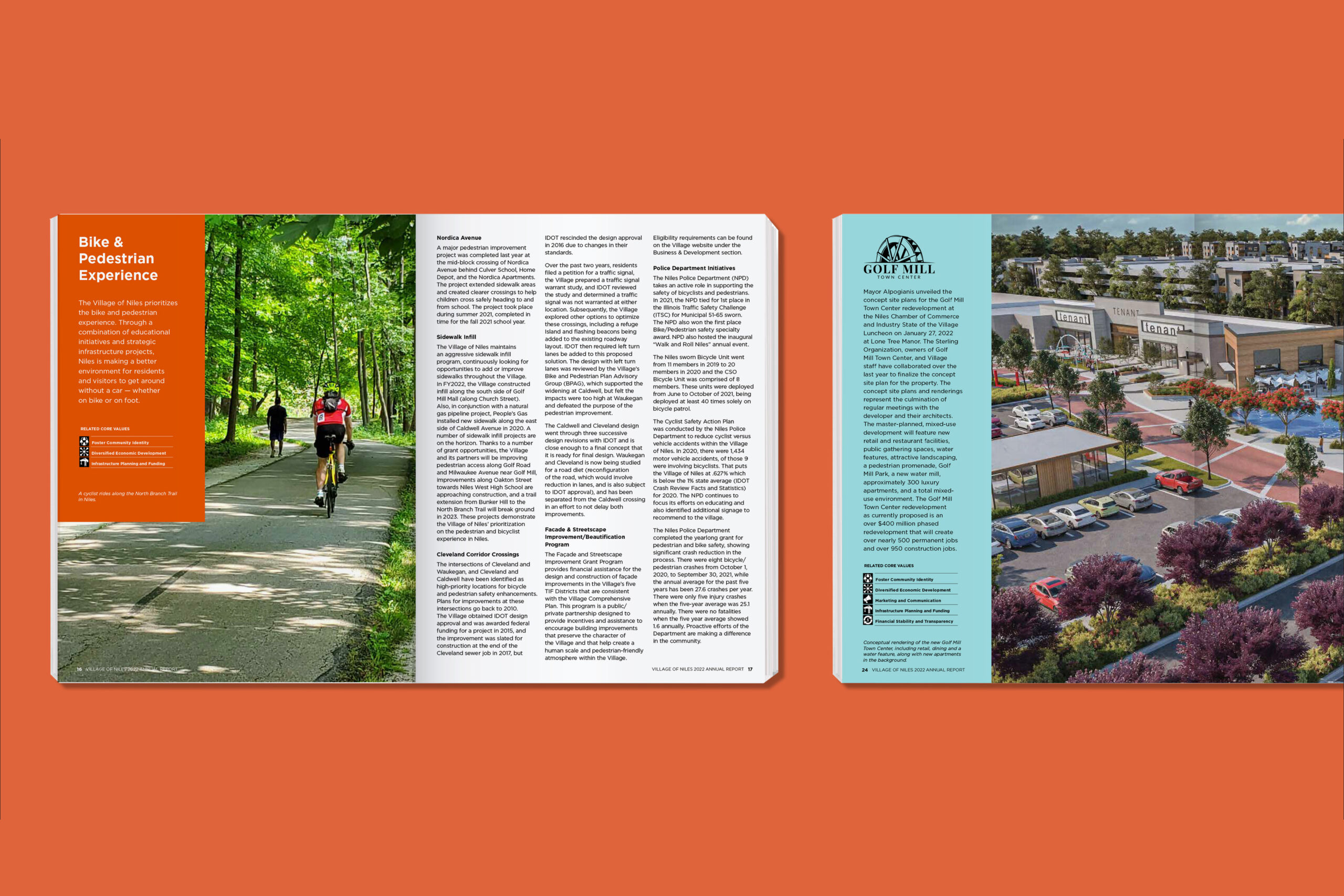
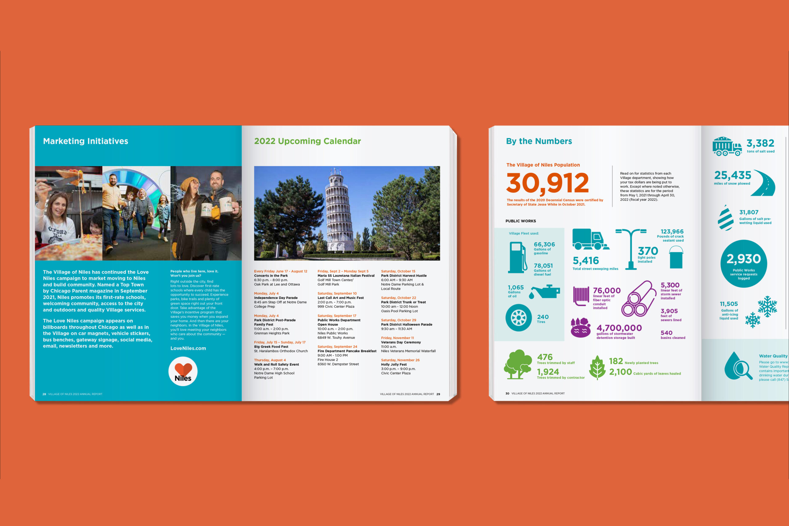
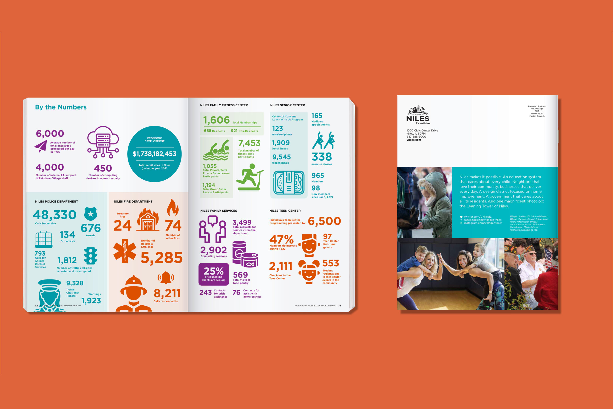
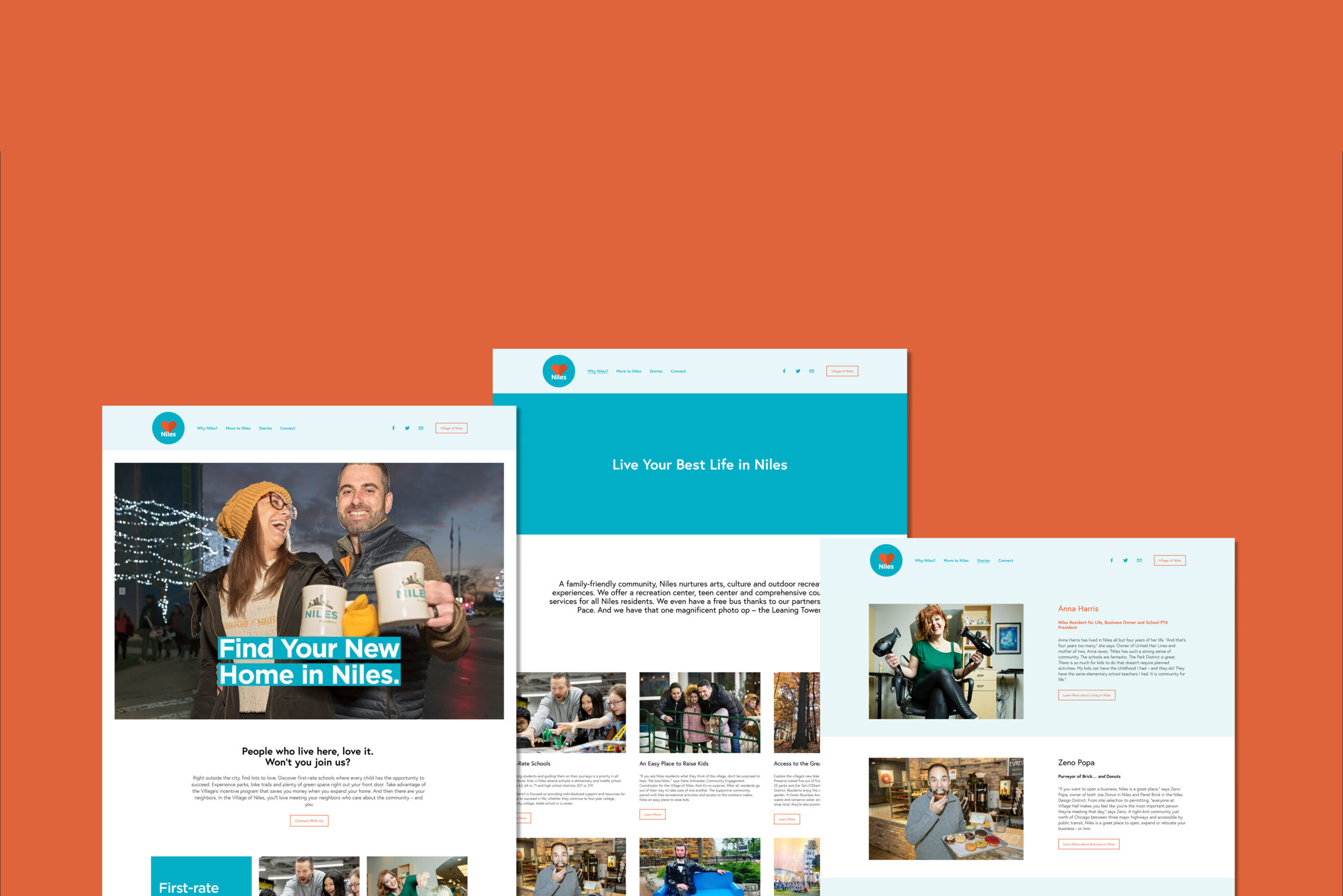
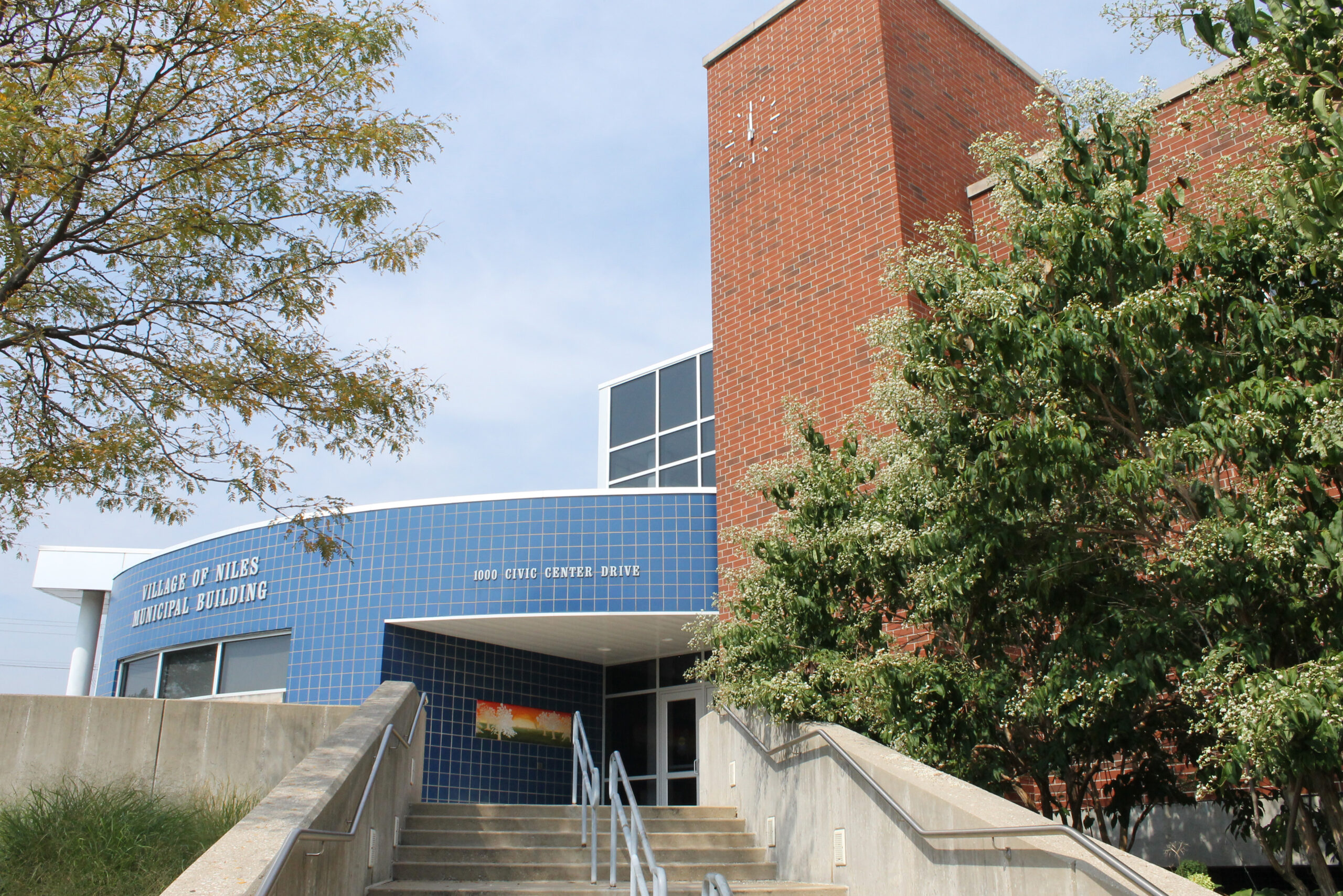
Niles Township (Niles, IL)
Project Overview
The city of Niles has an ongoing public relations campaign named "Love Niles". It was developed to attract new residents and businesses to this family friendly community just outside of Chicago. A5 Inc developed the look and feel of this campaign from the ground up, and then retained me to assist them with the annual report component. I have included other elements above from the branding suite and campaign for context. Work done through A5 Inc.
Update: The Village of Niles has won the Award of Excellence from Communicator for the A5 designed 2022 annual report. Niles was one of only five municipalities nationwide to win the award. Congratulations! I am honored to have been on the team.
Client
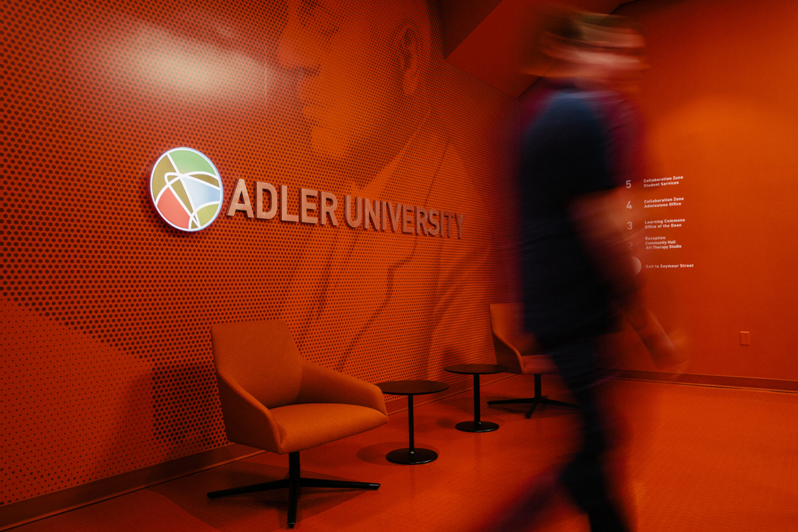
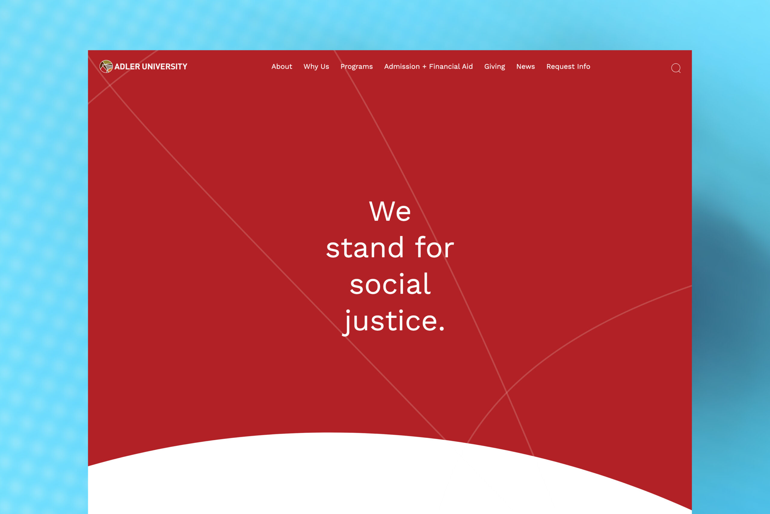
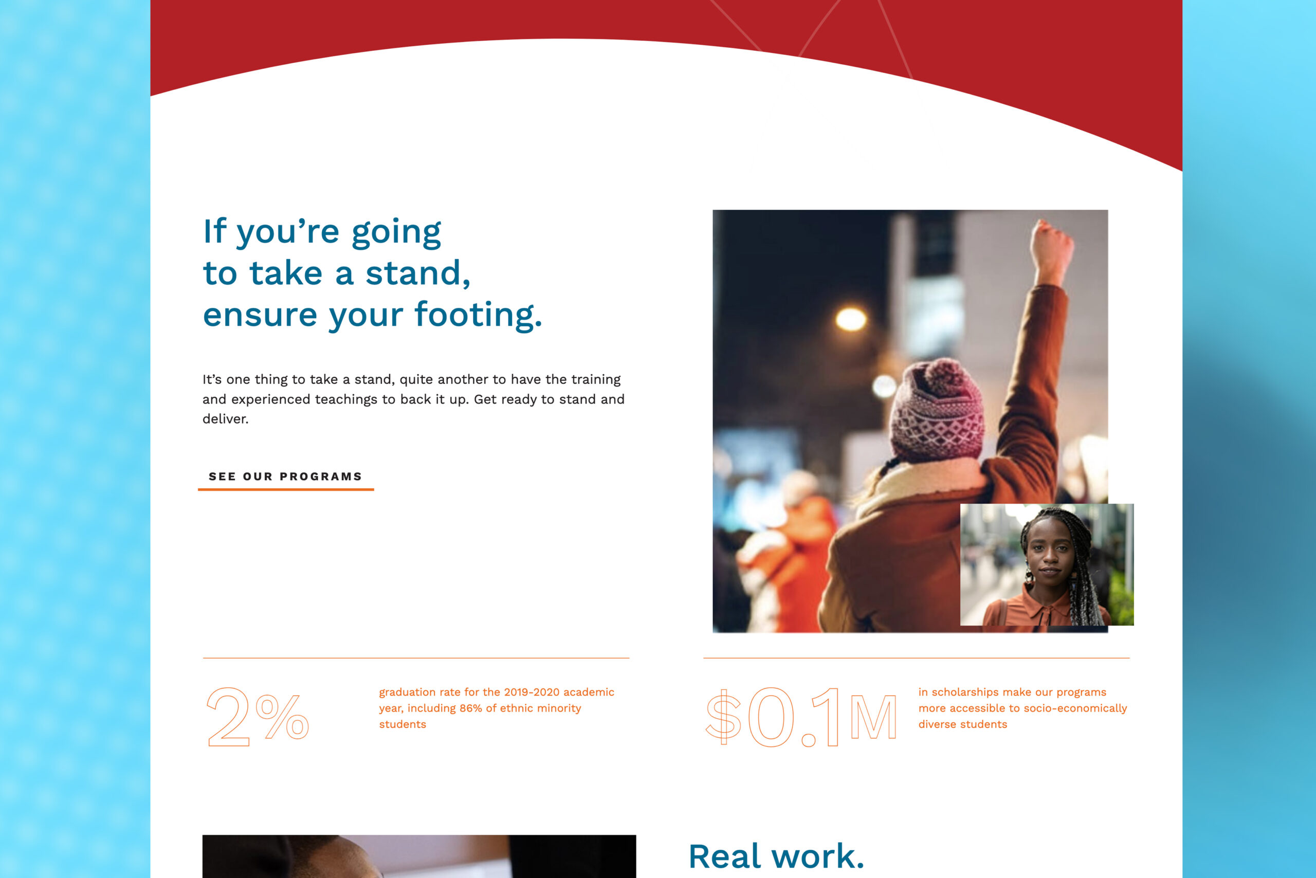
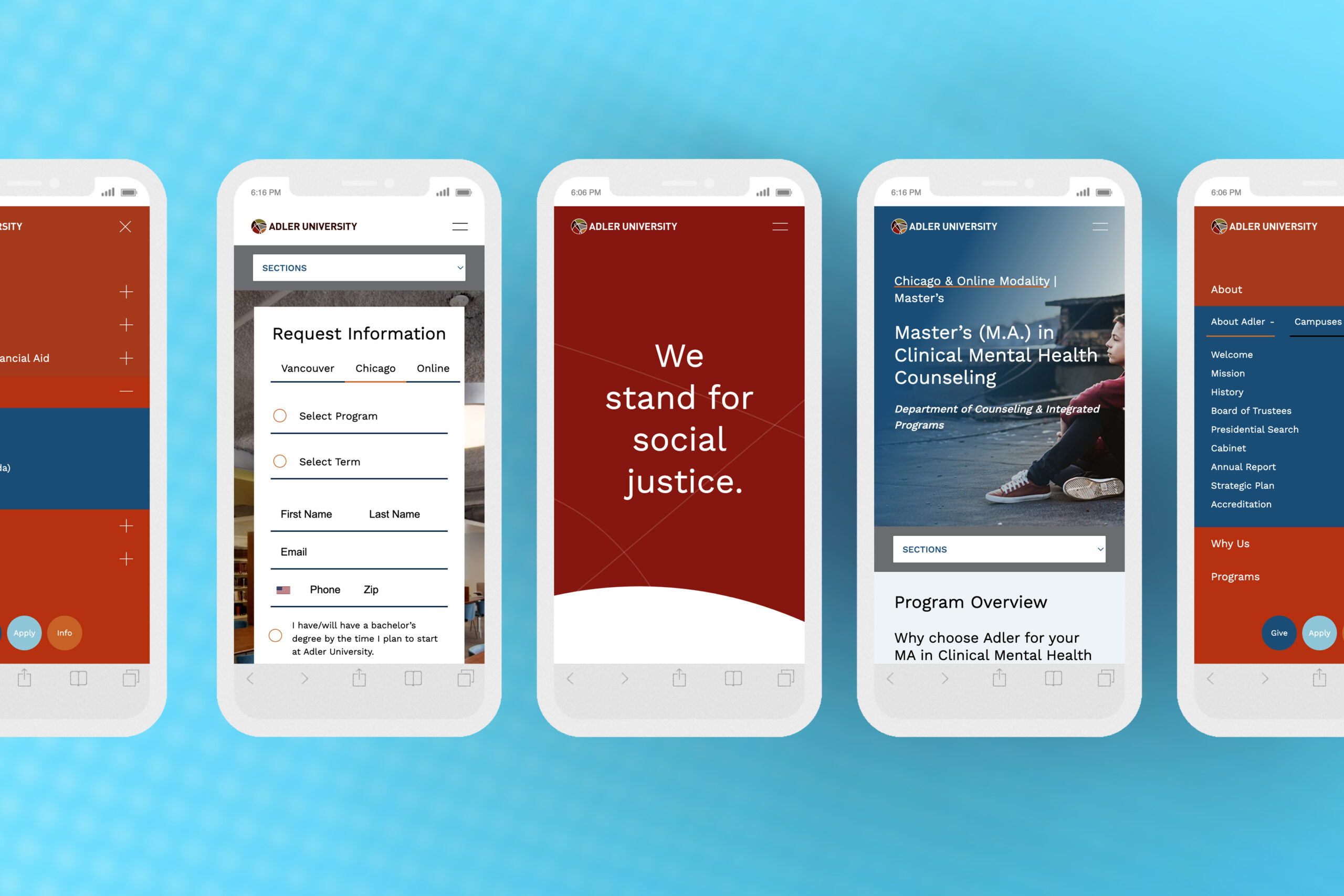
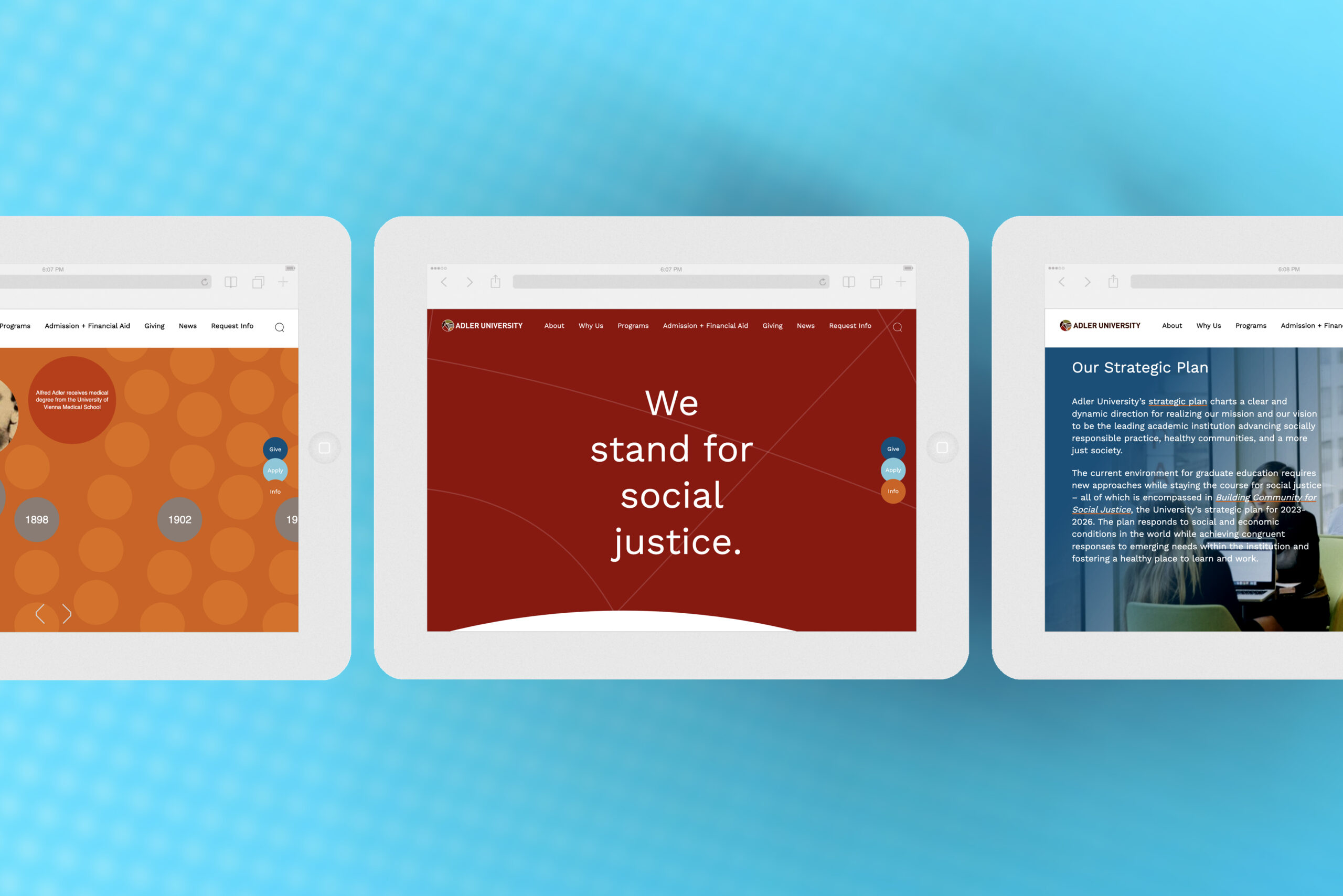
Adler University
Project Overview
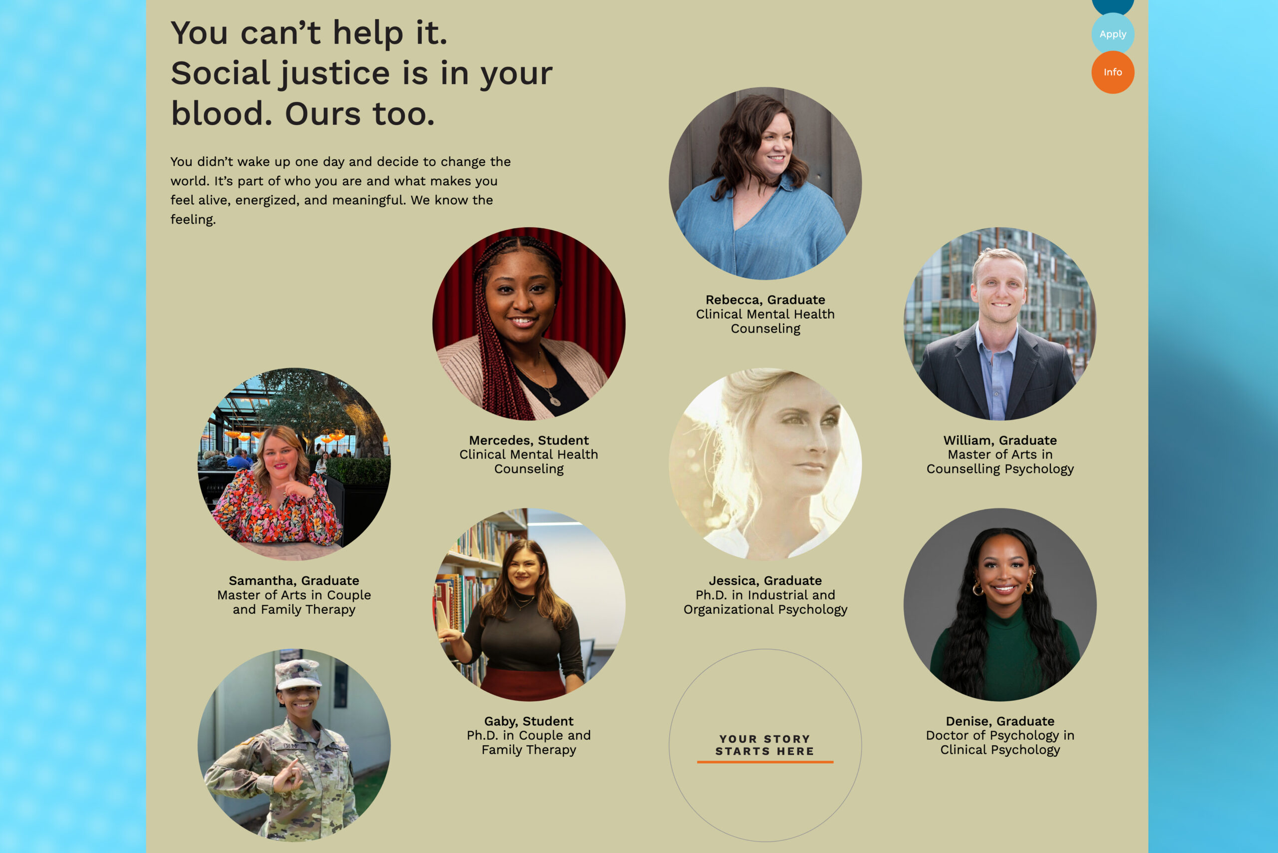
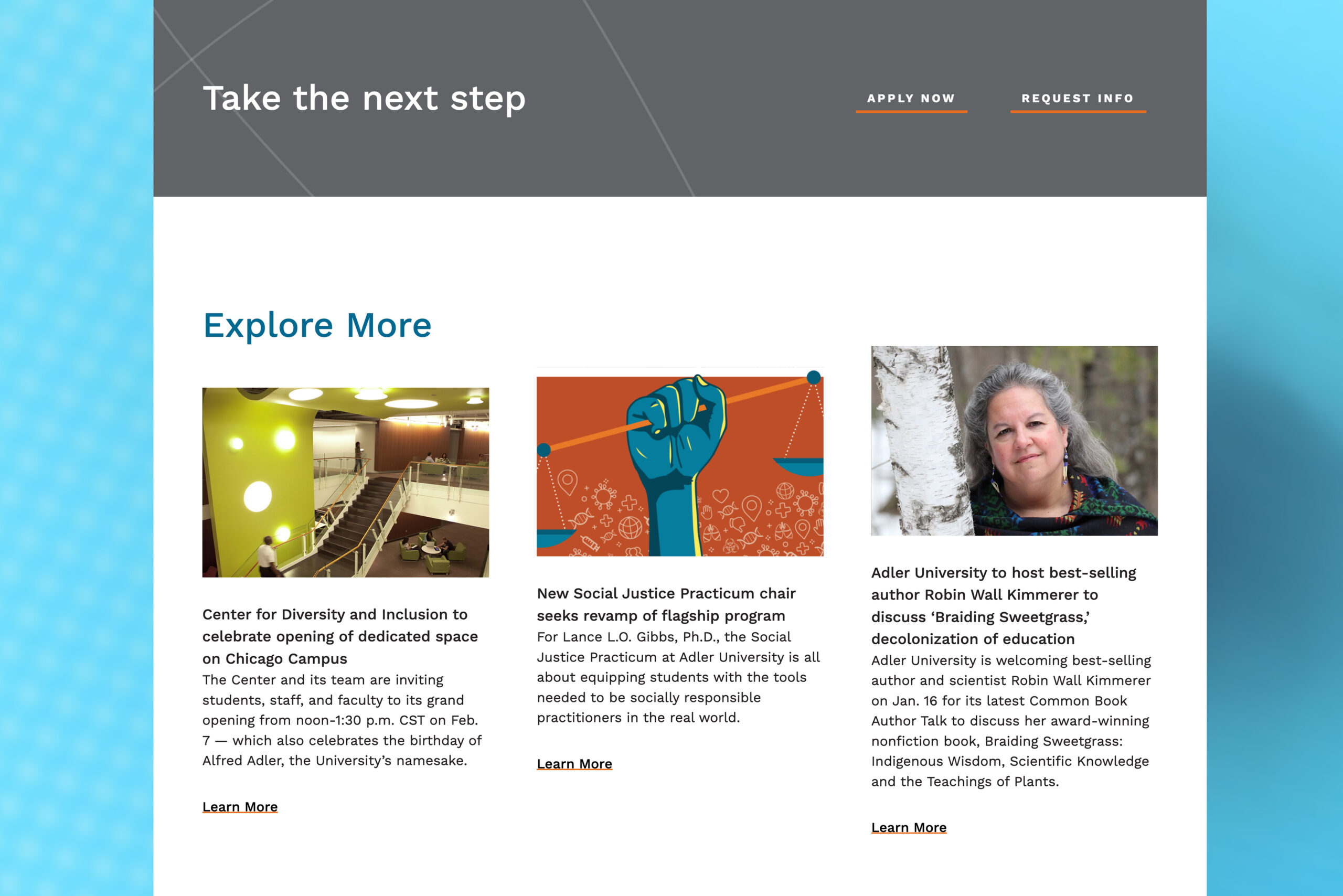
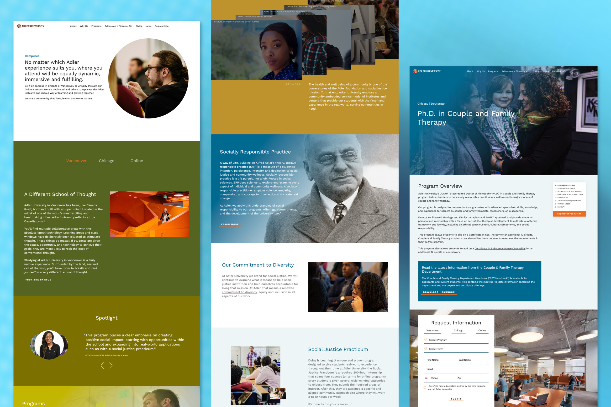
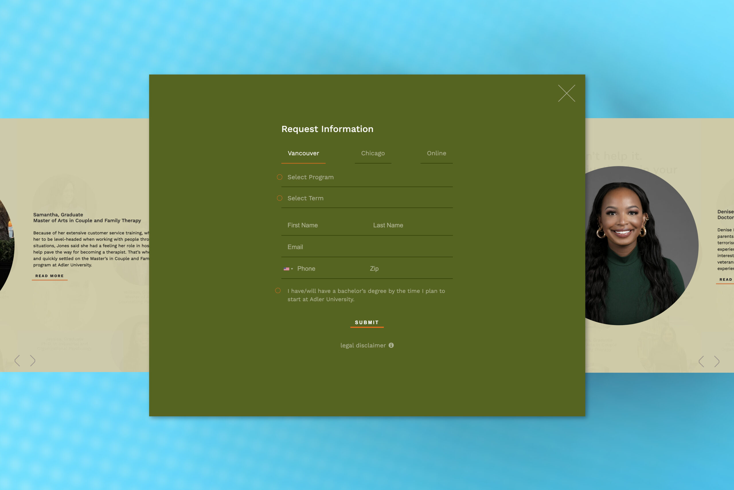
Continuing the pioneering work of the first community psychologist Alfred Adler by graduating socially responsible practitioners, engaging communities, and advancing social justice. While at Kym Abrams Design (as Brand Designer), Adler approached us to create a new web presence for them, with a focus on engaging prospective students. Our activities focused on storytelling, user experience, and a uniquely positioned design direction — "the truth". You can view the full site here. Work done through KAD.
Client
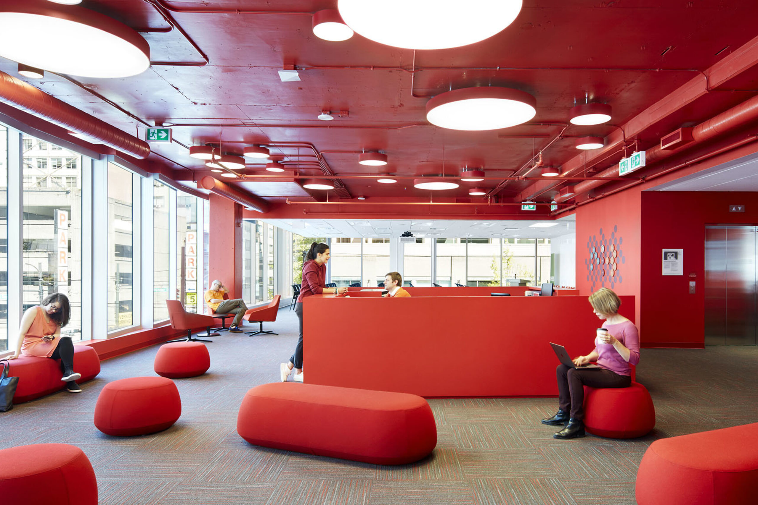
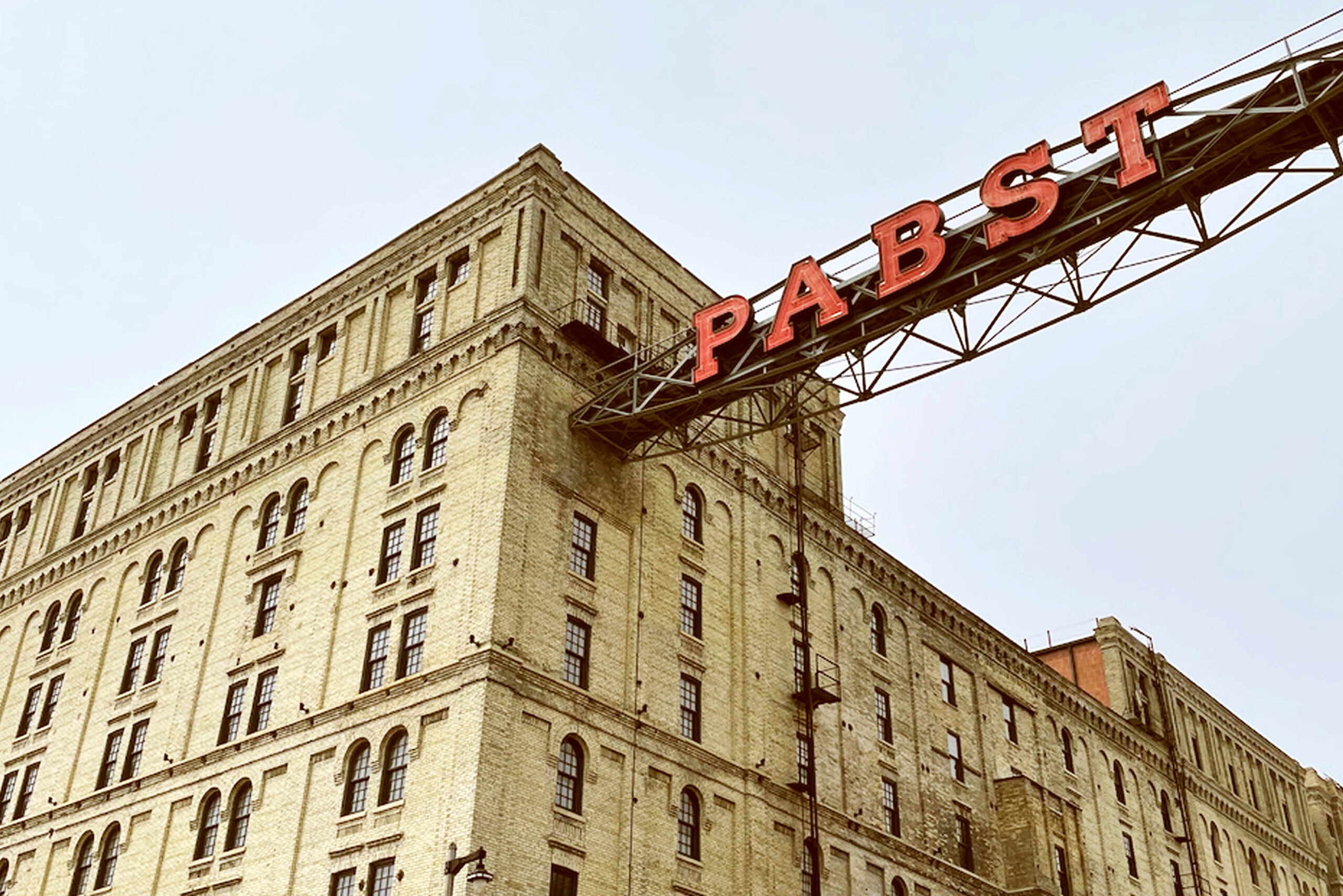
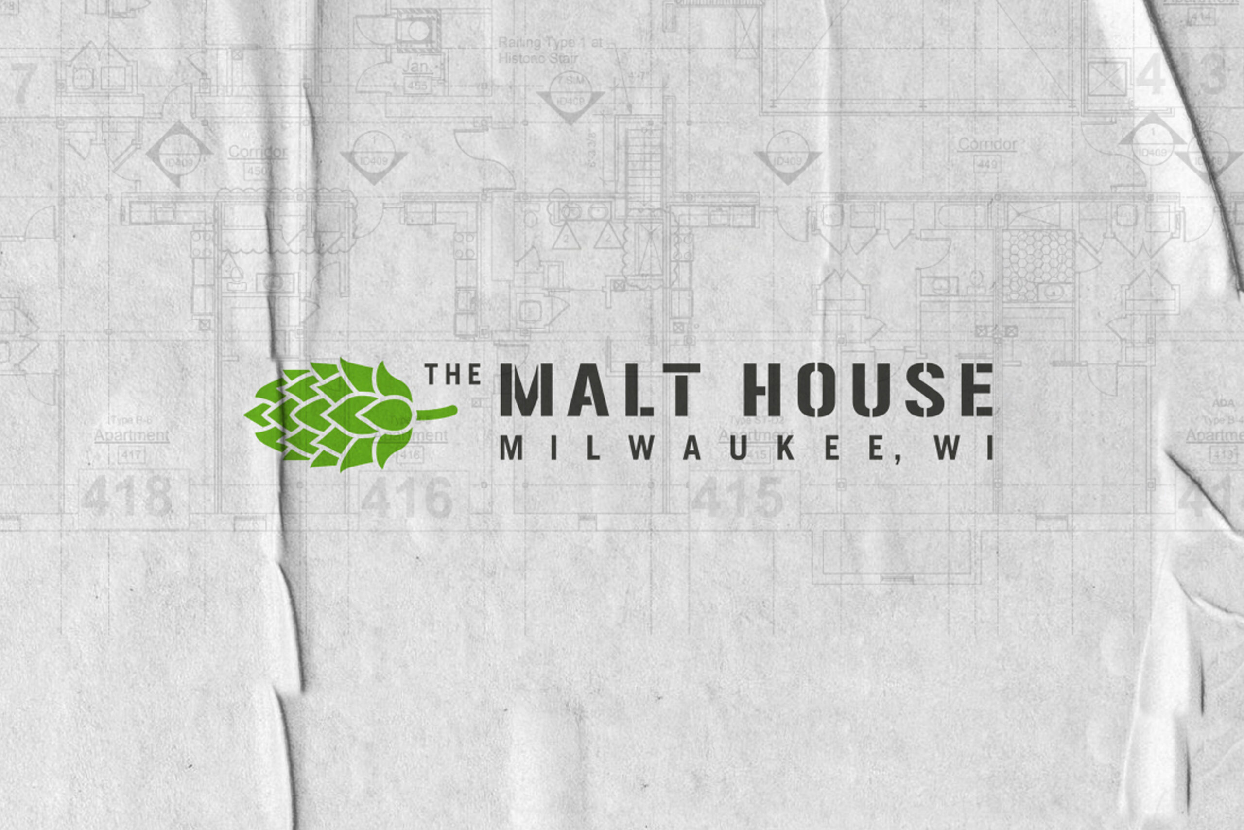
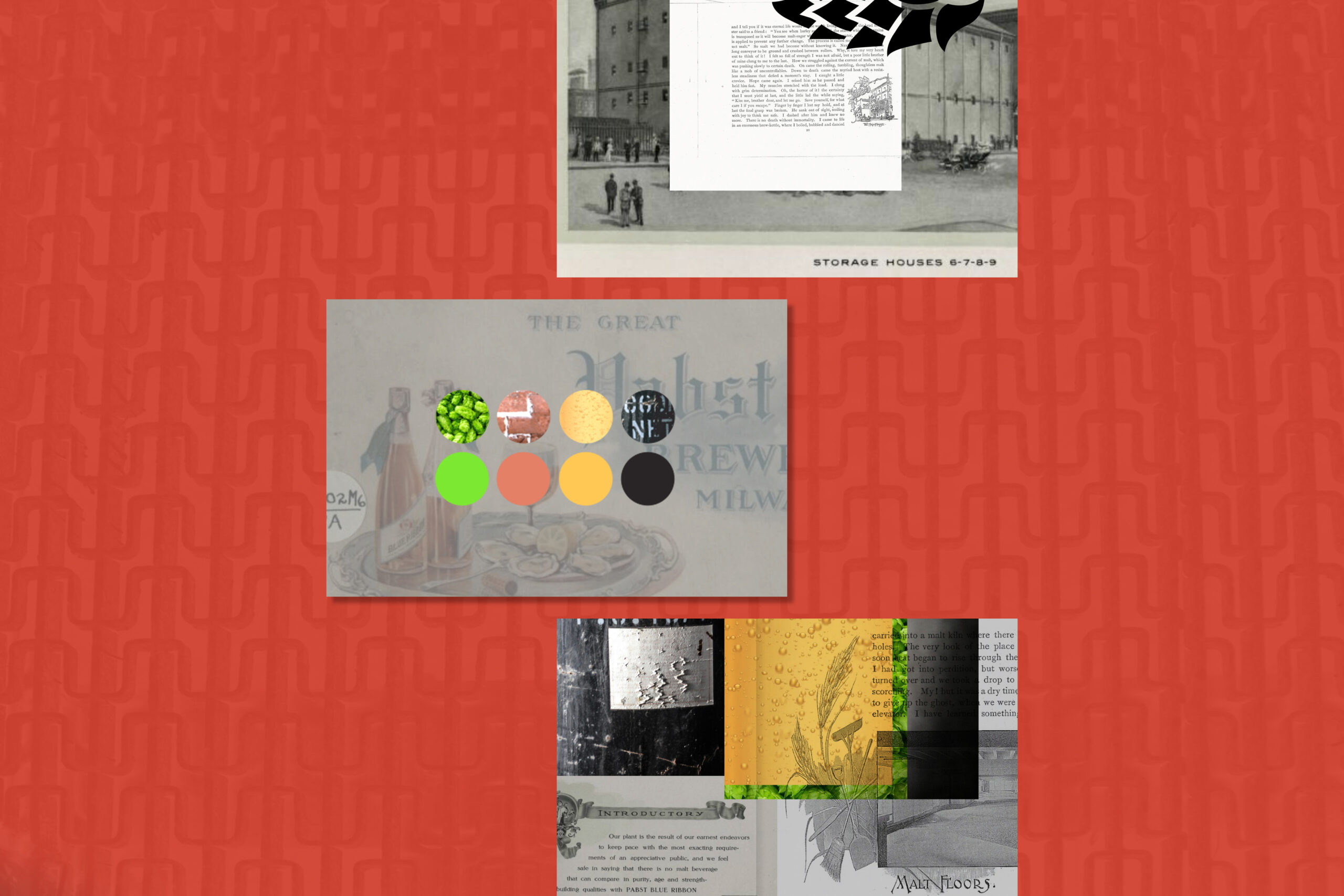
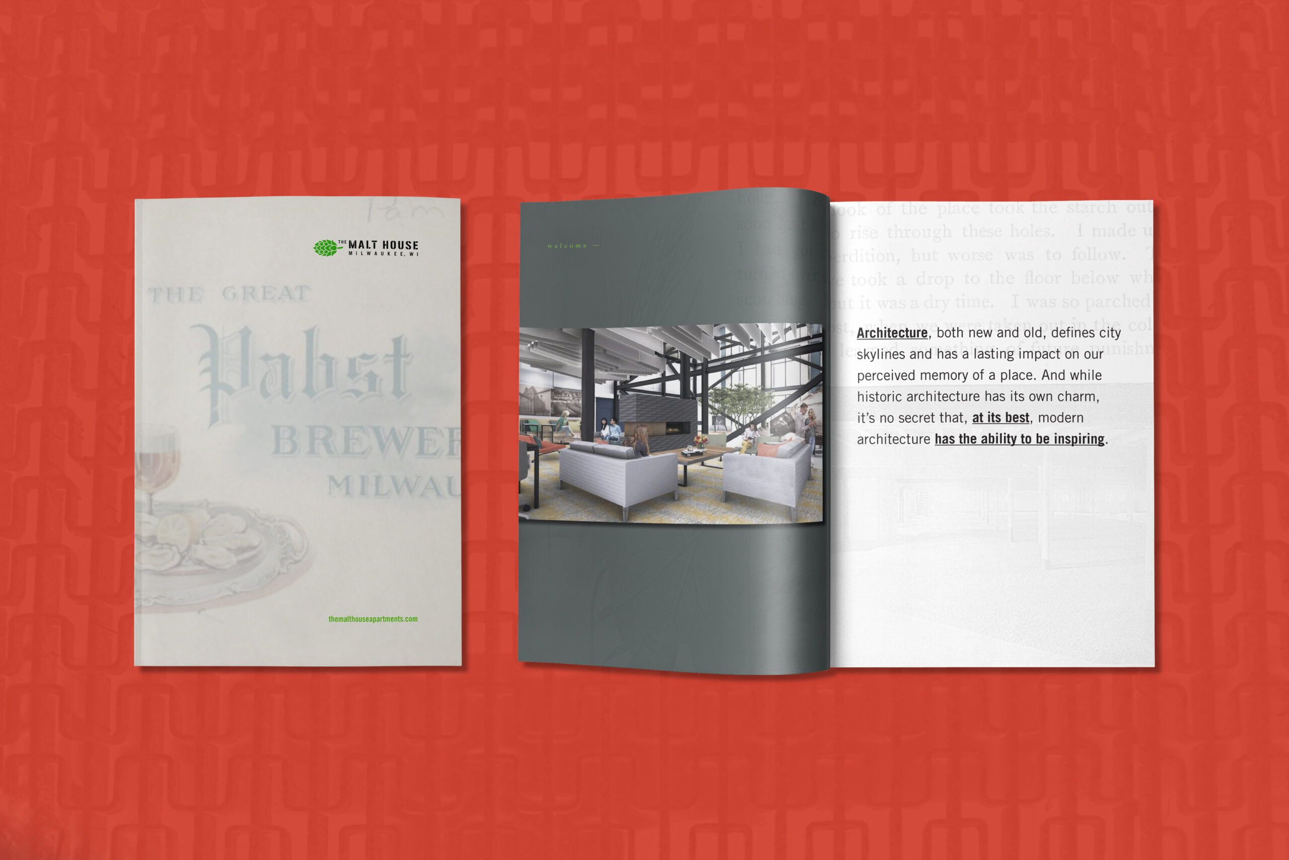
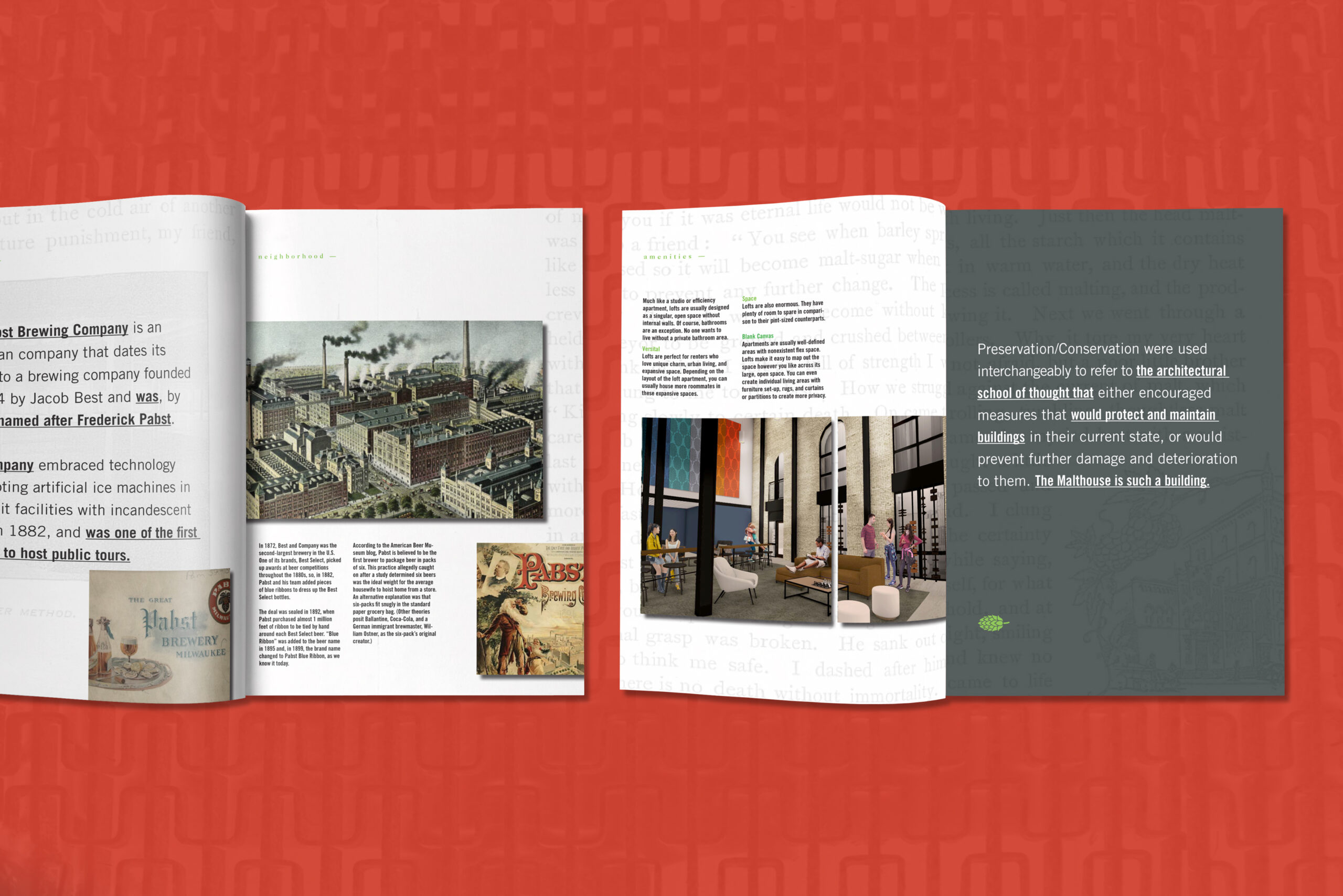
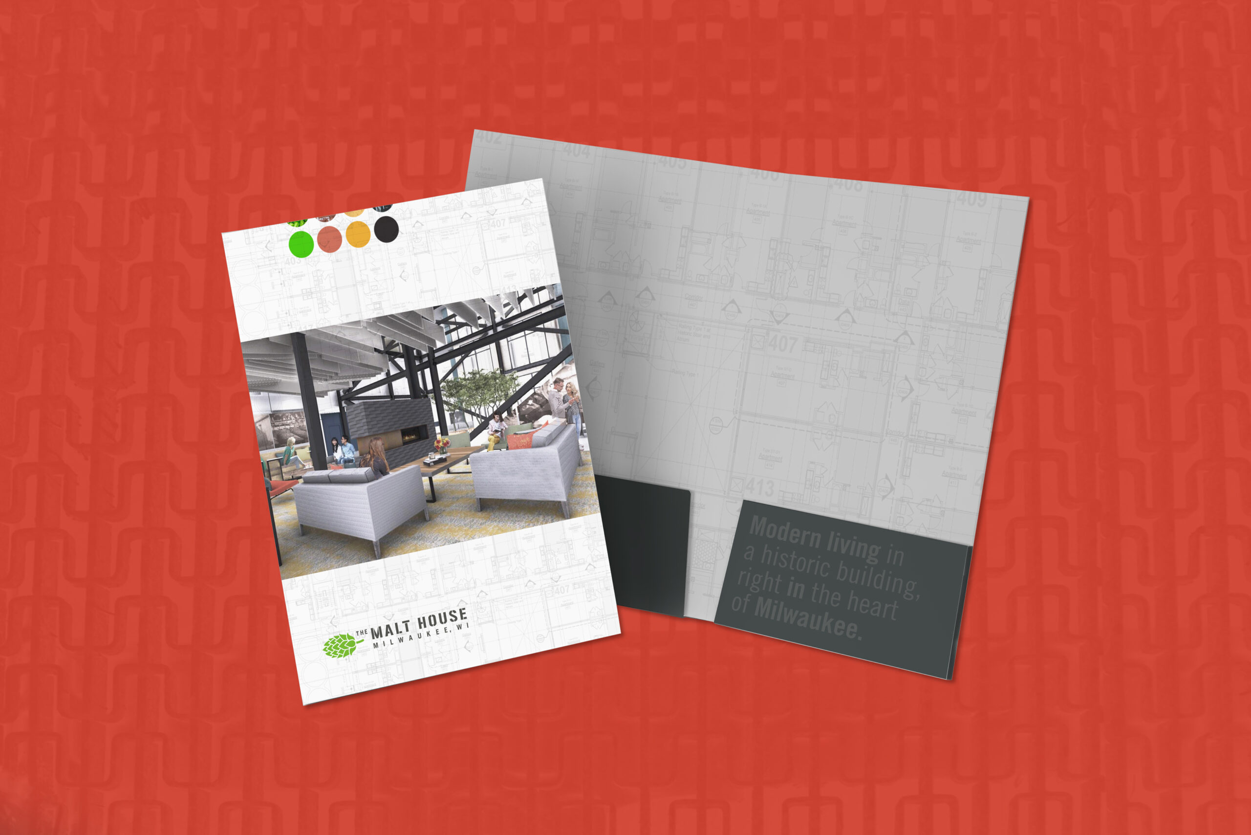
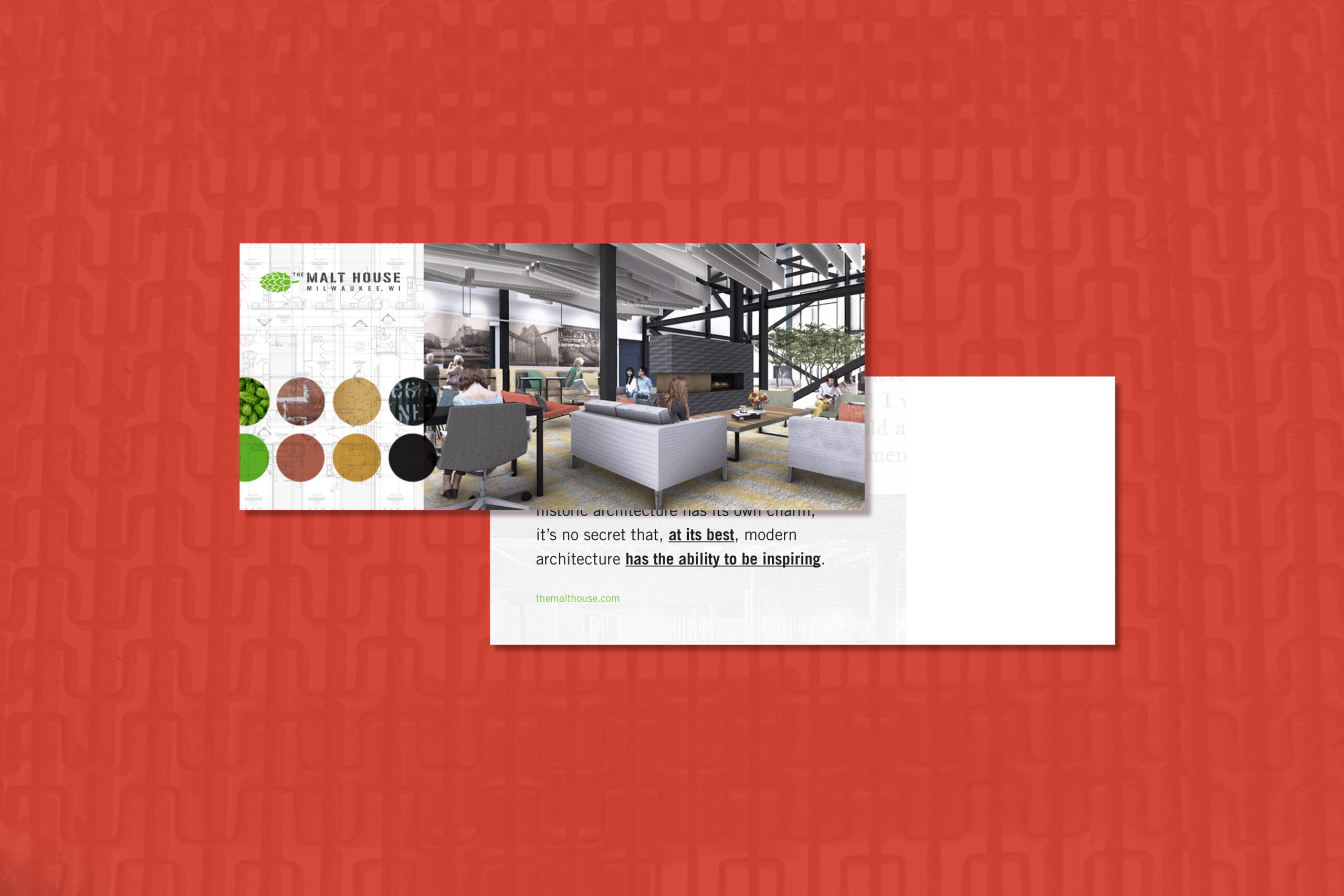
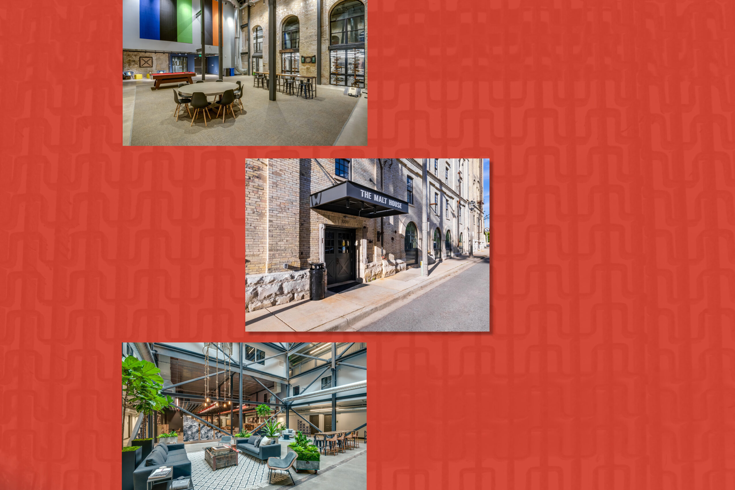
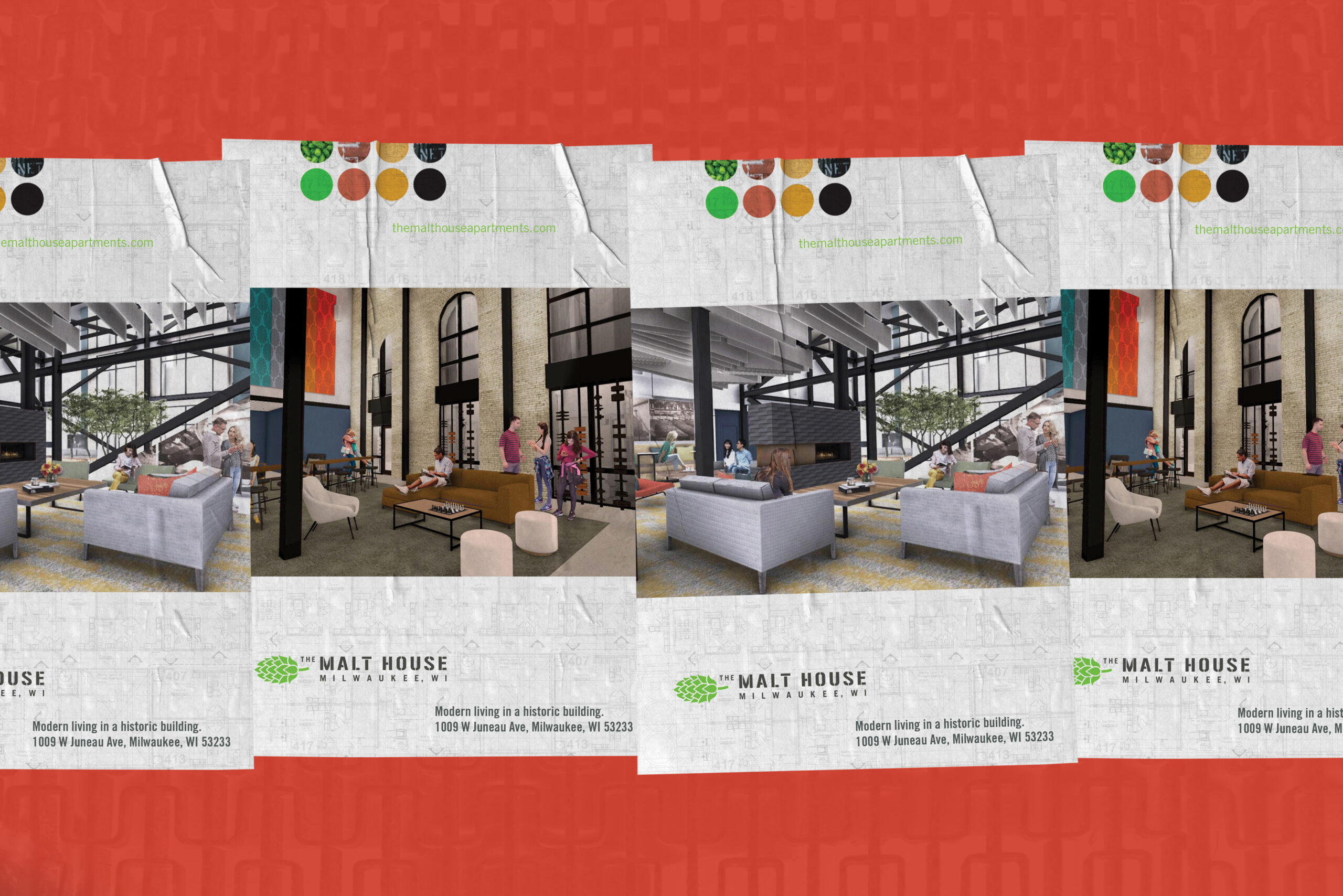
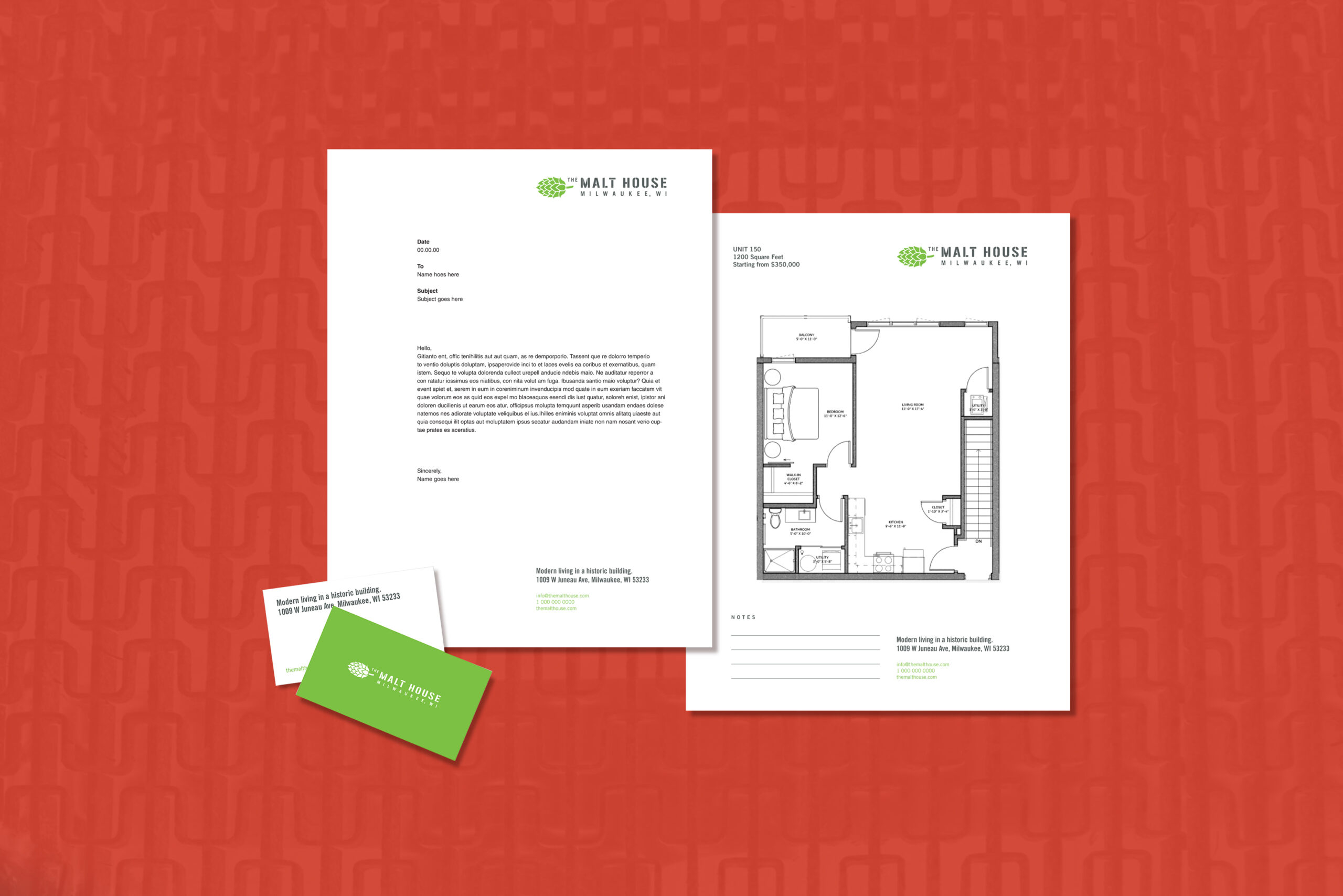
The Malthouse
Project Overview
The Malthouse is a modern loft building created out of the historic Pabst Brewing facility, (located at 1009 W Juneau Ave, Milwaukee, WI) in the Brewery District. I was recruited to brand this project from the ground up with a nod to, and inspiration from historic imagery and materials found on site. I created their identity, business forms, sales brochure, folder, postcard, advertising/posters, and environmental signage, amongst other items. The goal was to bridge the past to the "now", while paying respect to both. Learn more about The Malthouse here. Work done through Preserve Design Studio.
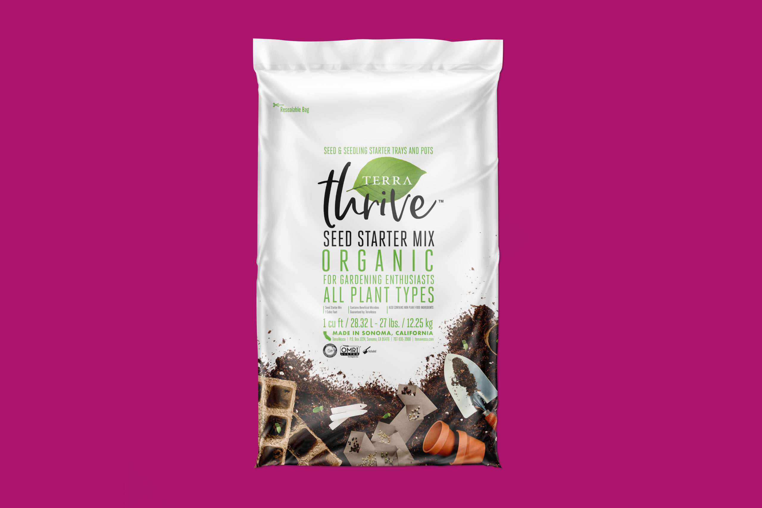
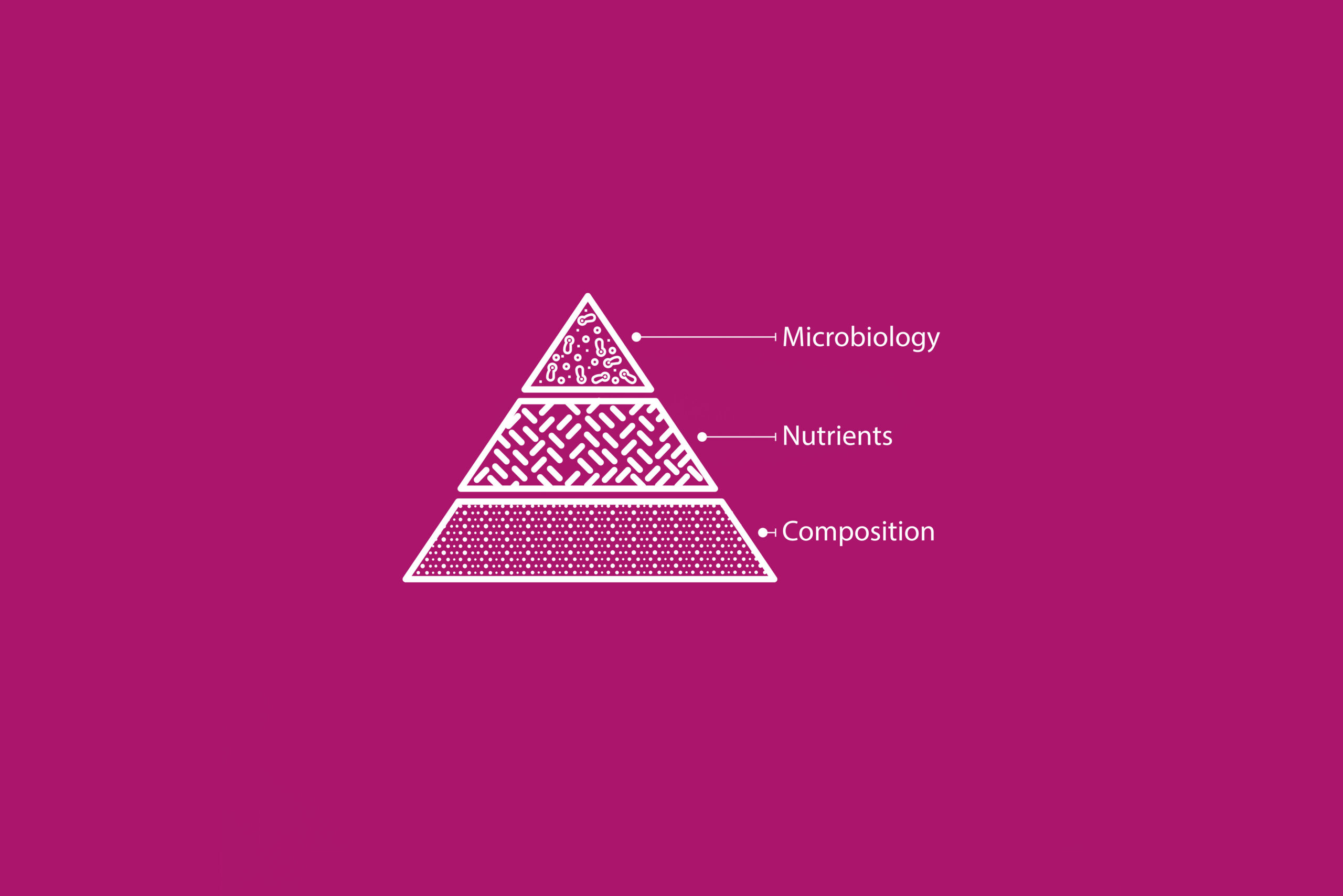
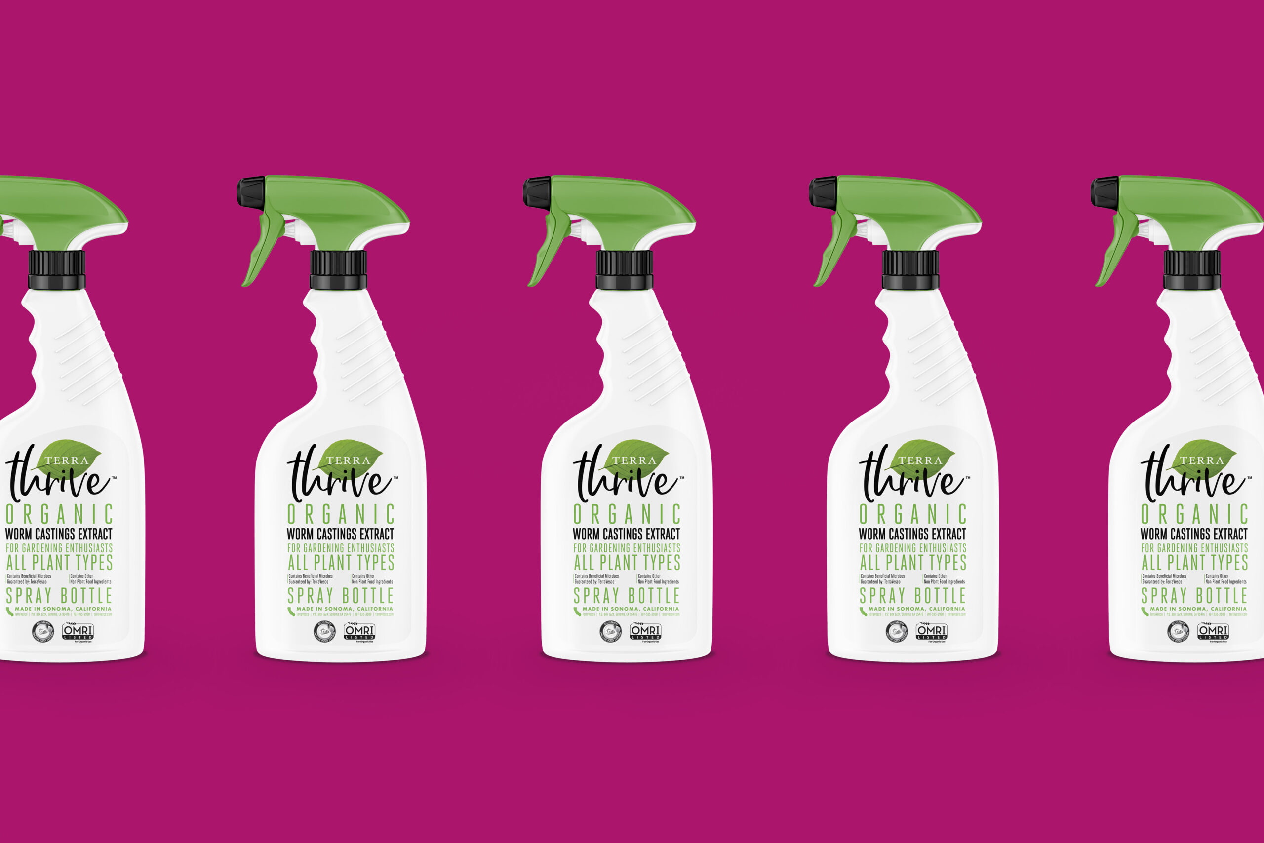
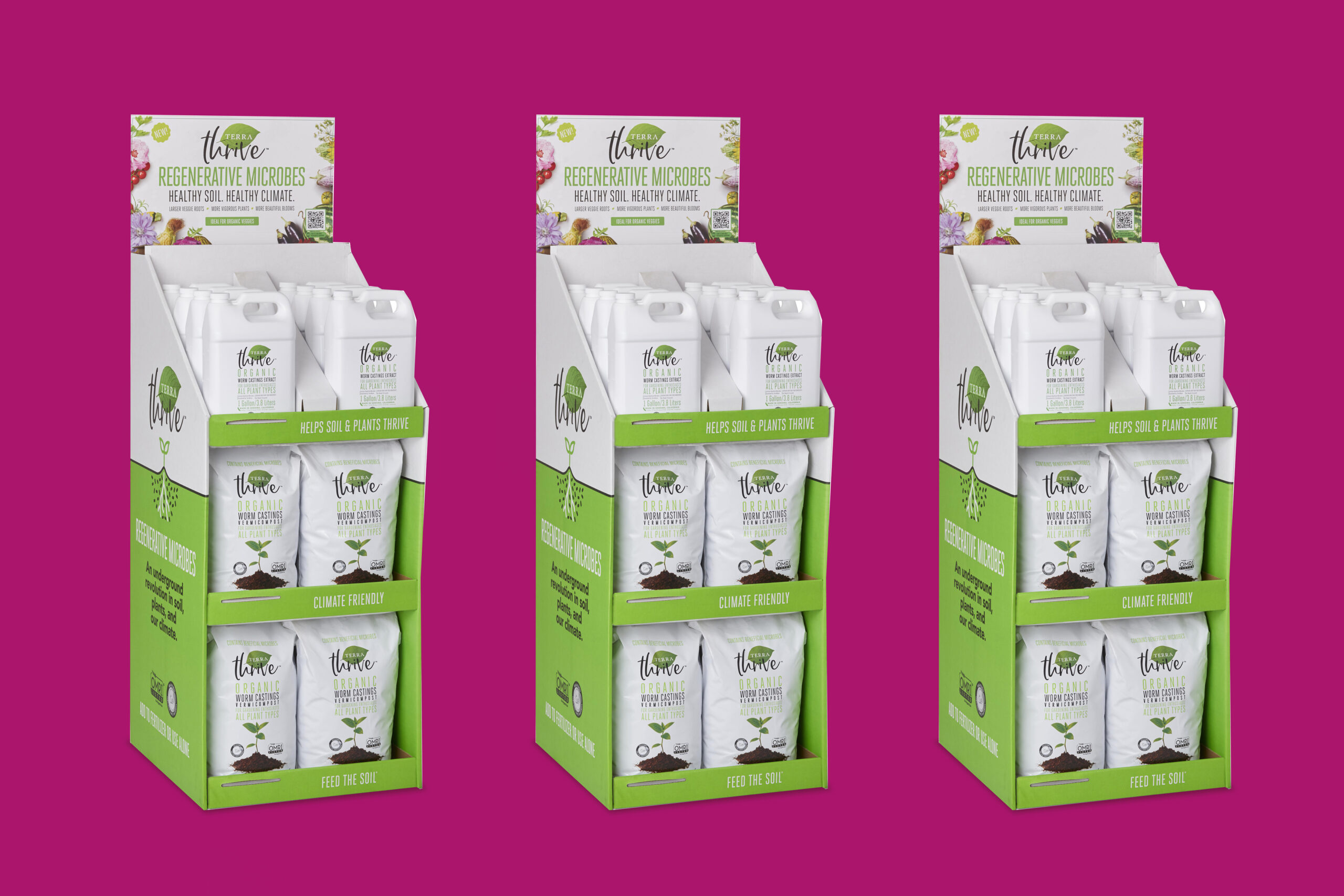
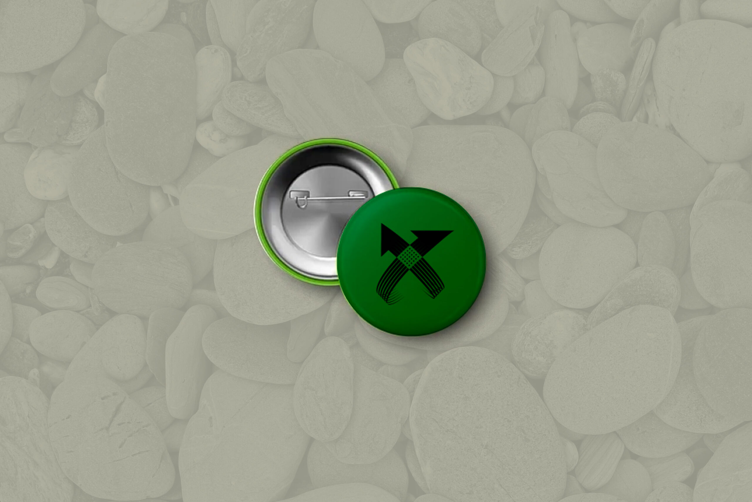
Client
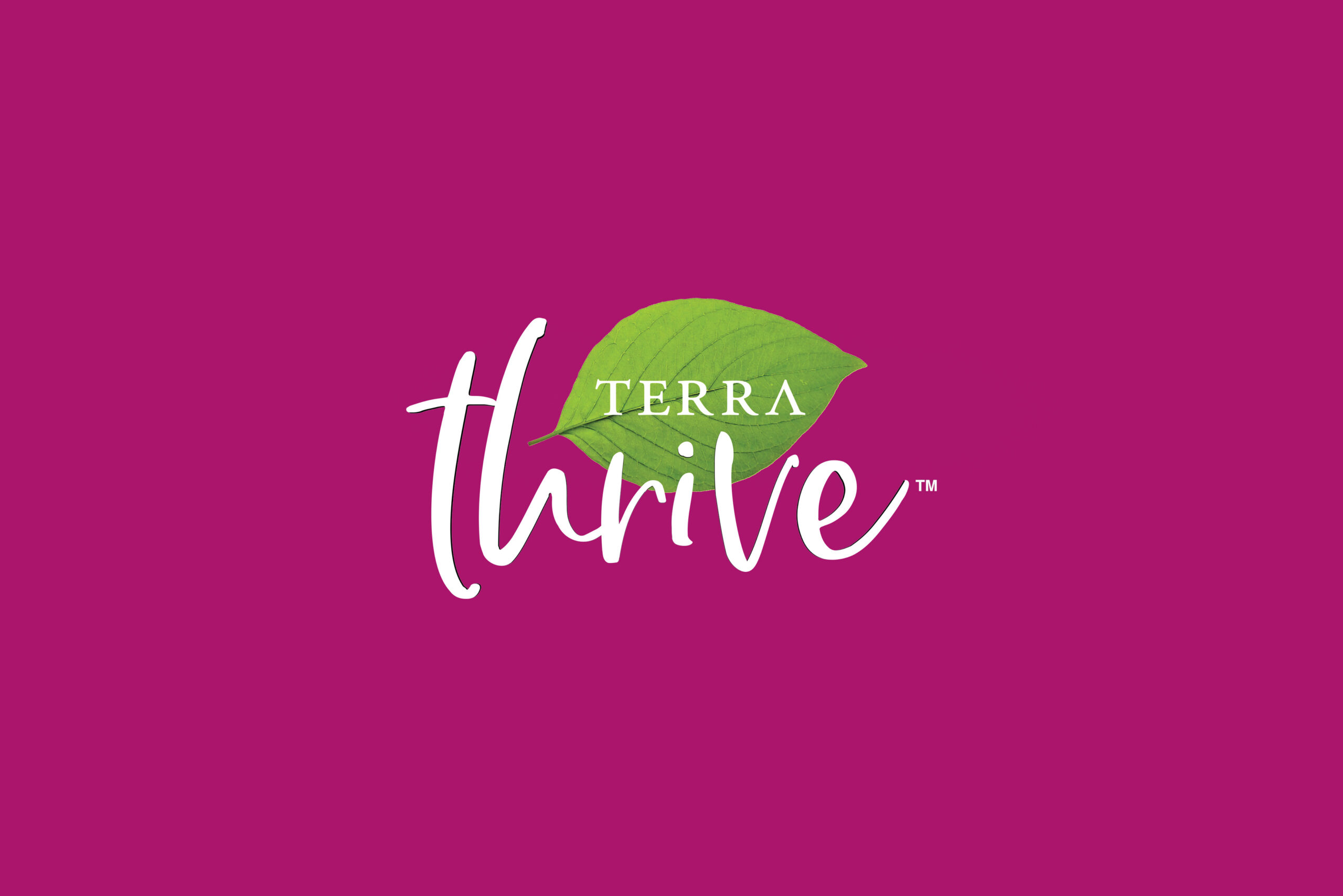
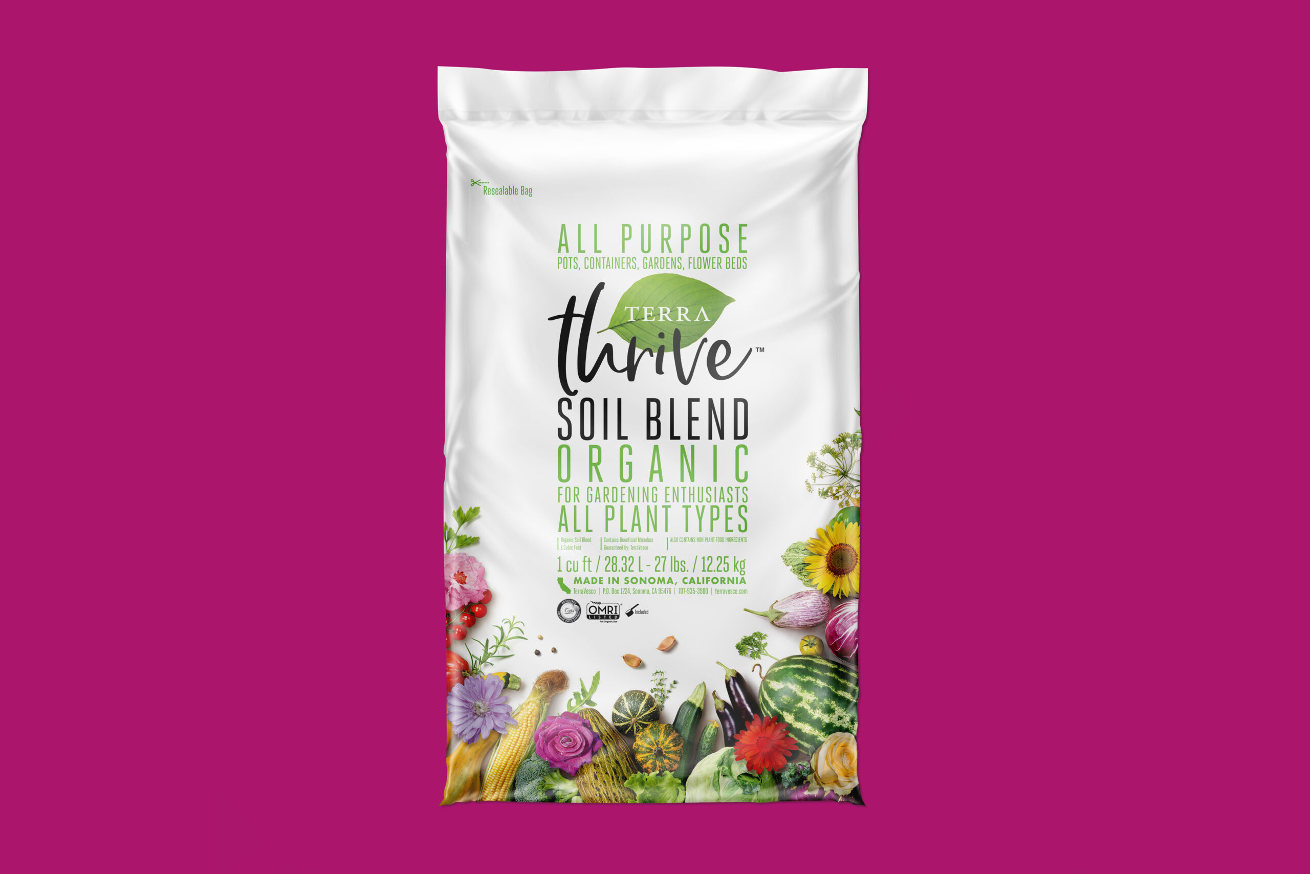
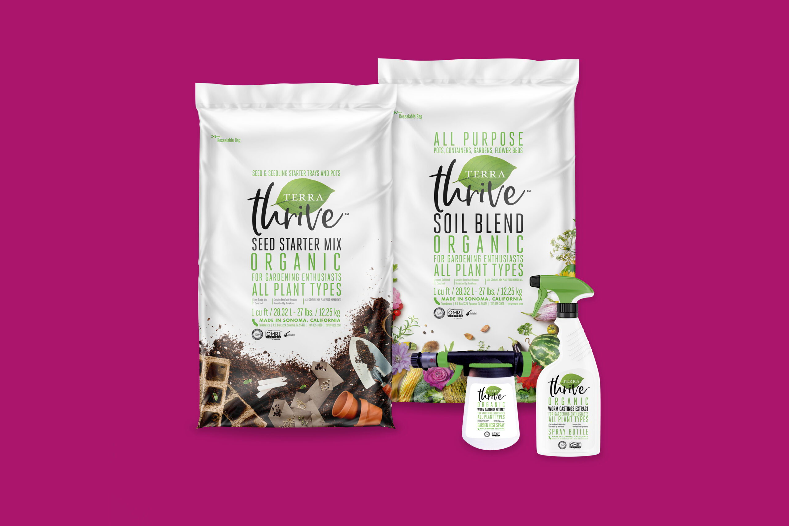
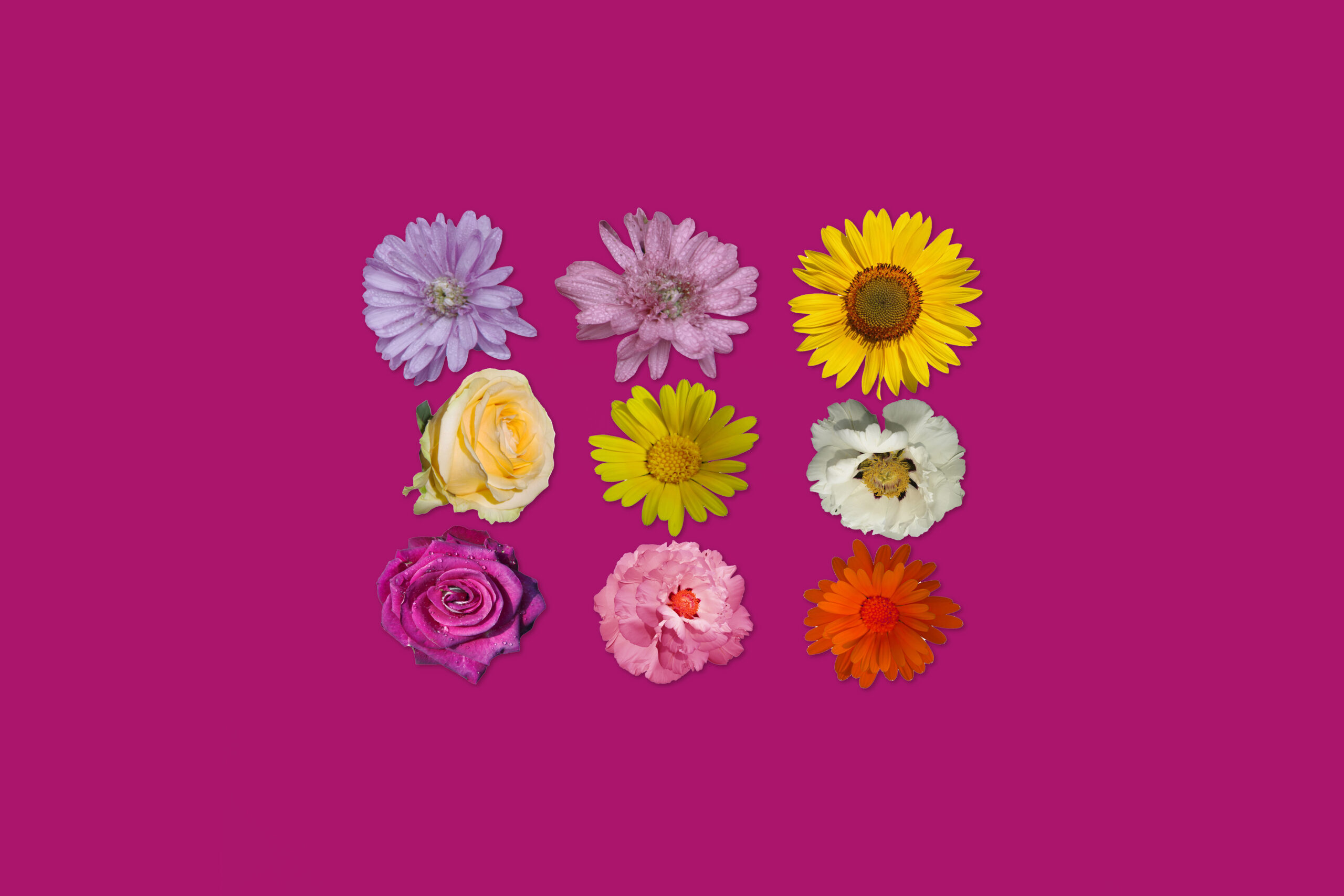
TerraThrive
Project Overview
TerraThrive (a product line of TerraVesco) has a simple mission — healthy soil, healthy food, healthy people. They do this by producing the highest quality organic soil amendments to improve soil health and plant resilience. I assisted them with the creation of their product line packaging brand architecture. This included but wasn’t limited to: identity development, product packaging, and support graphics. You can learn more about them here.